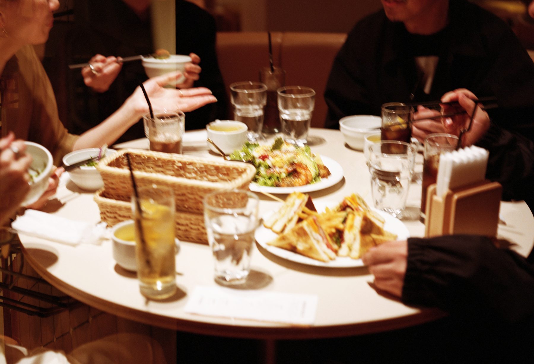

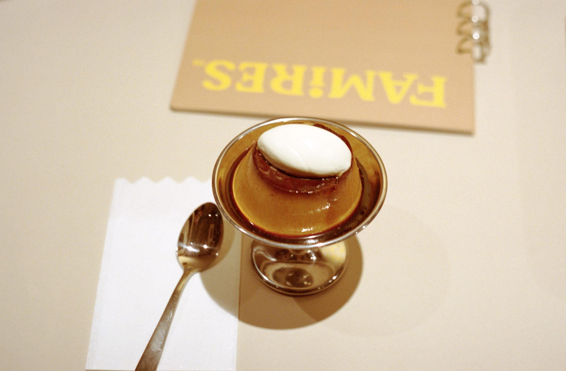
A chain family restaurant suddenly popped up in my town during my childhood. In those days, eating out was not yet a common practice, and it seemed so glamorous to me as a child, and I had longed to eat there. Eventually, the restaurants started to open on a 24-hour basis, various brands entered the market, competition increased, and before long, they began to appear cheap and were no longer the object of admiration. However, they still have many attractions that rarely exist elsewhere, such as spacious tables that make it easy to work, an atmosphere where you can talk with friends at leisure, parking, late hours, and easy-to-imagine foods, and they remain discreetly popular.
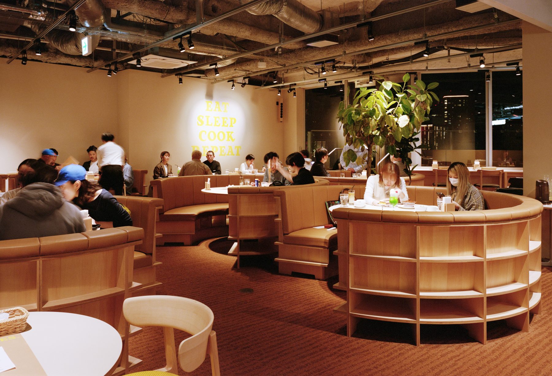
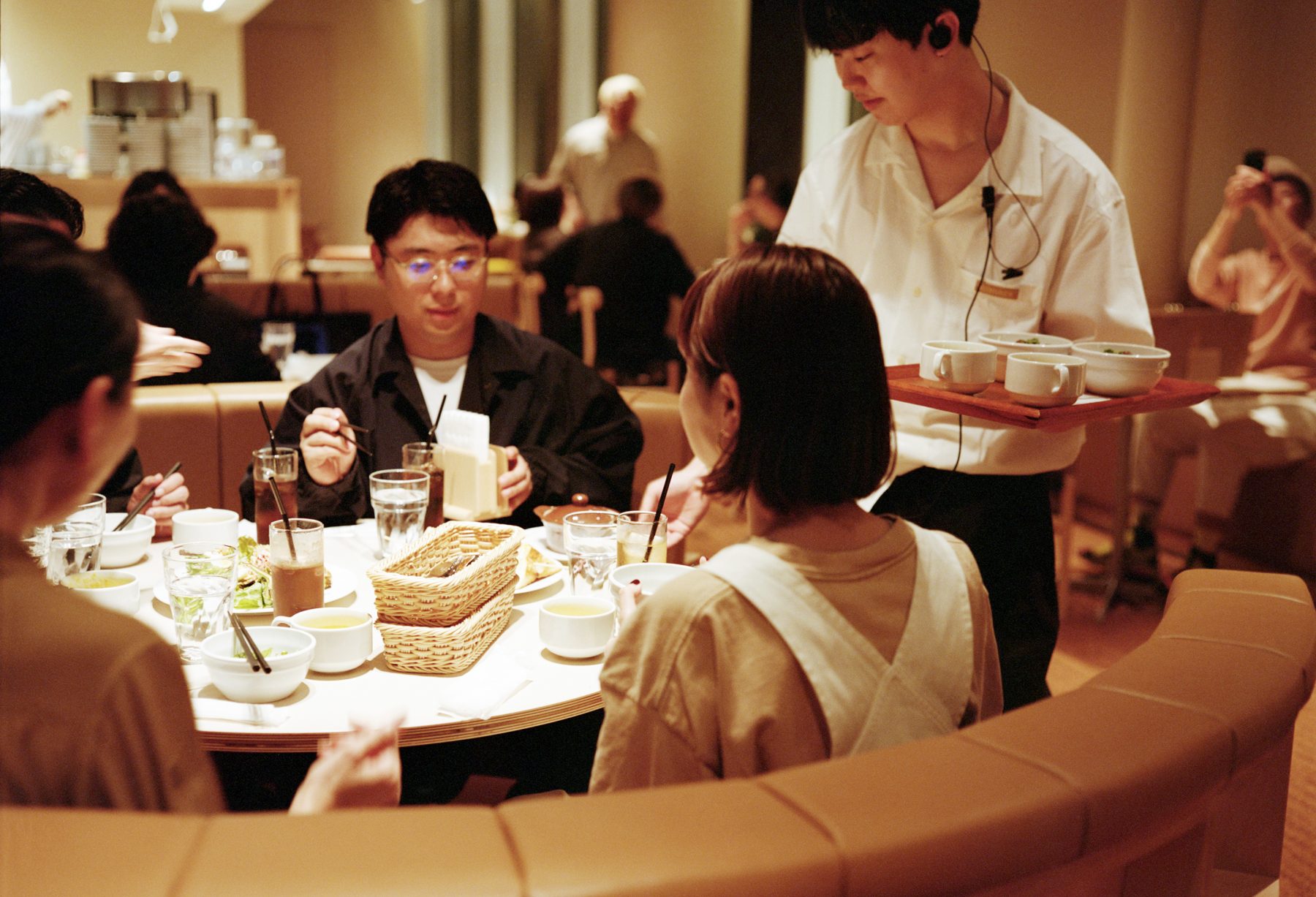
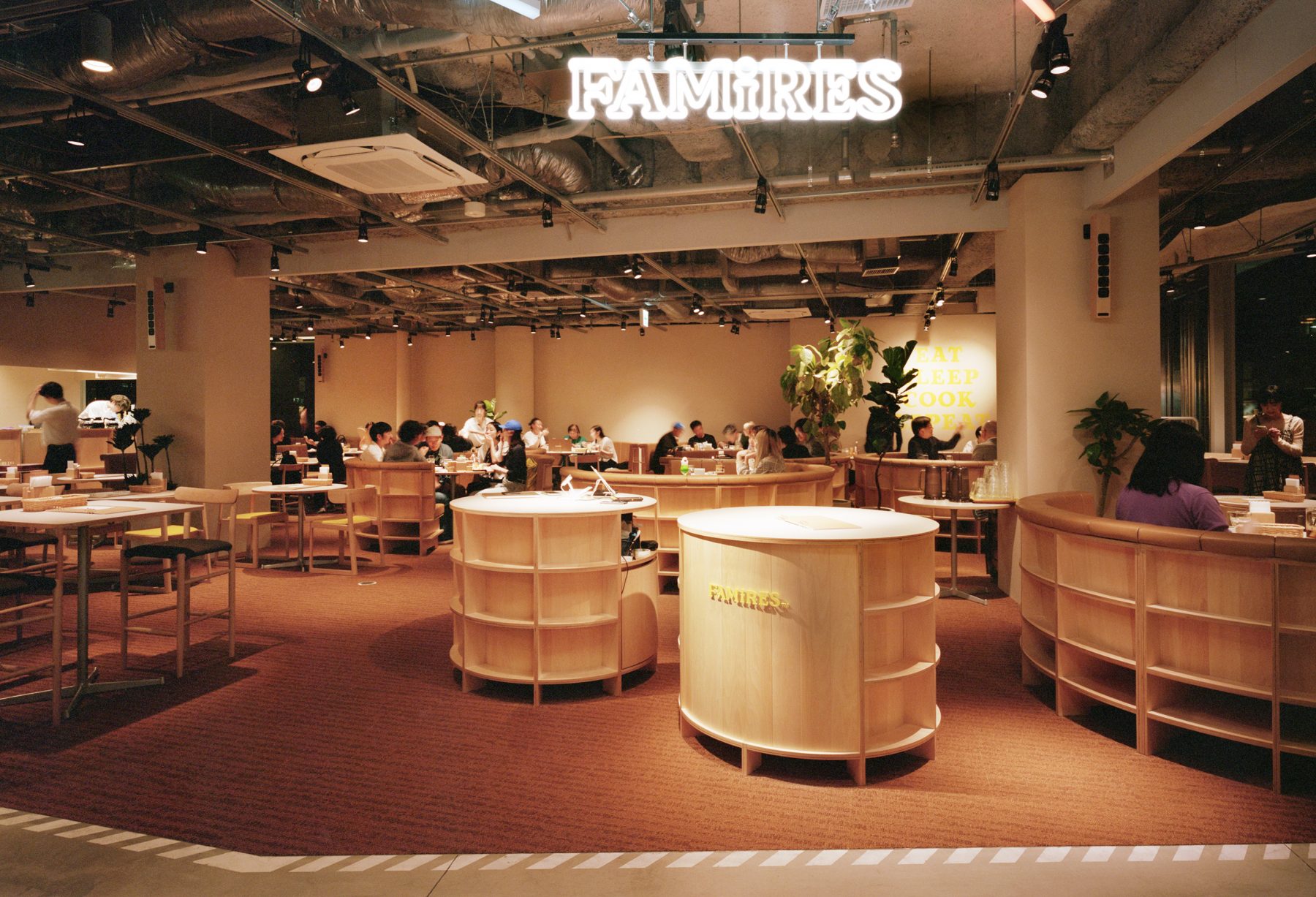
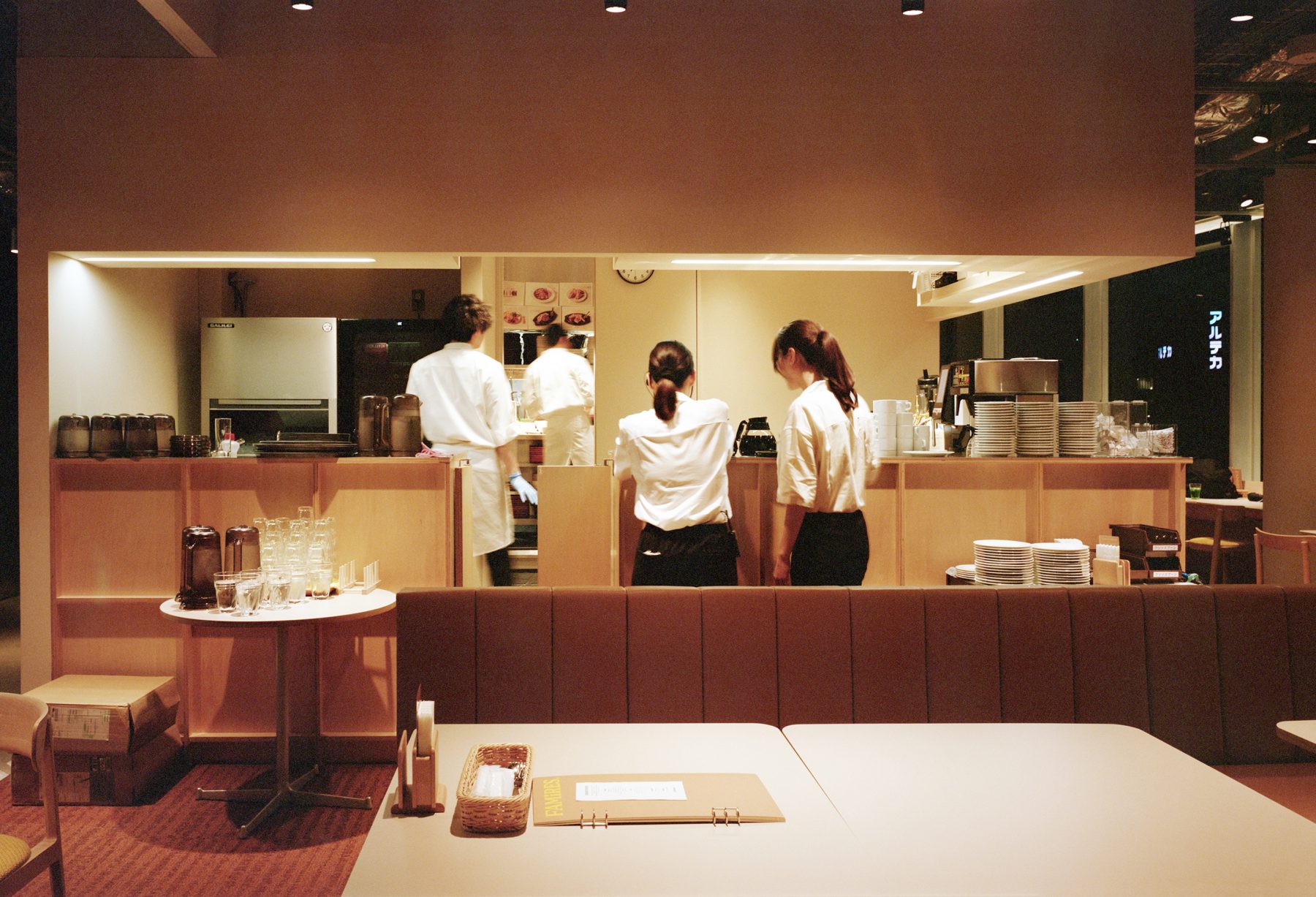
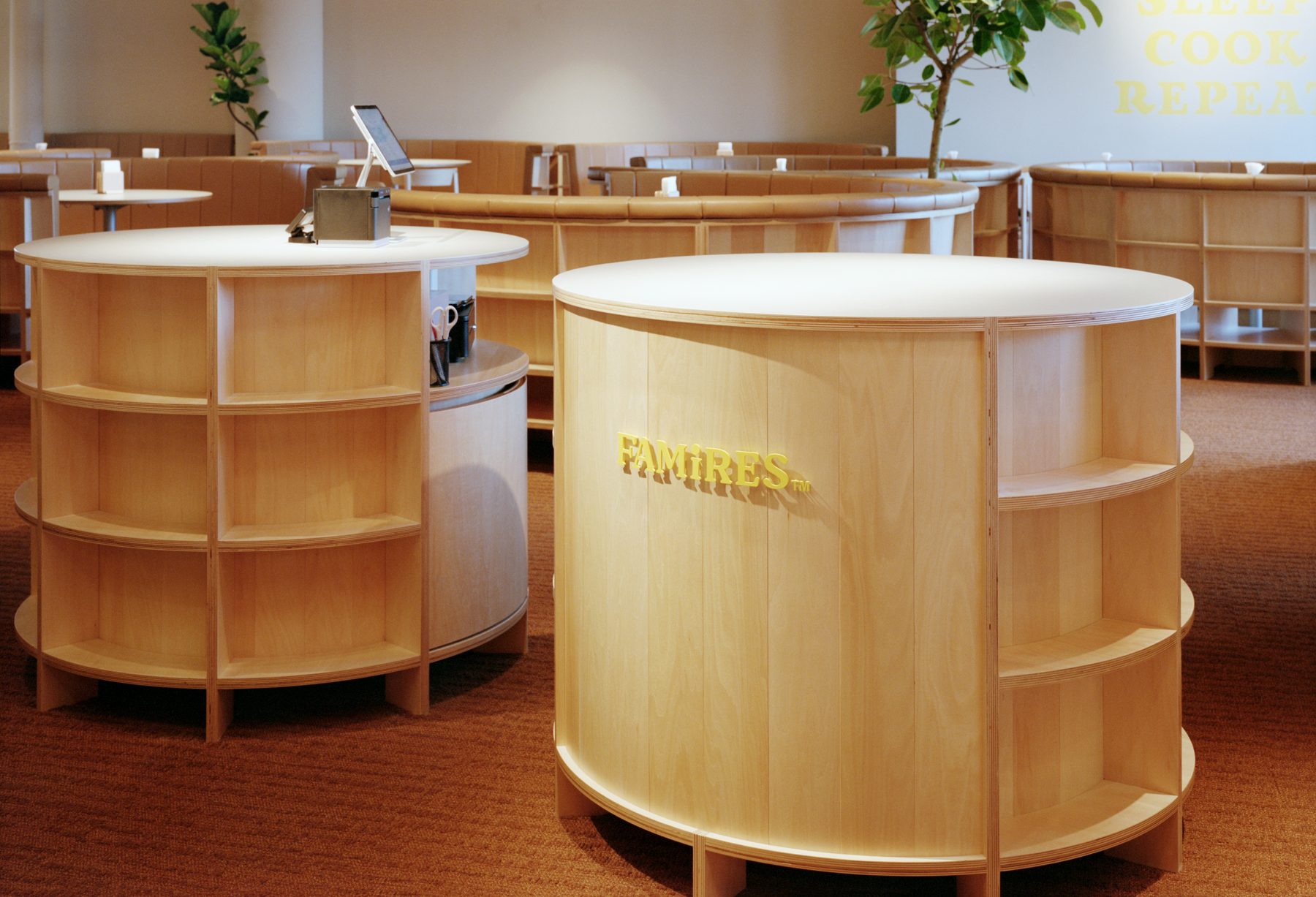
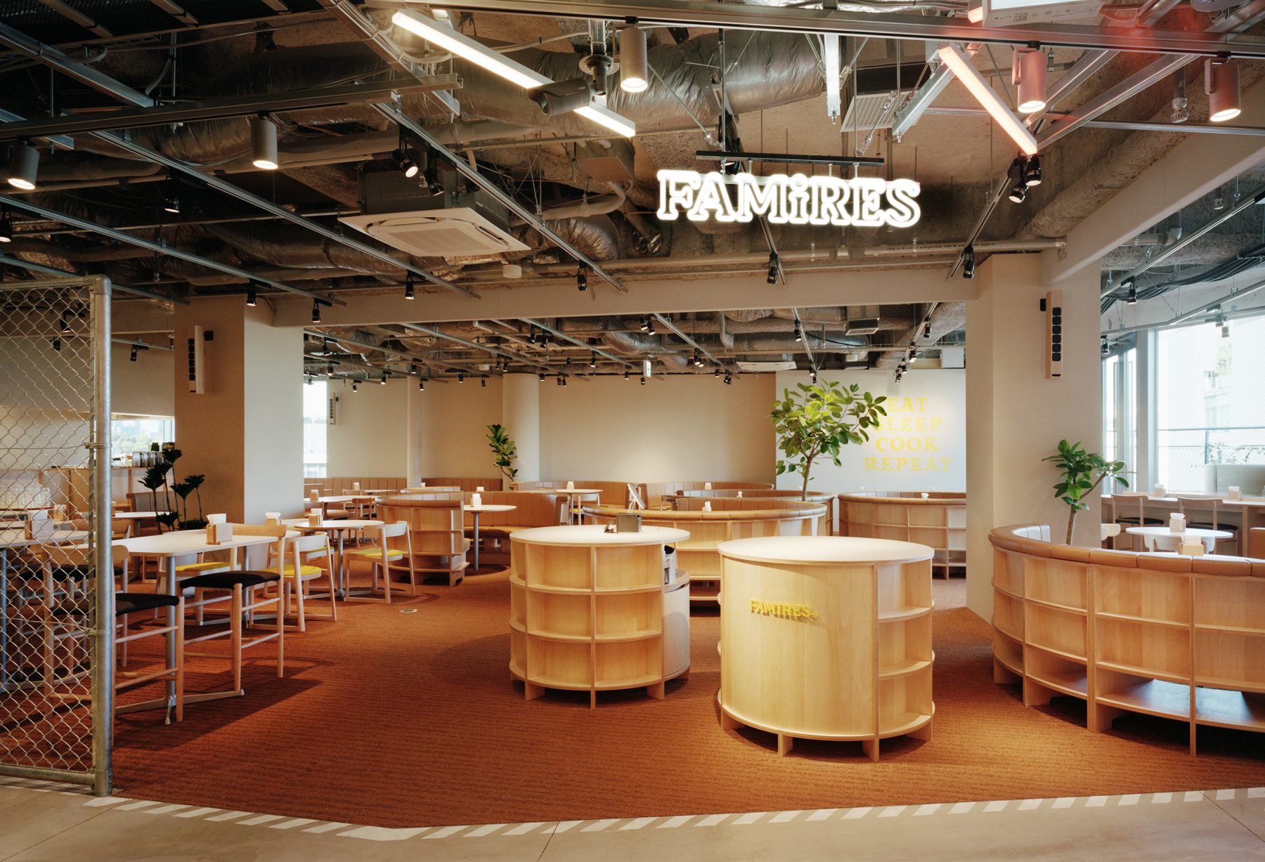
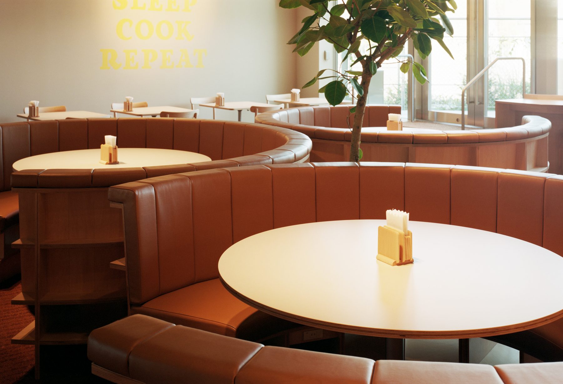
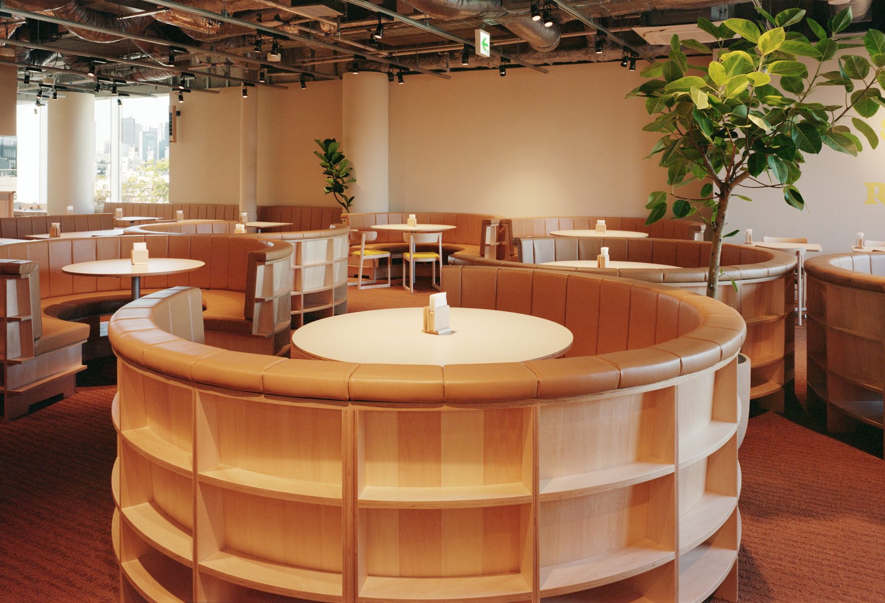
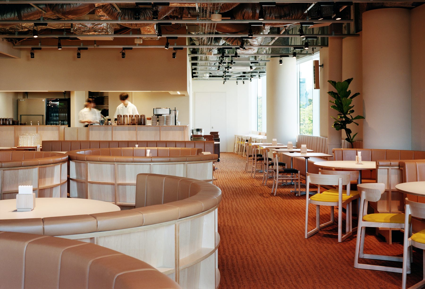
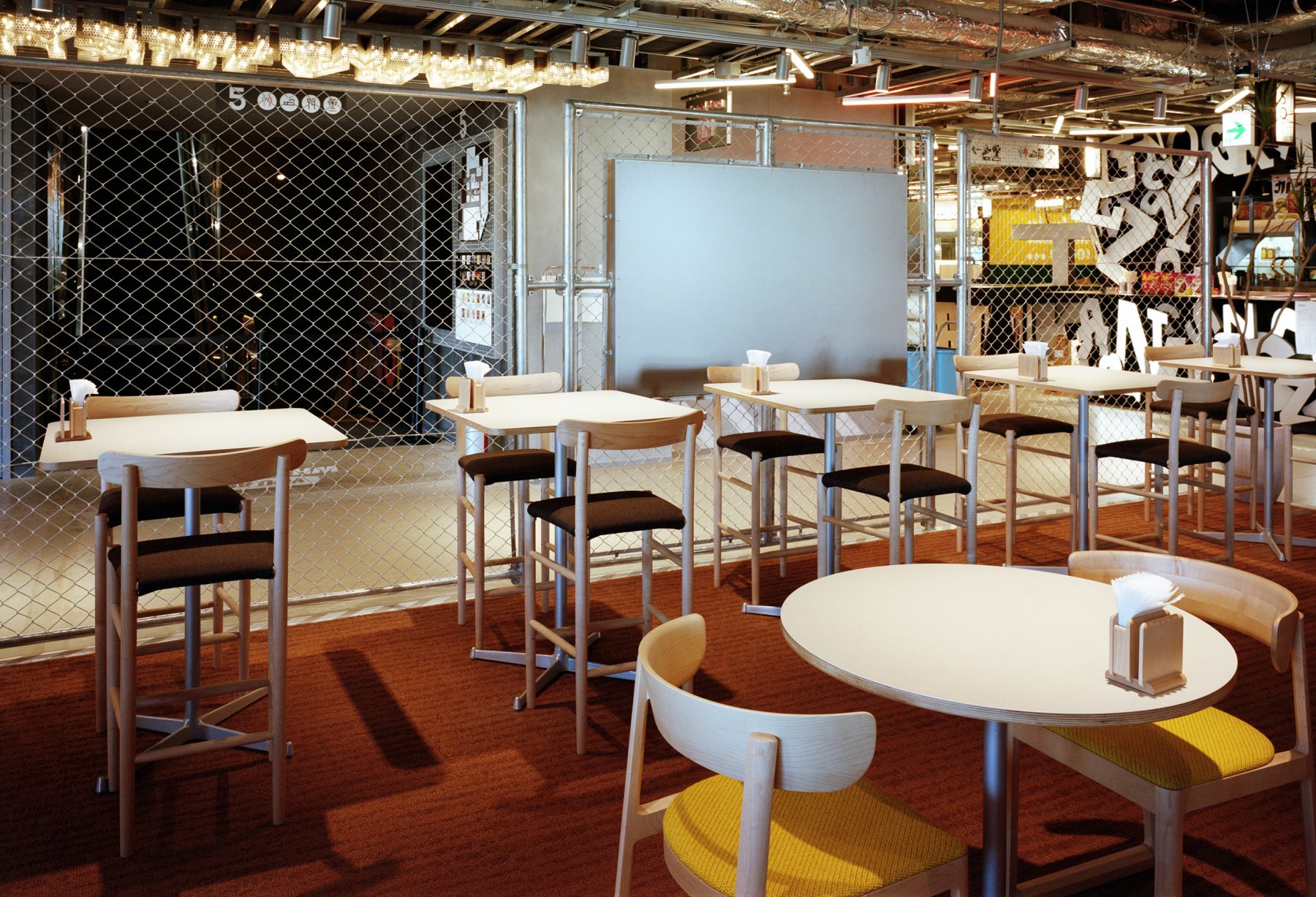
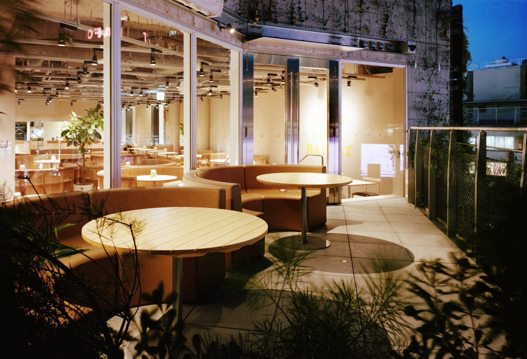
However, it seems that a family restaurant is not a store one would positively recommend but one many people secretly use. This project was to rebrand a family restaurant by Chef Toba of Sio. We collaborated on the space design, aiming to create a new family restaurant while giving it a distinctive “family restaurant” feel. As a first step, we planned booth seating. We designed round booths arranged in an island style so the staff can serve customers from the outside. The floor is finished with carpet tiles to prevent noise and allow people to eat in a relaxed atmosphere. The space’s color scheme is yellow and beige, intended to be friendly and inviting to all. (Jo Nagasaka)
DATA
Title: FAMiRES
Architect: Jo Nagasaka / Schemata Architects
Project team: Tomomi Ishibashi , Shoichi Sato
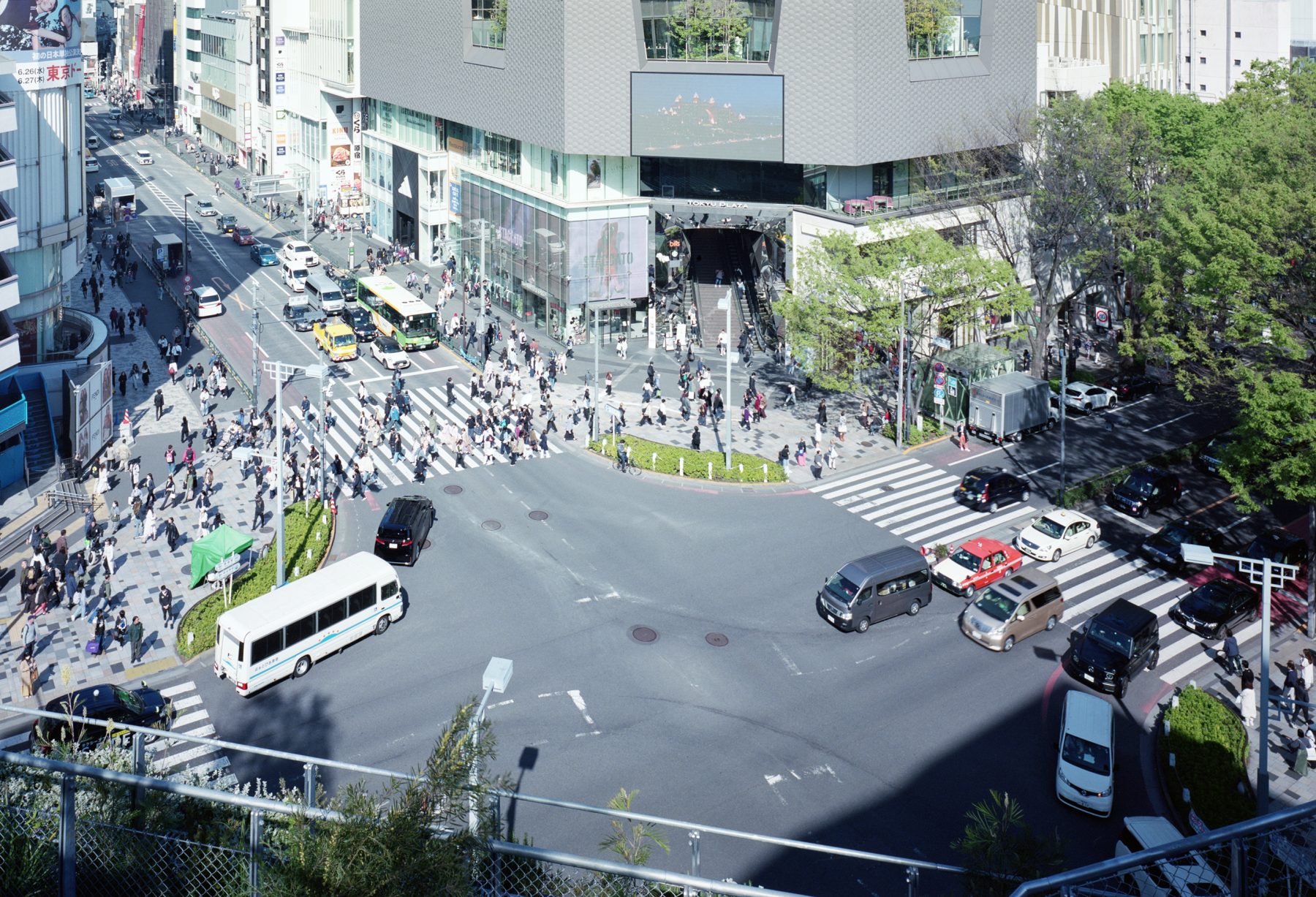
Location: 1000-6, Jingumae, Shibuya-ku, Tokyo, Japan
Usage: Restaurant
Construction: TANK
Number of stories: 5F
Floor area: 256.87㎡
Structure: SRC
Date of completion: Spring 2024
Photographer: Yurika Kono
Press data download
