

and wander MINAMI SEMBA
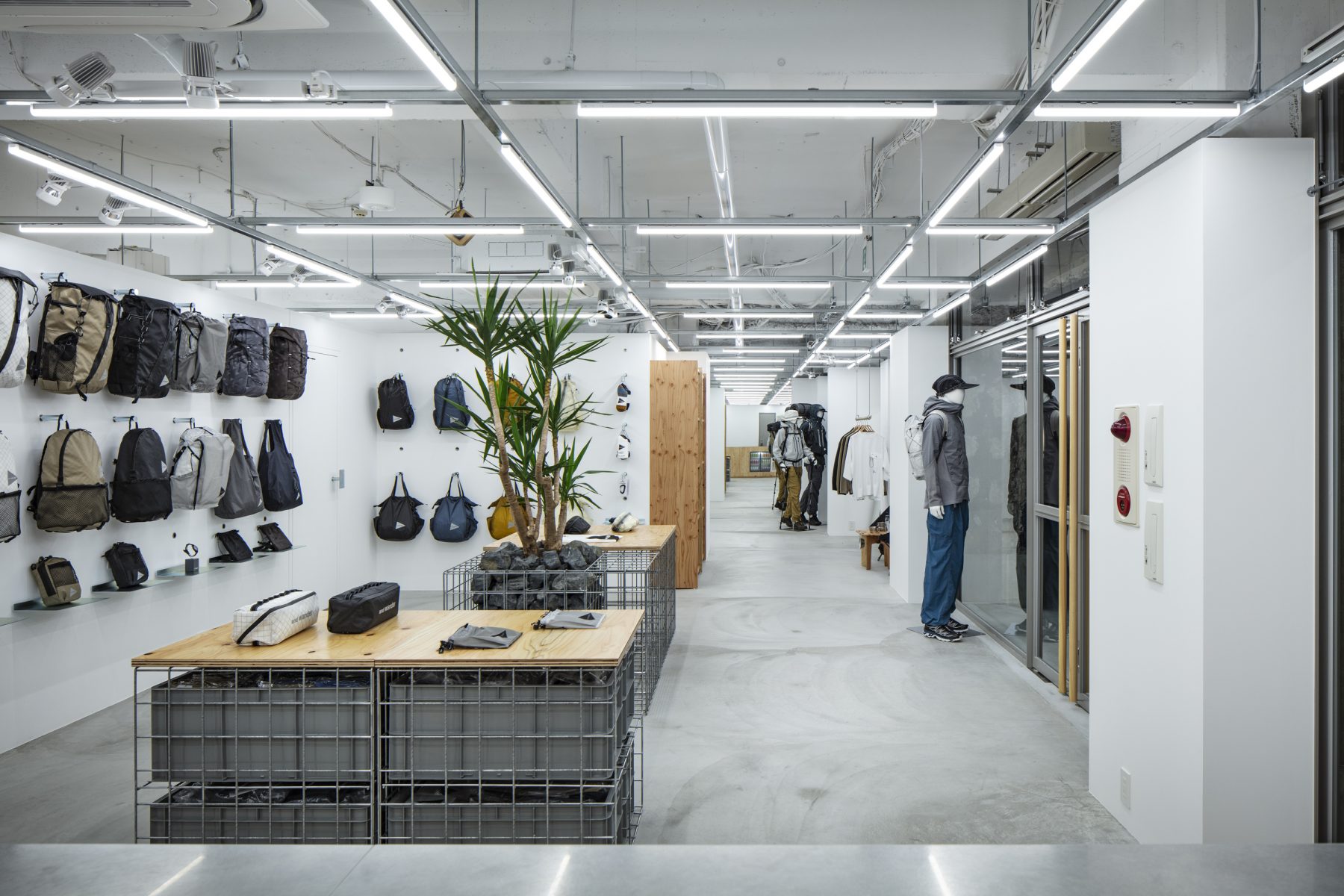
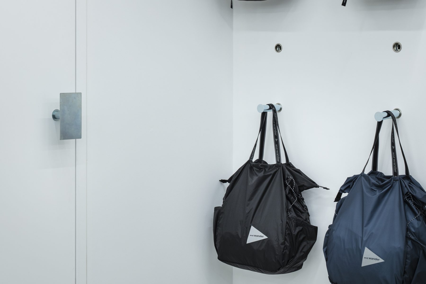
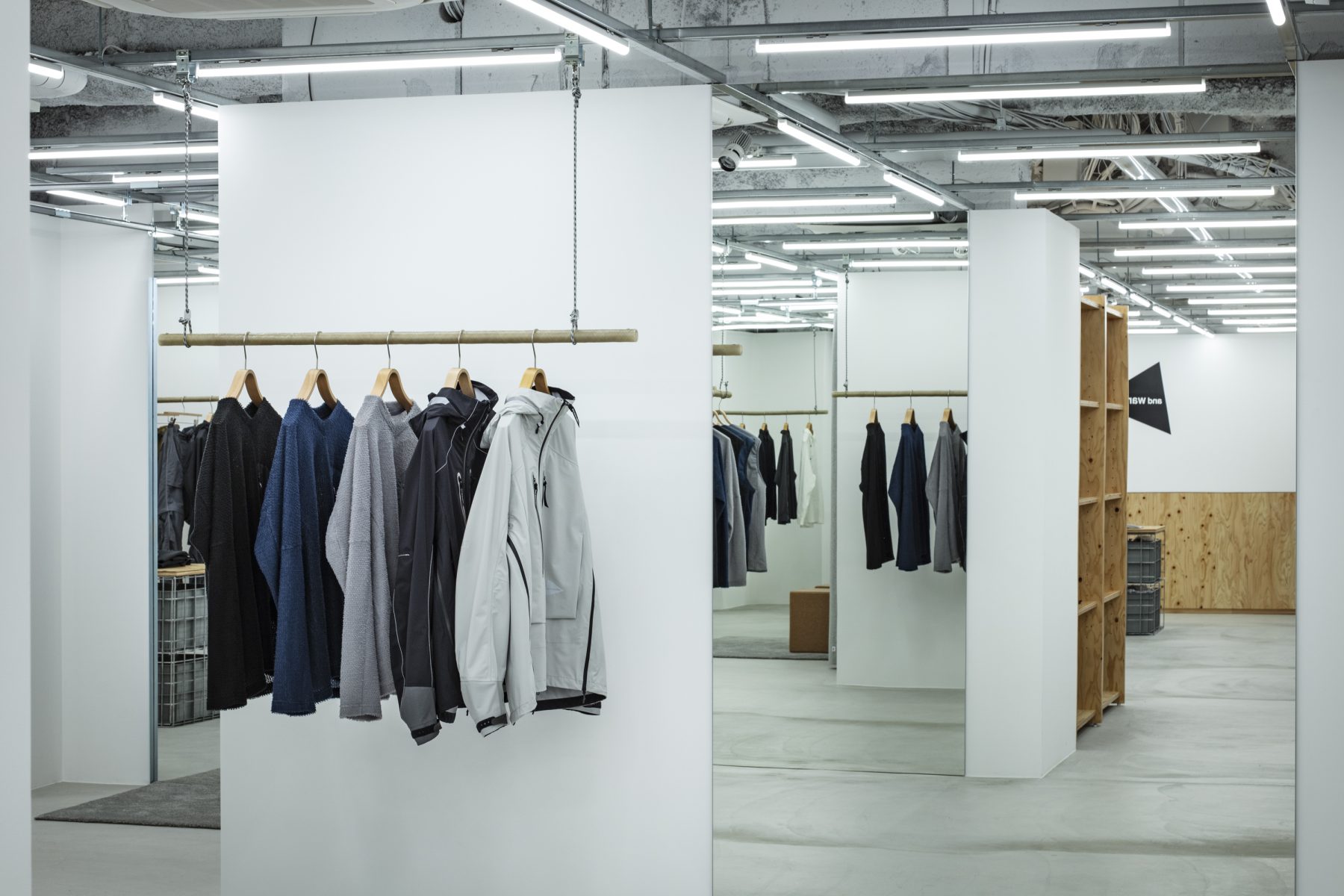
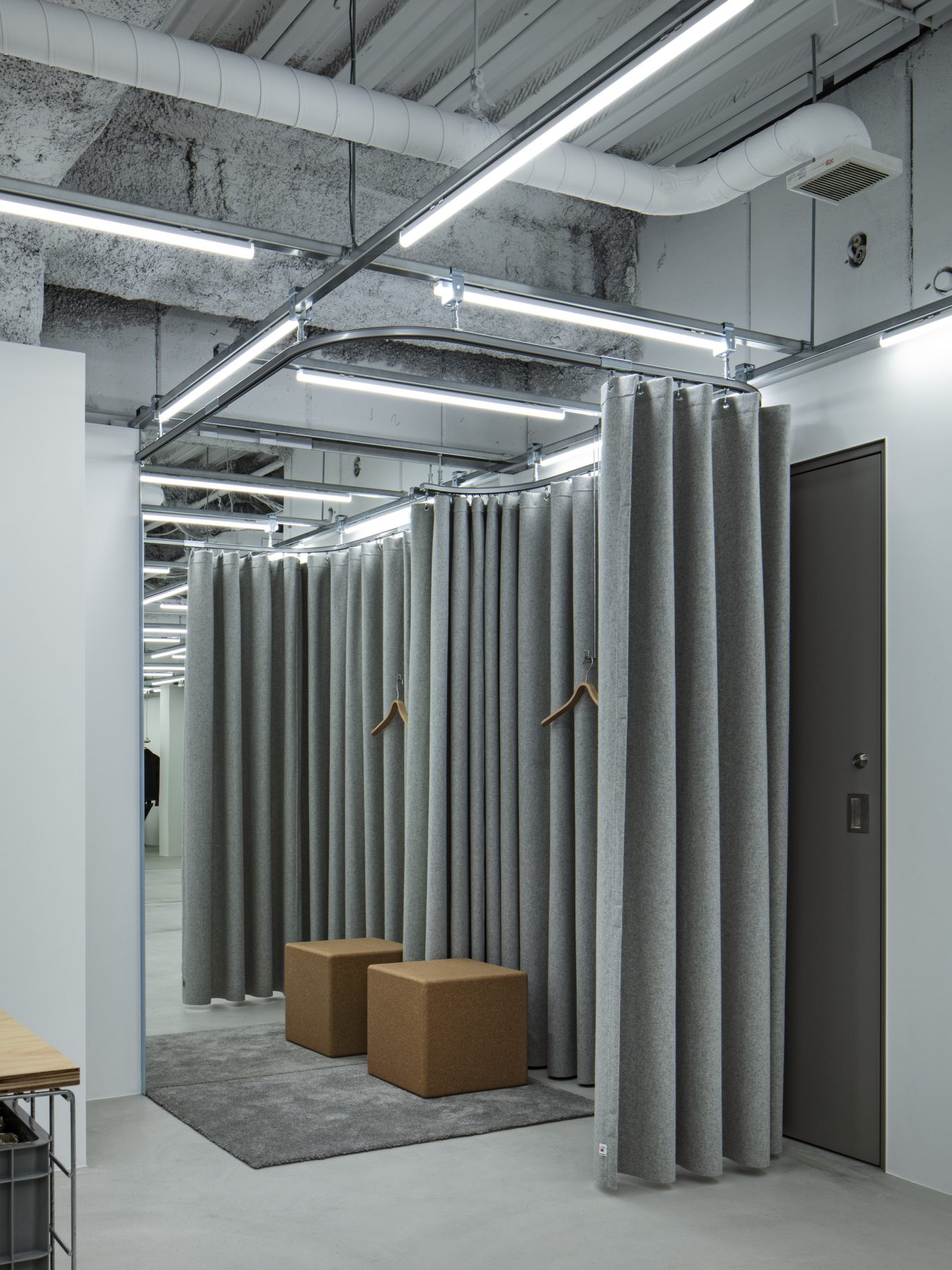
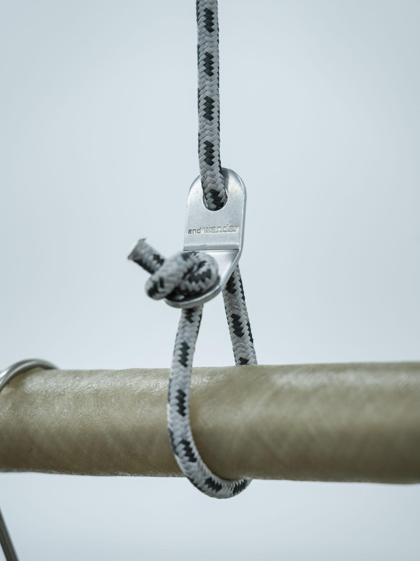
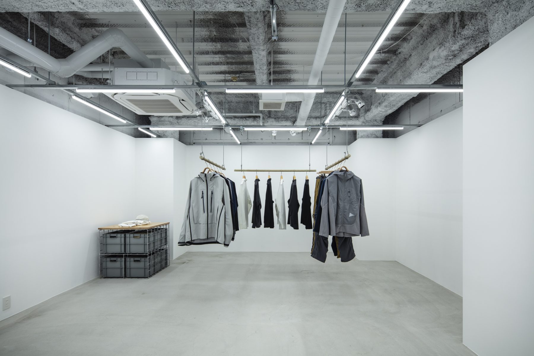
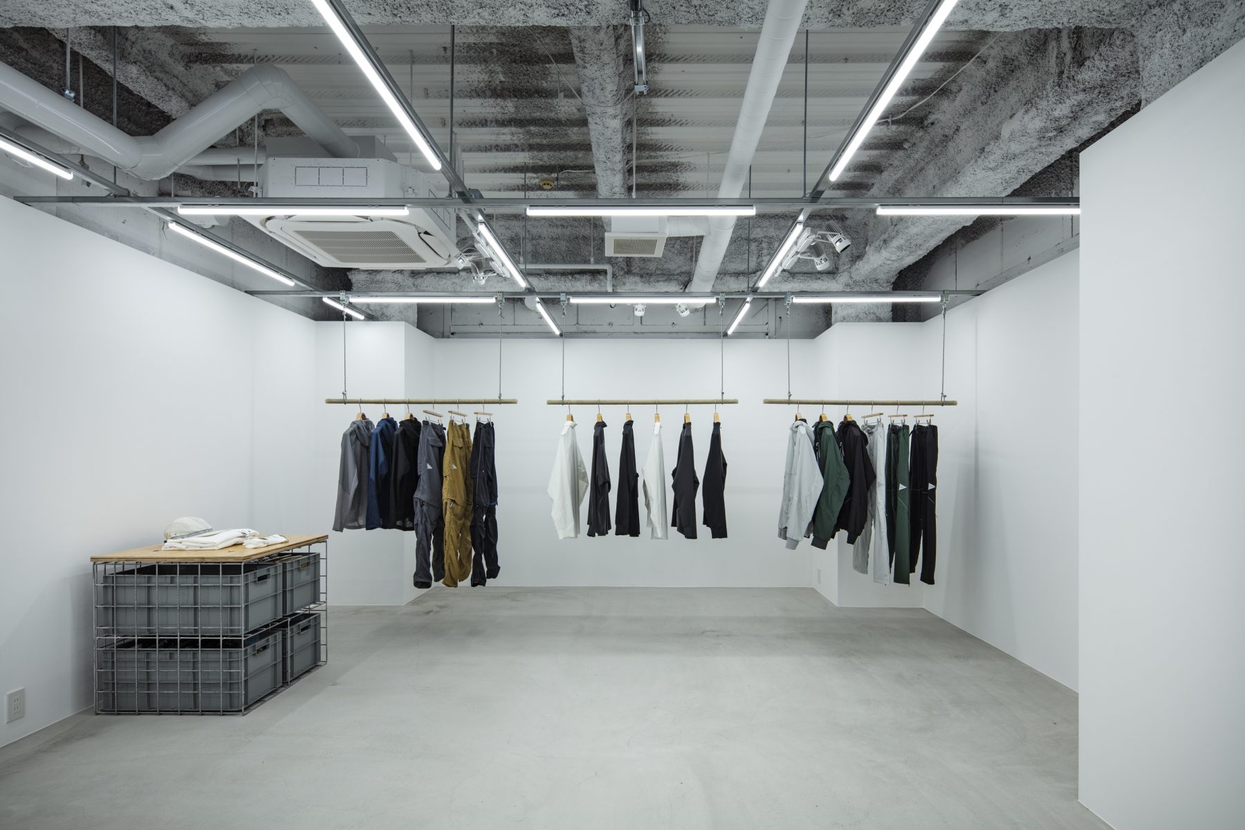
and wander features a wide range of unisex items available in various colors. Each item has its own unique cutting and design, which you only notice when you hold it in your hands, giving you the pleasure of discovering something new each time. A grid system suspended from the ceiling was used to create a moveable layout, allowing flexible arrangements of lighting, hangers, posters, fitting rooms, etc.
We intend to use a consistent system for all of the brand’s stores while customizing it to suit individual environments and target customers, allowing customers to enjoy different designs.
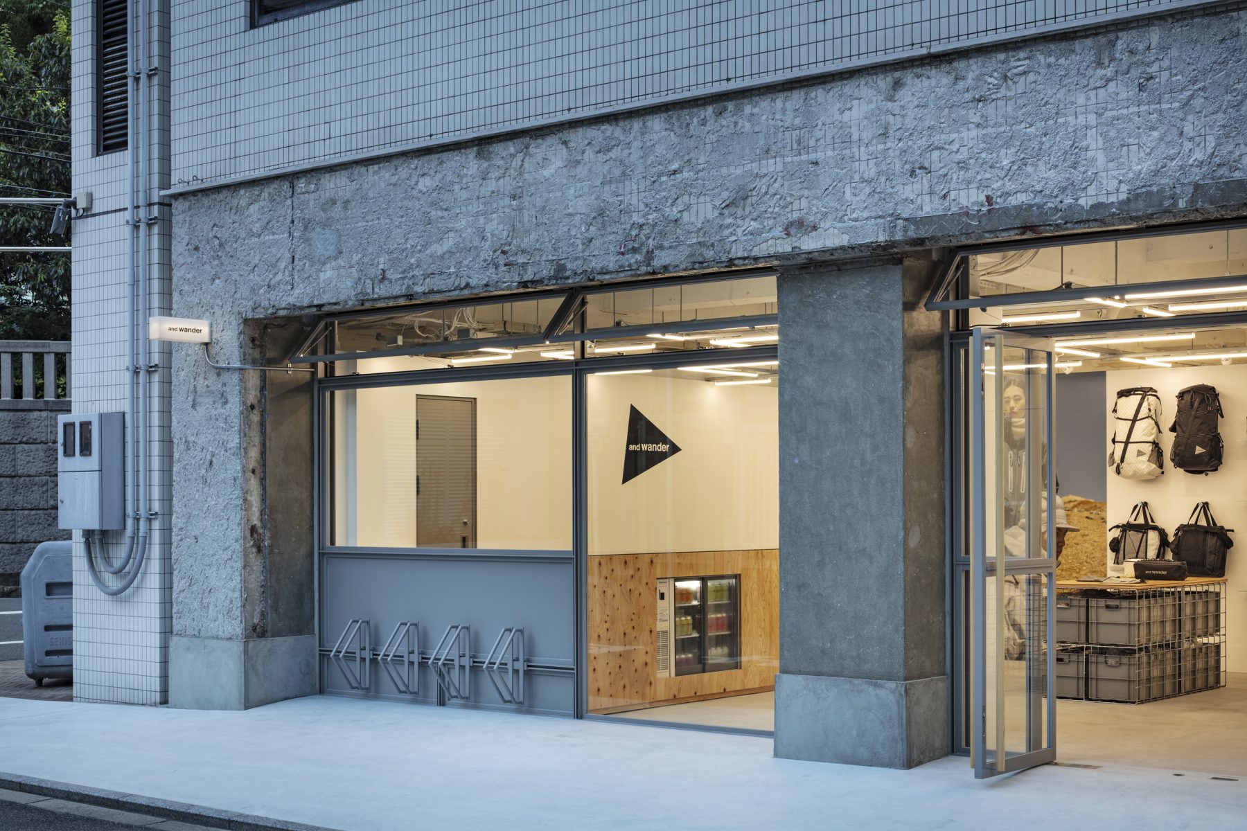
This time, we explored a new type of store at the and wander MINAMI SEMBA store that would serve as a third place and a part of the community, not as a place where you just buy things. In addition, since the site is on the street level and many people live in the city center near their workplace, as is characteristic of Osaka, we wanted this store to become a hub for the community.
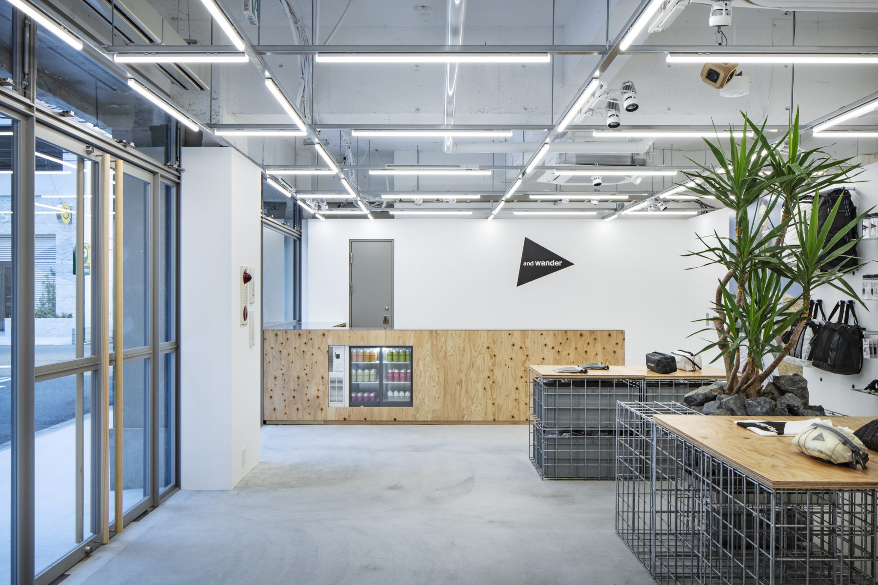
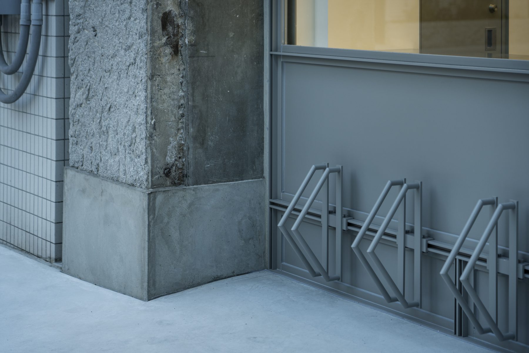
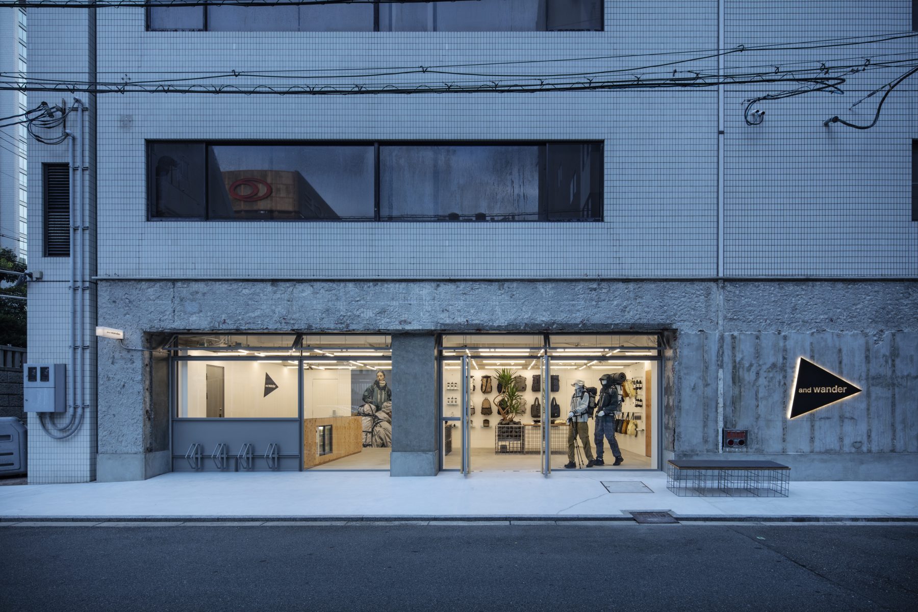
We considered the fact that, unlike Tokyo, Osaka is a city with few hills and its streets are laid out in a grid pattern, making it convenient to move around by bicycle, and installed a bicycle parking area integrated with the window sashes to facilitate urban circulation. Usually, window sashes tend to create boundaries. However, here, we use a flip-up window that conveys a lively feeling to the outside and double swing doors that welcome people in to liven up the area and draw people inside.
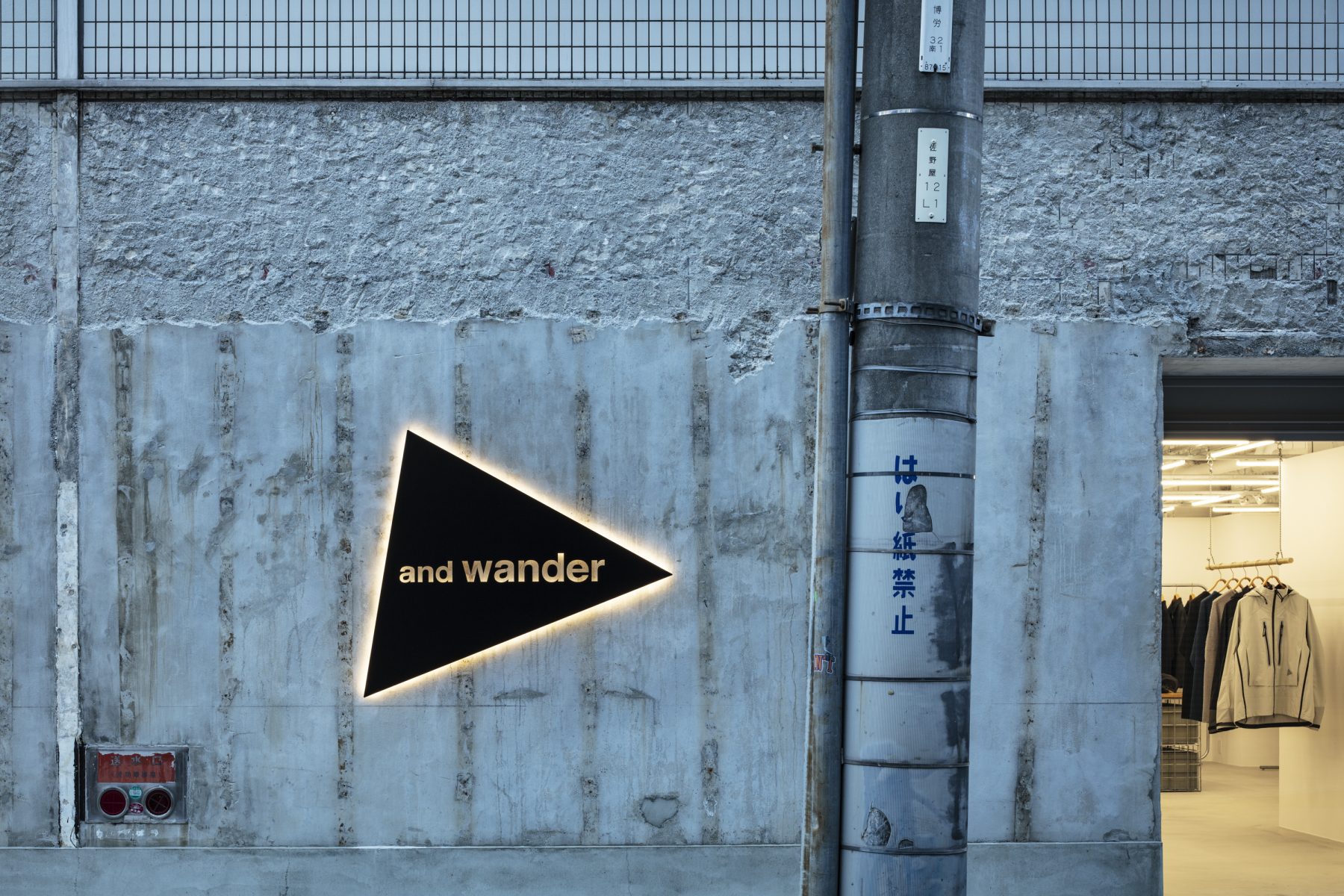
Since it was a street-level store, we also designed the facade. First, we stripped off the finishes left by the previous tenant. Then, we applied the minimum necessary treatments while embracing the scrape marks on the tiles and the mortar applied over them to create a dry and rough appearance that complements the products inside instead of using tiles with smooth and slick textures.
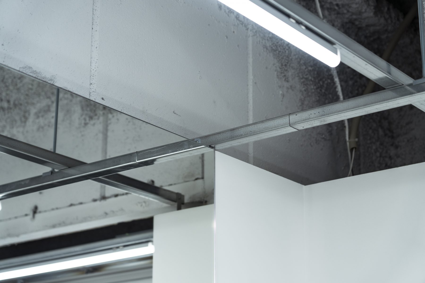
We also used mirrors as an architectural finish rather than as furniture, in contrast to the other and wander stores we designed previously. The mirrors arranged in a grid naturally create a sense of continuity, revealing a space with more openness and depth than before.
This street-level store invites customers to enjoy visual and physical experiences of and wander in Minami Semba.
(Koh Seki)
Title: and wander MINAMISEMBA
Design: Jo Nagasaka / Schemata Architects
Project Lead: Koh Seki
Location: 1F, Shigematsu Building, 4-2-7 Bakuromachi, Chuo-ku, Osaka, 541-0059 Japan
Primary Use: Retail
Construction: Bauhaus Maruei Co., Ltd.
Landscaping: Qusamura
Lighting: GLORY
Floors: 1st Floor
Floor Area: 143.1 m²
Structure: Reinforced Concrete (RC), Steel (S), Mixed Structure
Completion: August 2024
Photography: Kenta Hasegawa