
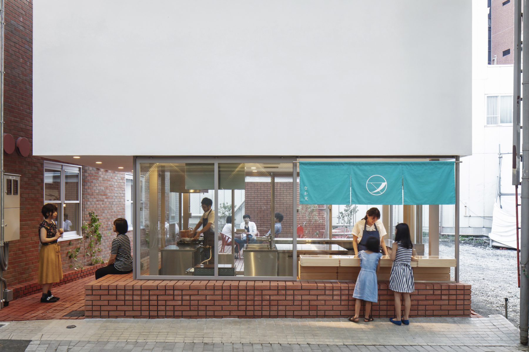
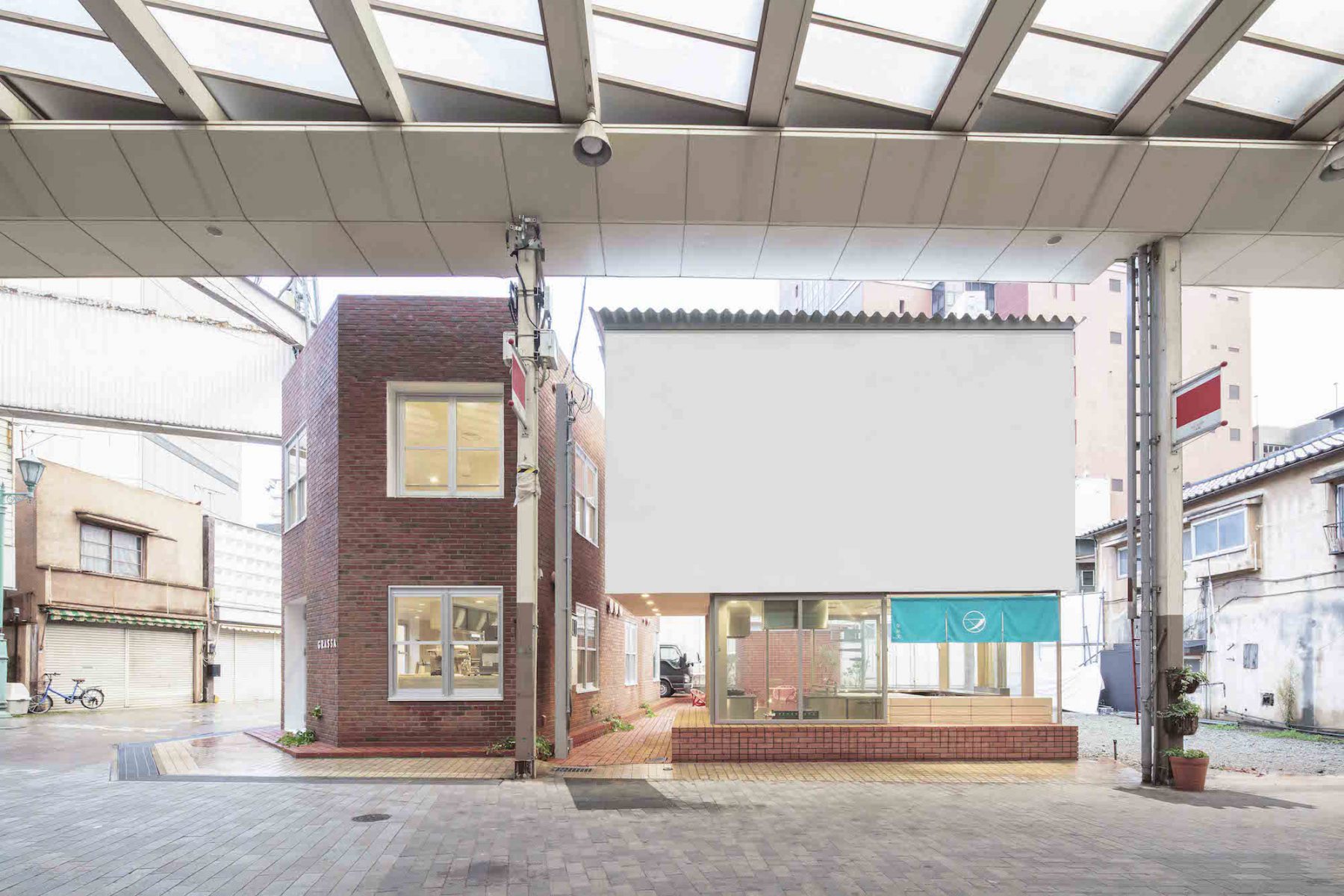
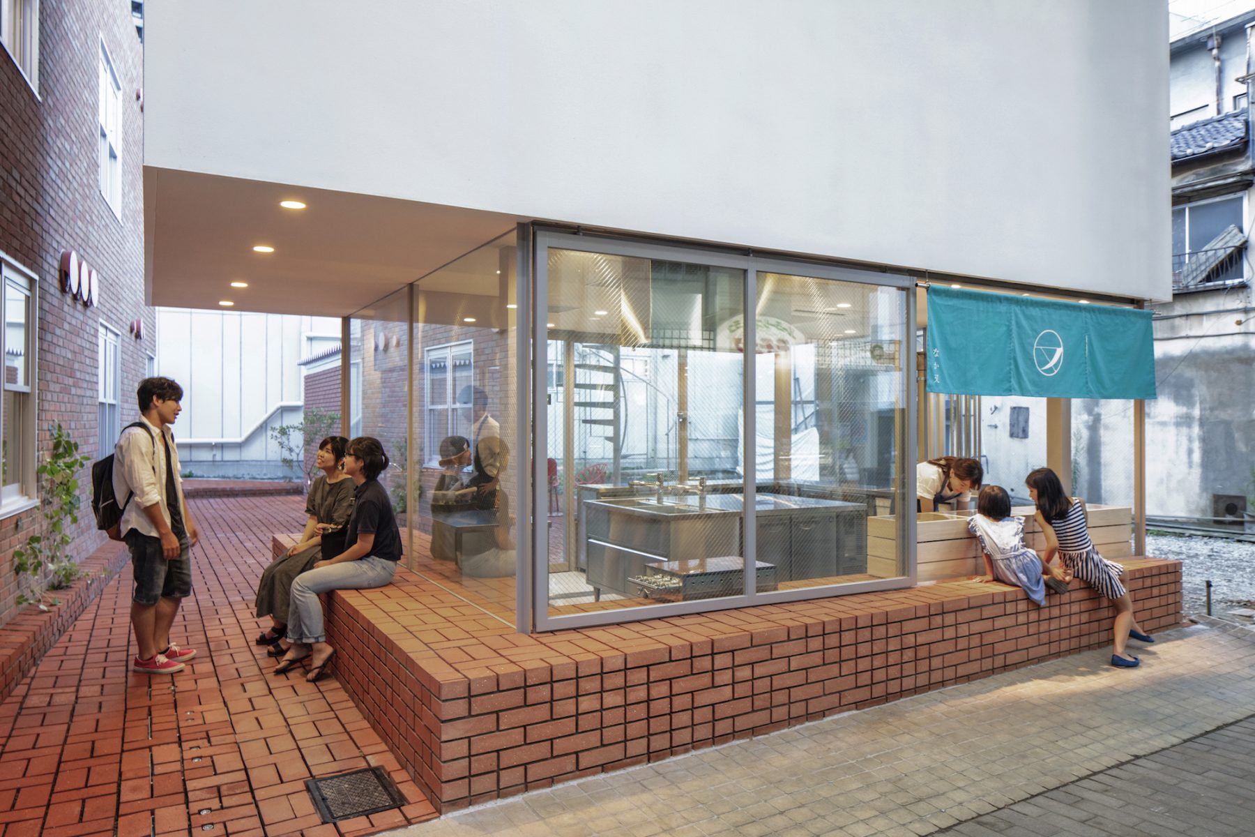
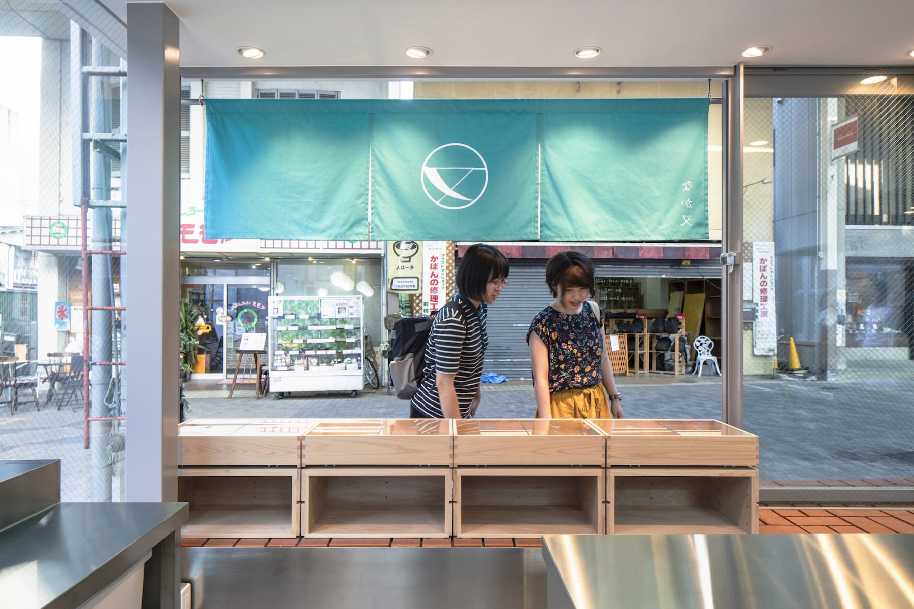
 We designed a newly opened Japanese confectionary store “Nakamata” along the Chuo-dori shopping street in Maebashi, Gunma Prefecture. Originally, a two-story shoe store and residence fully occupied this site. The building, flanked by buildings on both sides and sandwiched between the arcade and pavement at the top and bottom, had only one facade visible to the street and one could perceive the depth of the building only in the interior.
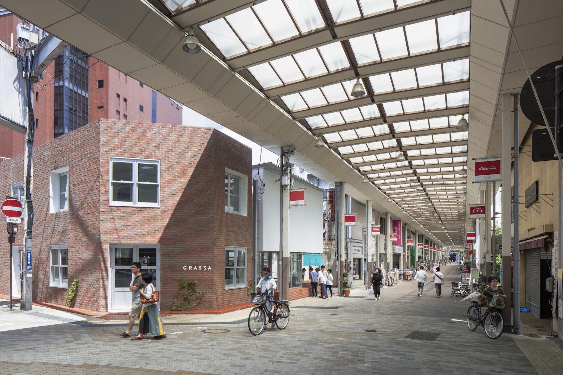
We demolished the existing buildings to build a new store. The building on the left is a pasta restaurant designed by architect Ryuji Nakamura, and a new tonkatsu (Japanese pork cutlet) restaurant designed by architect Fumiko Takahama will be built on the right soon.
This shopping street, like other shopping streets in regional cities throughout Japan, was facing the danger of becoming a “shutter street” where most storefronts are closed for business. There are few passers-by even during the day and vacant lots are spotted here and there. Driven by a strong desire to stop the decline of the shopping street, entrepreneur Jin Tanaka, who was born in Maebashi, facilitated the establishment of “Maebashi Machinaka Agency”, an organization promoting networking of people and things in Maebashi, and several projects, including the Nakamata project we worked on, were launched at the same time. However, the “shutter-street” issue is very serious and “shuttered” stores seem to be still increasing two years after the project started.
Because a Japanese confectionary store does not need an eating area for customers, the required floor area of the store was very small in proportion to the site area, which means we have a large excess volume on the site. The key to designing this project would be how to use the “excess volume” in order to give back to the city.
Considering the future of this city, it is not realistic to look back to the past and try to restore a lively and bustling atmosphere on this shopping street–– like the streetscapes during the economic miracle in the Showa period of Japan as shown in the movie “Always: Sunset on Third Street”––in our depopulating society. We needed to come up with a new “shopping street-scape” for the coming era. For a start, we went to observe a suburban shopping mall attracting many customers ––one of the major causes of the decline of shopping streets––and speculated what kind of customer discontent might arise there in near future.
A shopping mall is equivalent to the internet world where “expected” things exist in an “easy-to-understand” way. Such a “prescribed” way of shopping at a shopping mall has and an advantage of offering customers opportunities to see and try actual products they want, but the internet shopping is superior in terms of the amount of stocks, speed, and wide range of distribution area. In addition, the automobile society is going through drastic changes. The automobile navigation system can take you anywhere and it is easy to spot a place to park a car due to increasing vacant lots in the city. Today each internet user can re-edit his/her experiences by re-editing information on the interface, which means that the actual experience at a shopping mall may not be so advantageous. I thought that this small building would be able to show a way to welcome people unsatisfied with such “prescribed” experiences and offer unique experiences in the city––even if it may sound too grand for a small store––and we explored the best way as we designed.
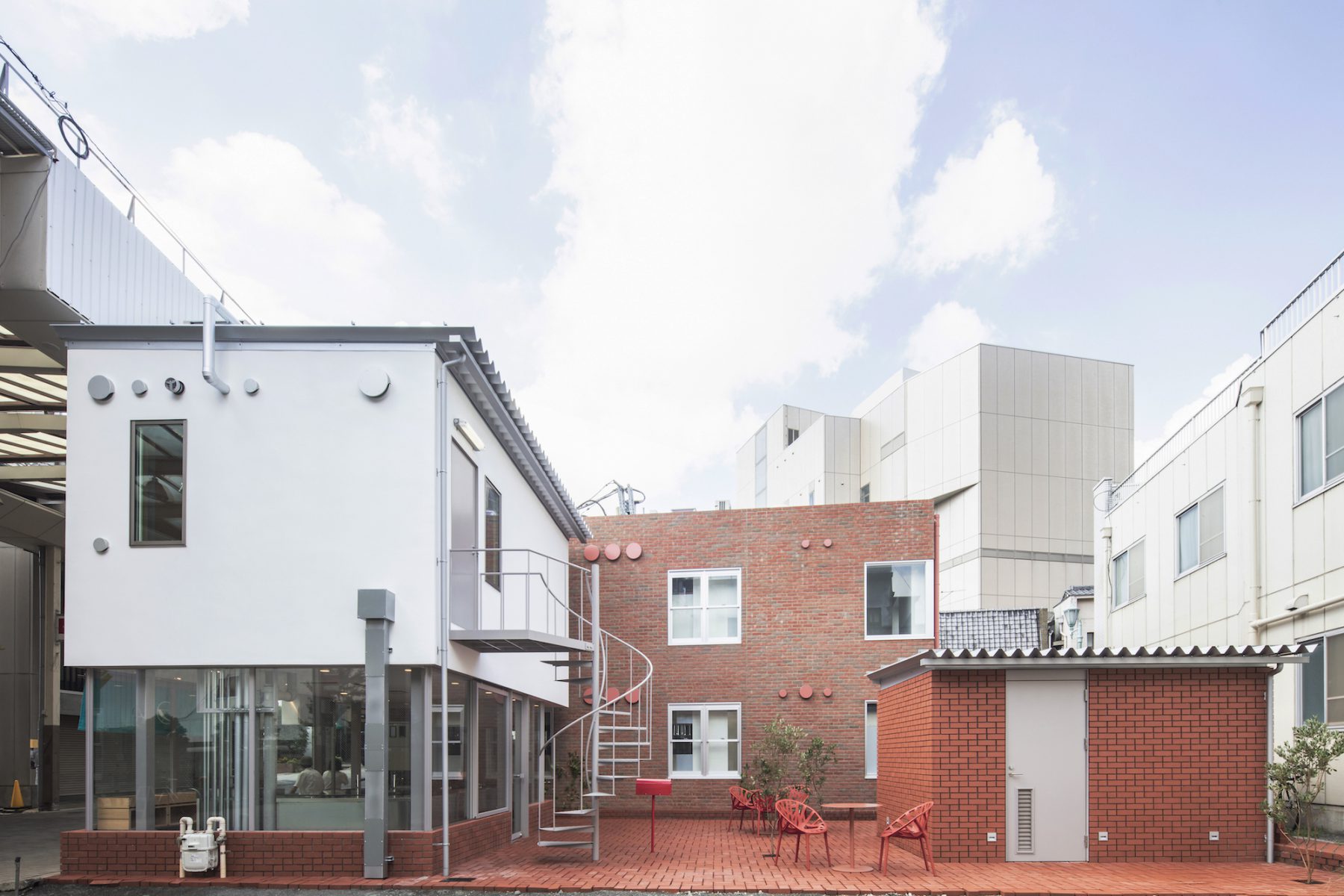
Different historic layers exist parallel to the shopping street, and we created a path extending perpendicular to these layers to add a sense of depth in the city and enhance customers’ expectations by increasing the surface area of the building. In other words, we decided to use the “reduced” building volume to create the spatial depth. Our challenge of designing a “reduction” on this site shows potential of a vacant lot along the shopping street and may give hope to those who are interested in opening small stores here.
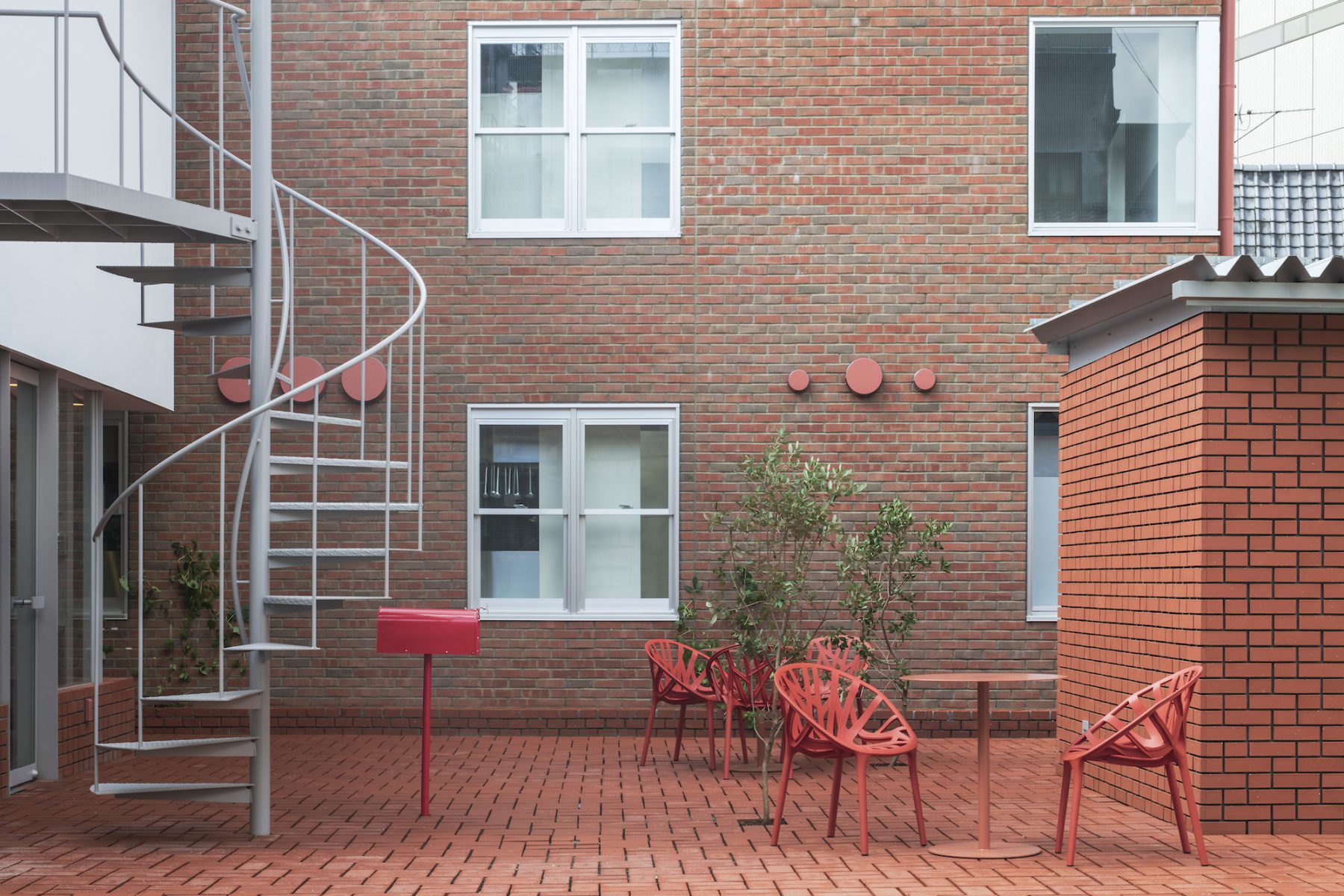
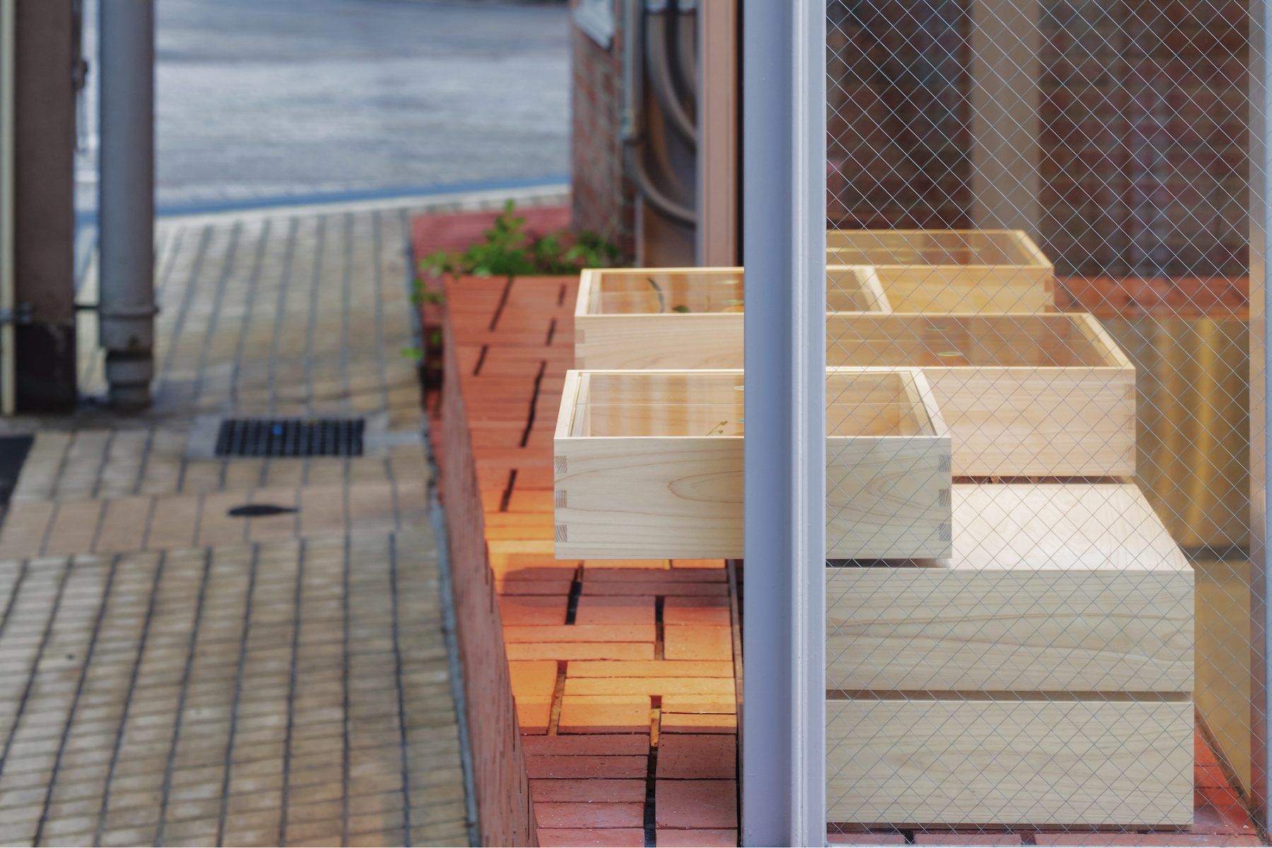
The design code established by Maebashi Machinaka Agency required the use of bricks on the building exterior. The interesting part of this project was that we were able to design while checking the progress of the projects on both sides. We imagined how they would stack bricks on both sides and studied how to stack our bricks in various patterns––making a large stack like them, dividing it in two, and reducing each volume––in relation to the neighboring buildings, while paying attention to enhancing “void” spaces between the brick stacks. This project was about designing a new store, yet we could say it was also about designing “reduction” on the shopping street. While this building comprises part of a visual sequence of the shopping street, it creates spatial depth perpendicular to the street not only in the interior and but also the exterior. We intended to create a place enhancing customers’ expectations by expanding the shopping street three dimensionally.
Another design code requirement is to plant trees on the site. We planted three small trees in the “void” space and designed in such a way that bricks around the trees will be removed along with the growth of each tree and the soil area will gradually increase. Considering such unique details, we did not fill in brick joints with mortar and left them as deep grooves to emphasize the solidity of bricks and highlight the contrast between light and shadow. We used this joint detail not only on the floor but also on vertical stacks to create a distinct brick appearance.
Data
Title: Nakamata (Maebashi Design Project)
Architect: Jo Nagasaka / Schemata Architects
Project team: Takuya Sakamoto
Structural engineer: TECTONICA INC.
Location: 2-7-21 Chiyoda-machi Maebashi-shi Gunma Japan
Usage: Japanese confectionary store
Construction: Miyashita Kogyo
Collaboration:
Maebashi Machinaka Agency (coordinate)
HOSHIZAKI TOKYO CO.,LTD (kitchen)
SOLSO (plant)
neufurniture works (furniture)
Floors: 2 stories
Site area: 108.32m2
Building area: 33.82m2
Total floor area: 51.82m2 (1st floor 27.50m2/2nd floor 24.32m2)
Structure: steel
Completion: 7/2018
Open: 8/2018
Photo: Shinya Kigure