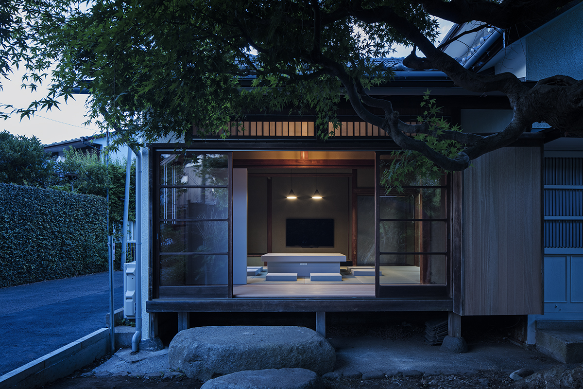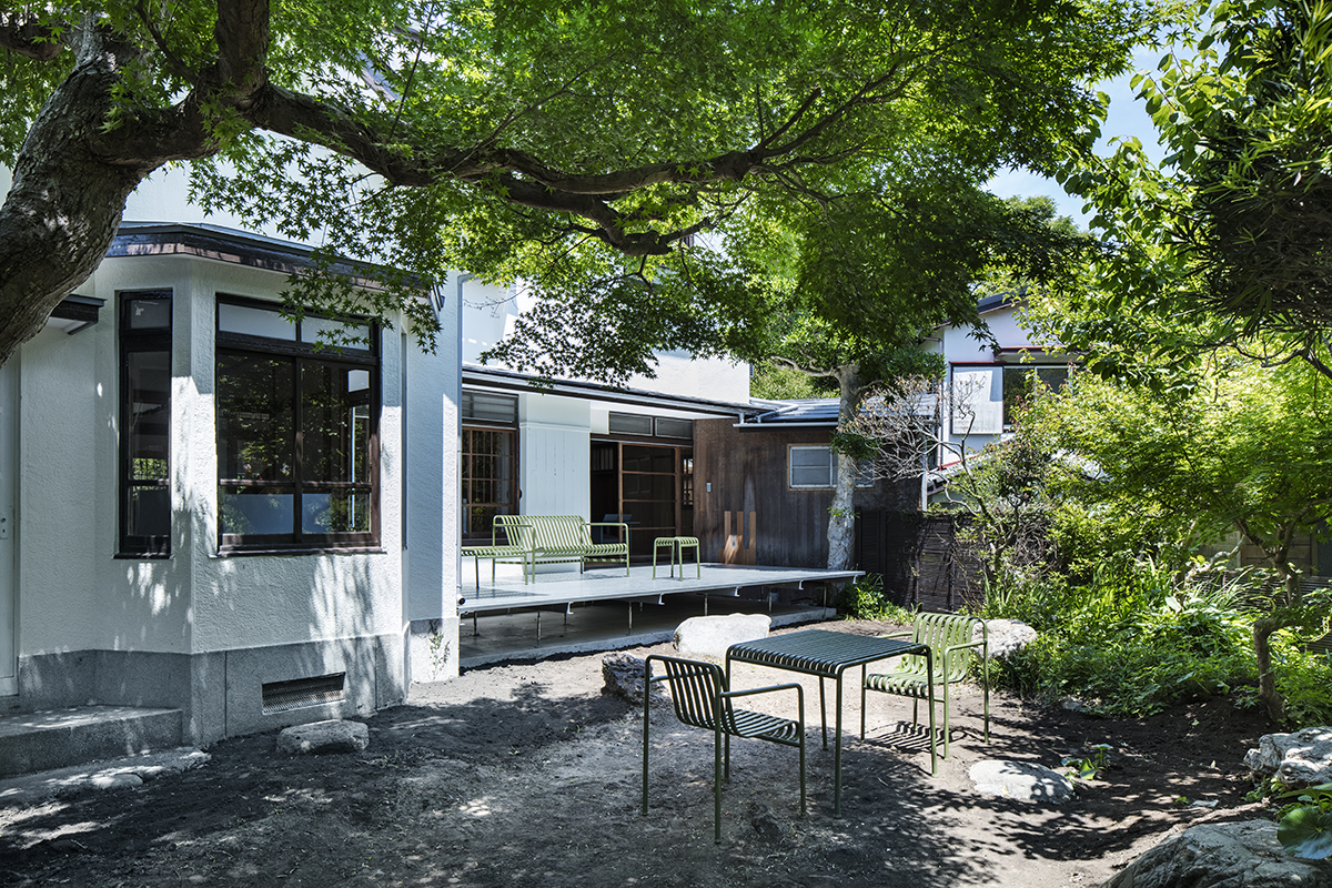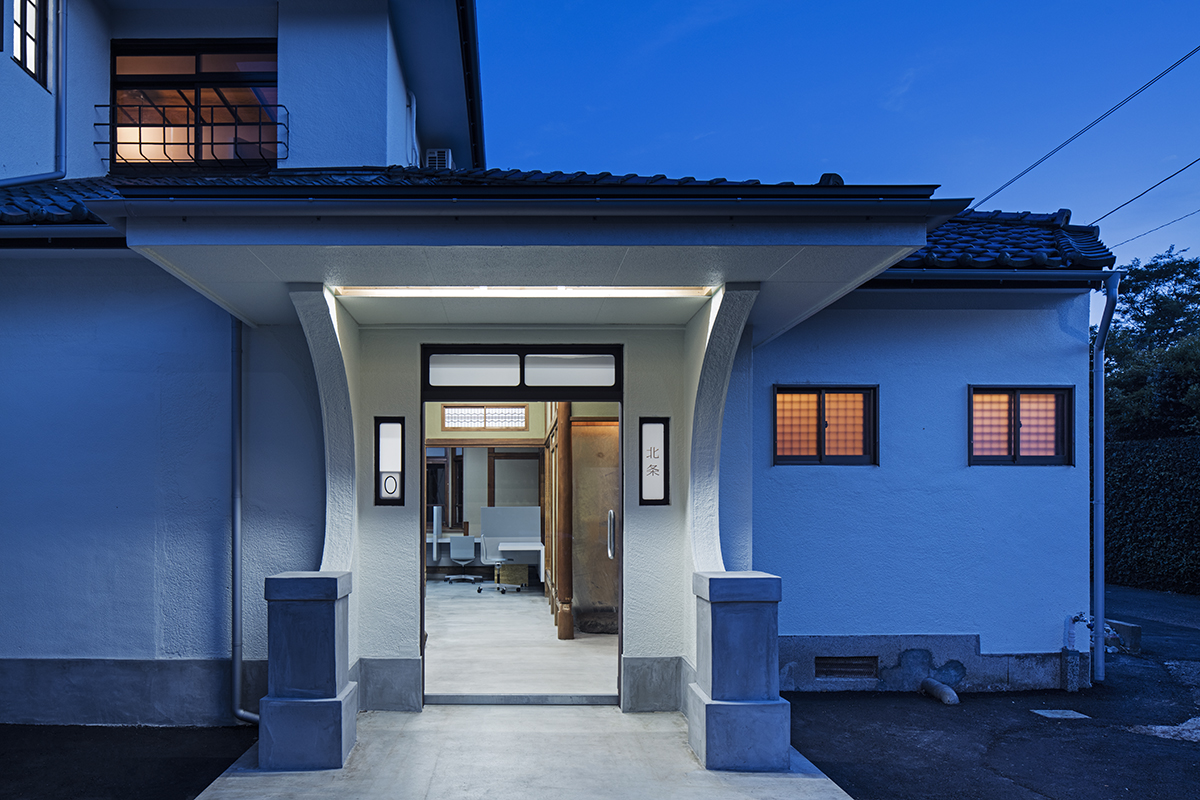
This traditional Japanese house is located in a quiet residential district among lush greenery in Kamakura. We were commissioned to renovate it into a residence and office.
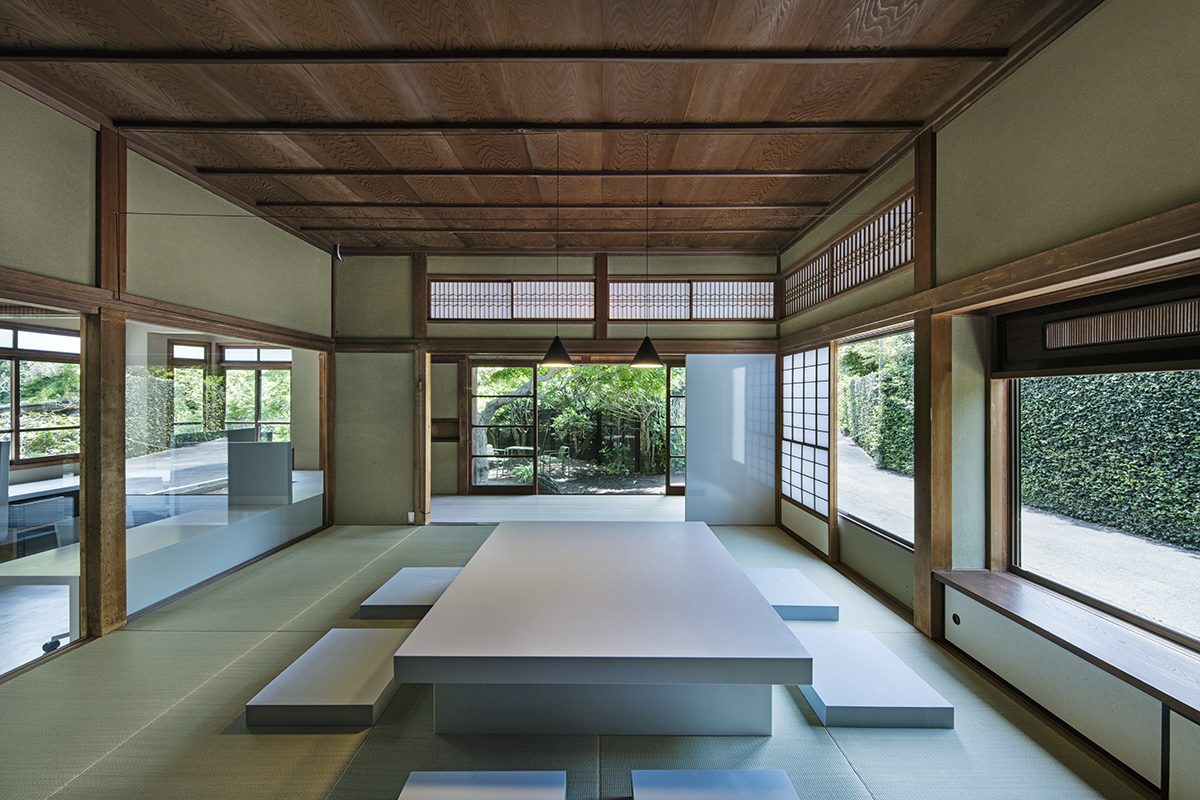
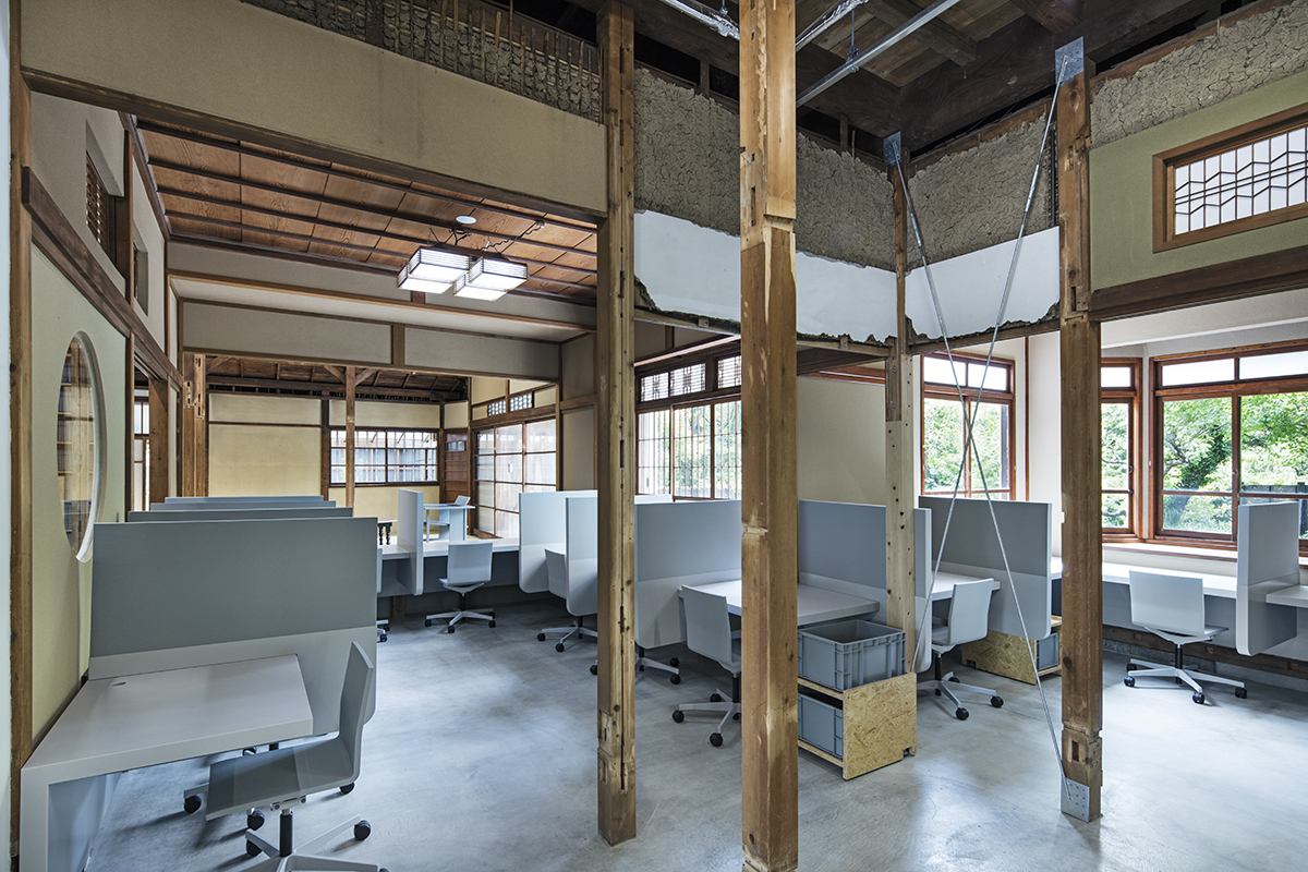
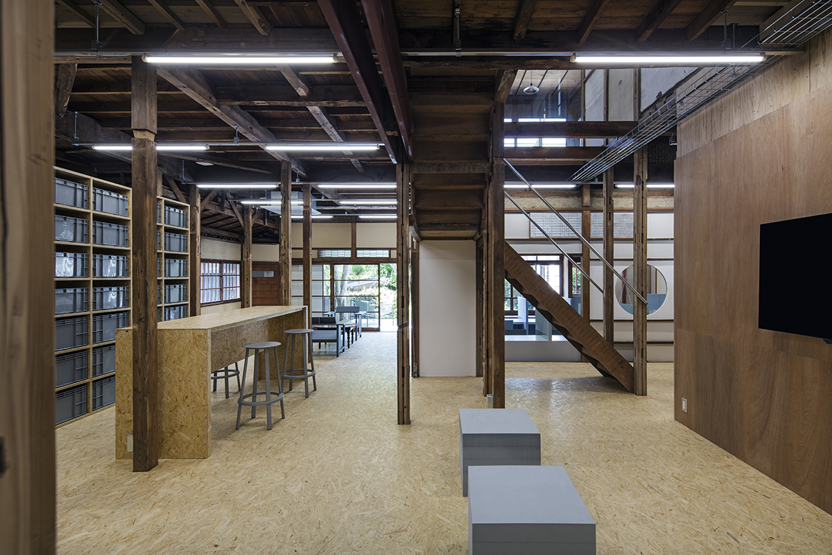
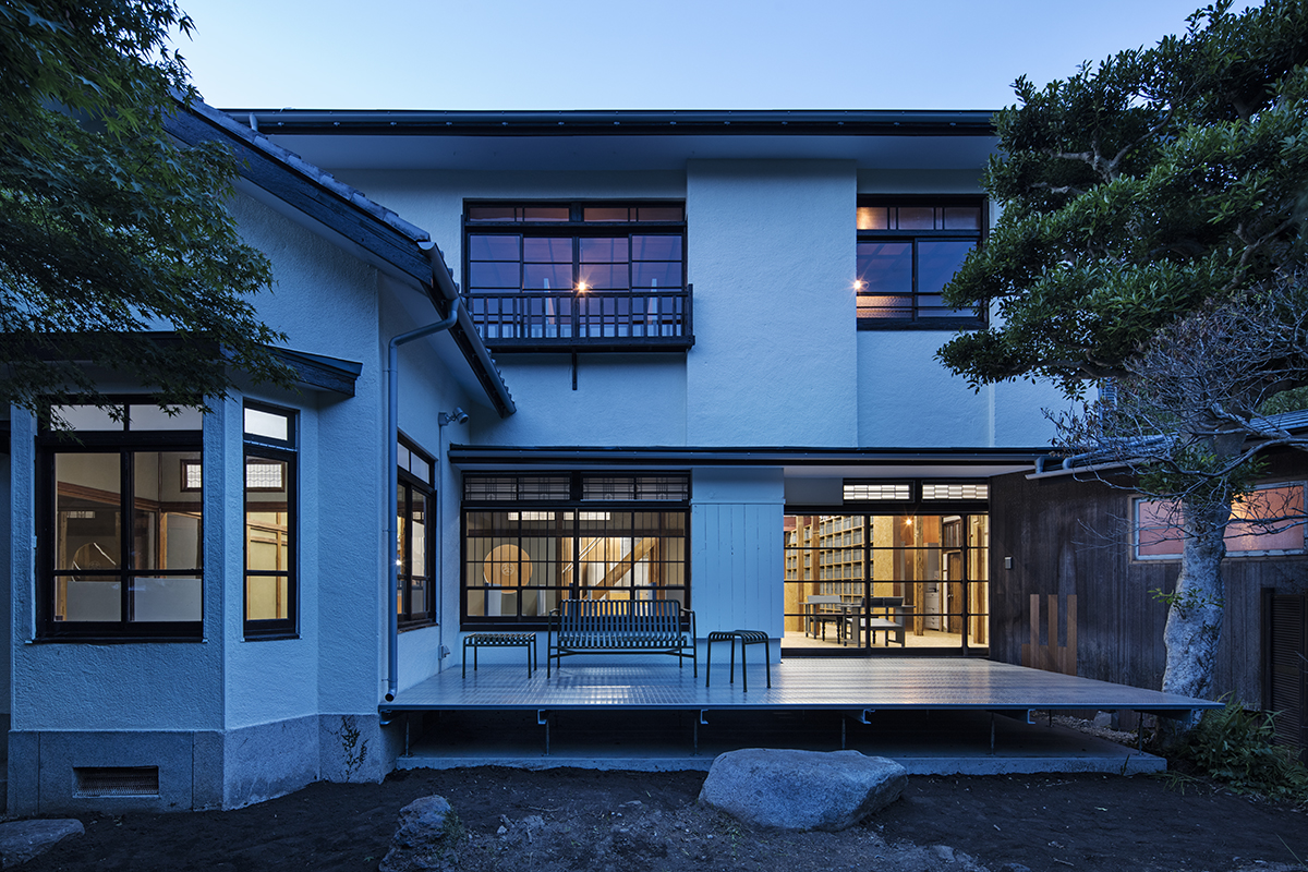
There is a beautiful garden at the site, covered with lush greenery extending from surrounding nature. The building is a typical traditional Japanese house where all rooms face outside and the interior turns into a single open space by removing all fusuma (wood-framed paper sliding doors) dividing the rooms. The floor is raised above the ground by 60cm and mostly finished with tatami (straw mats). The existing wall and ceiling finishes of the 80-year-old house had distinct beauty that had evolved over a long period of time. I expected that we would be able to create enhance such beauty by keeping the existing finishes as they are while partially exposing the substructure by removing them in some parts. When we observed these things, we decided to focus on floor heights and finishes and treat them as means to express different spatial characters and define spatial/functional zones.
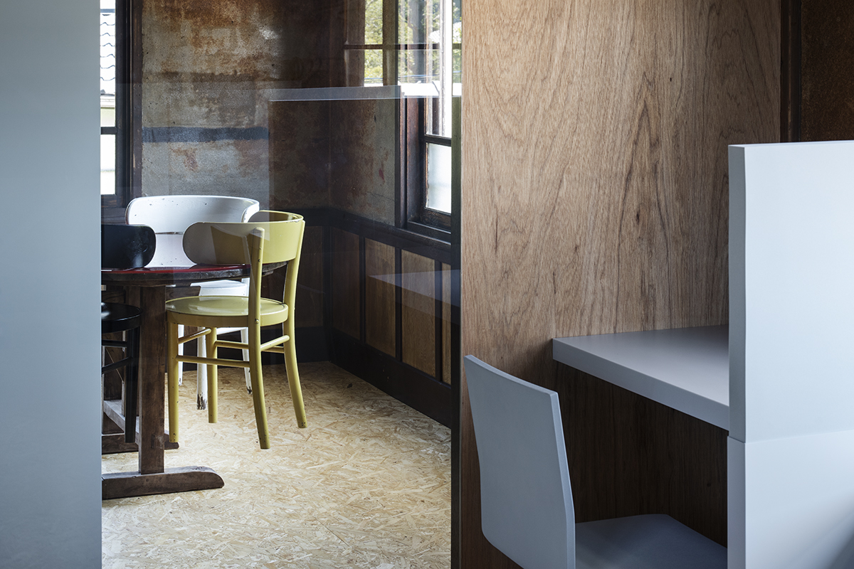
Firstly, we set a tatami floor area raised 40cm above the earth floor at the entrance as a reference plane and determined the height, dimension and finish of respective floors in other areas. Each room was distinguished from others by different characteristics of furniture placed there. The floor height differences create a vibrant feeling as well as different viewpoints, allowing one to constantly feel nature and creative energy at any place and anytime in this space. There is an authentic Japanese-style room with an engawa (an edging strip or a kind of veranda along the outer perimeter of a house) directly connected to the garden on the west side and a common space with wooden floors set at different heights and equipped with a kitchen unit on the northeast side. A characteristic earth-floored space, surrounded by gray-colored desks, extends from the entrance to the center of the house while loosely dividing and connecting the two spaces with different characters on both sides at the same time.
As stated above, we aimed to renew the existing space by carefully modifying the floors and conceived spaces with diverse characters as a result. Gray-colored furniture pieces are inserted in some places to moderate excessive spatial diversity.
Repetitious contrasts between organic and inorganic elements create an integrated atmosphere in the house.
Data
Title: HOJO SANCI
Architect: Jo Nagasaka / Schemata Architects
Architecture team: Kohei Hayashi, Shun Sato
Furniture Team: Ou Ueno, Seiju Udodaira
Location: Kamakura-shi, Kanagawa, Japan
Usage: Residential with office
Construction: TANK
Collaboration:PARTY, &Co. (UX Planning)
Furniture collaboration: b Prize Corporation (Lacquer table), Shuhei Nakamura (Flat Table)
Number of stories: 2
Site area: 457.43m²
Total floor area: 267.54m²
1F: 198.74m²
2F: 68.8m²
Structure: wood
Date of completion: May 2018
Photographer: Kenta Hasegawa
