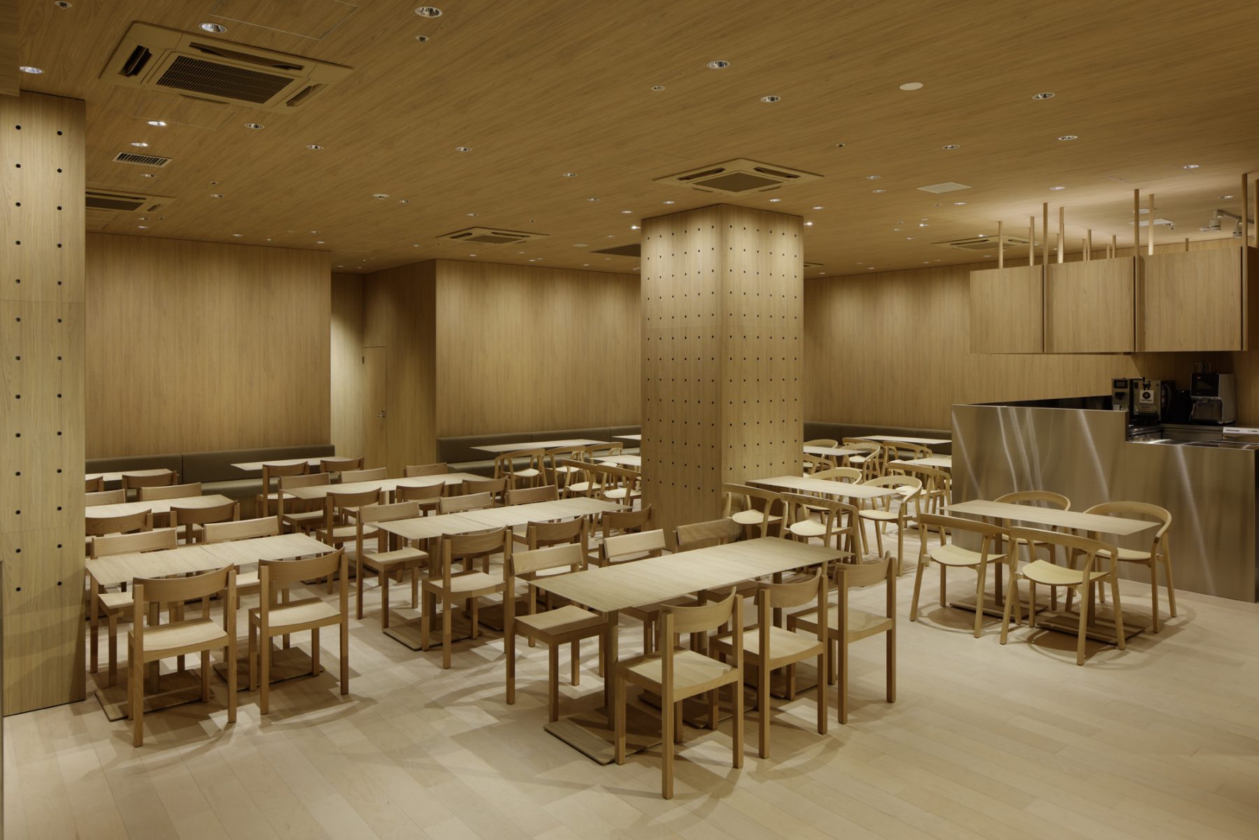
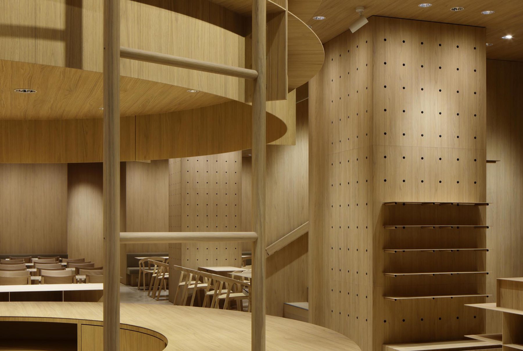
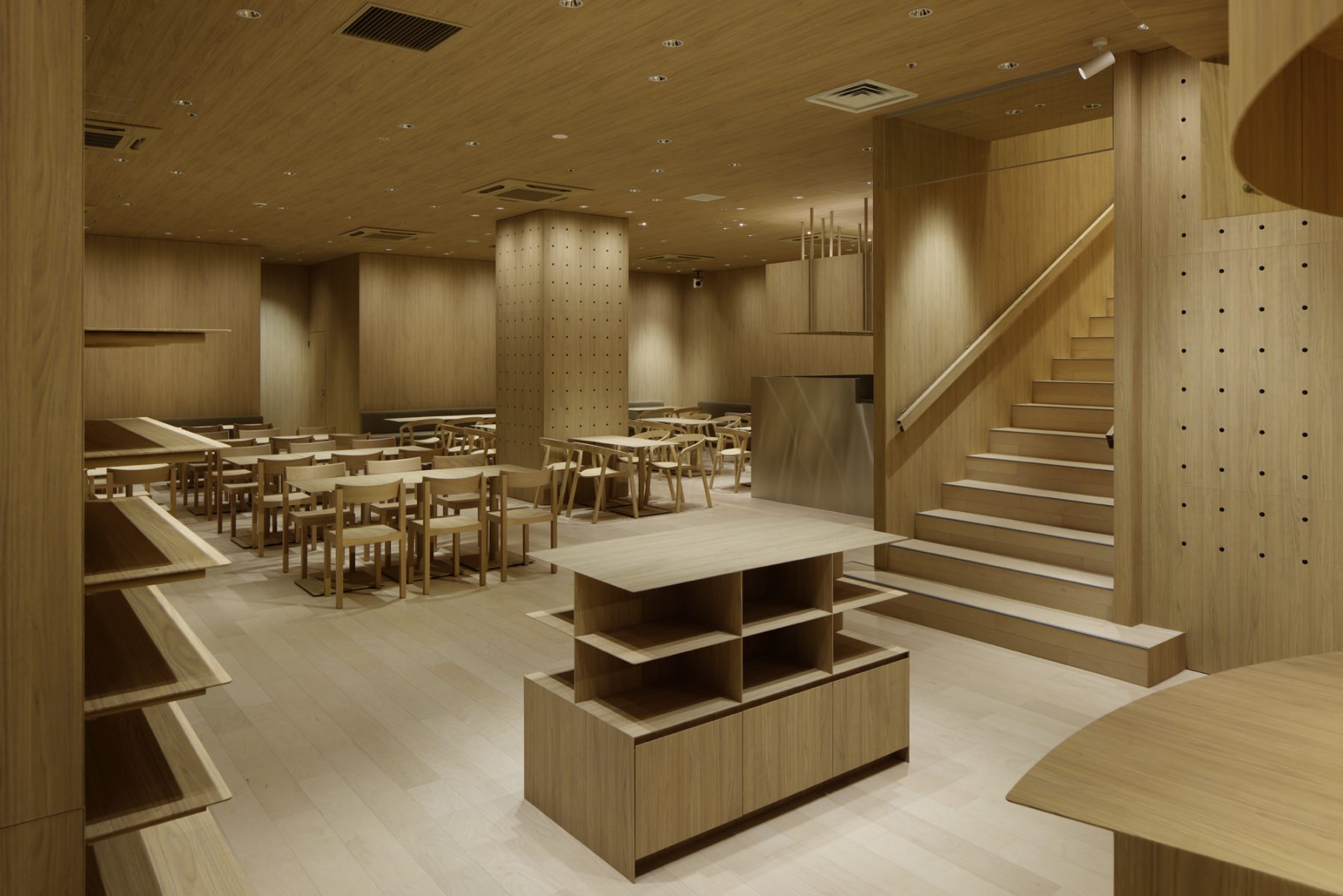
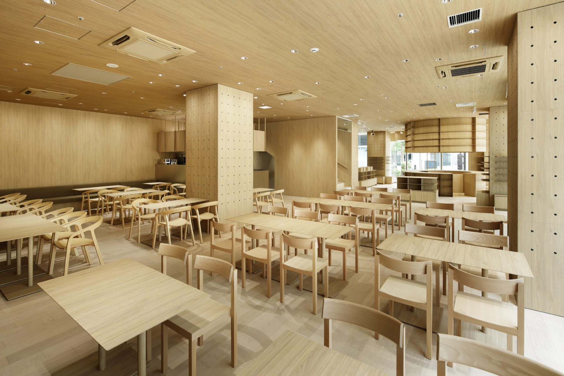
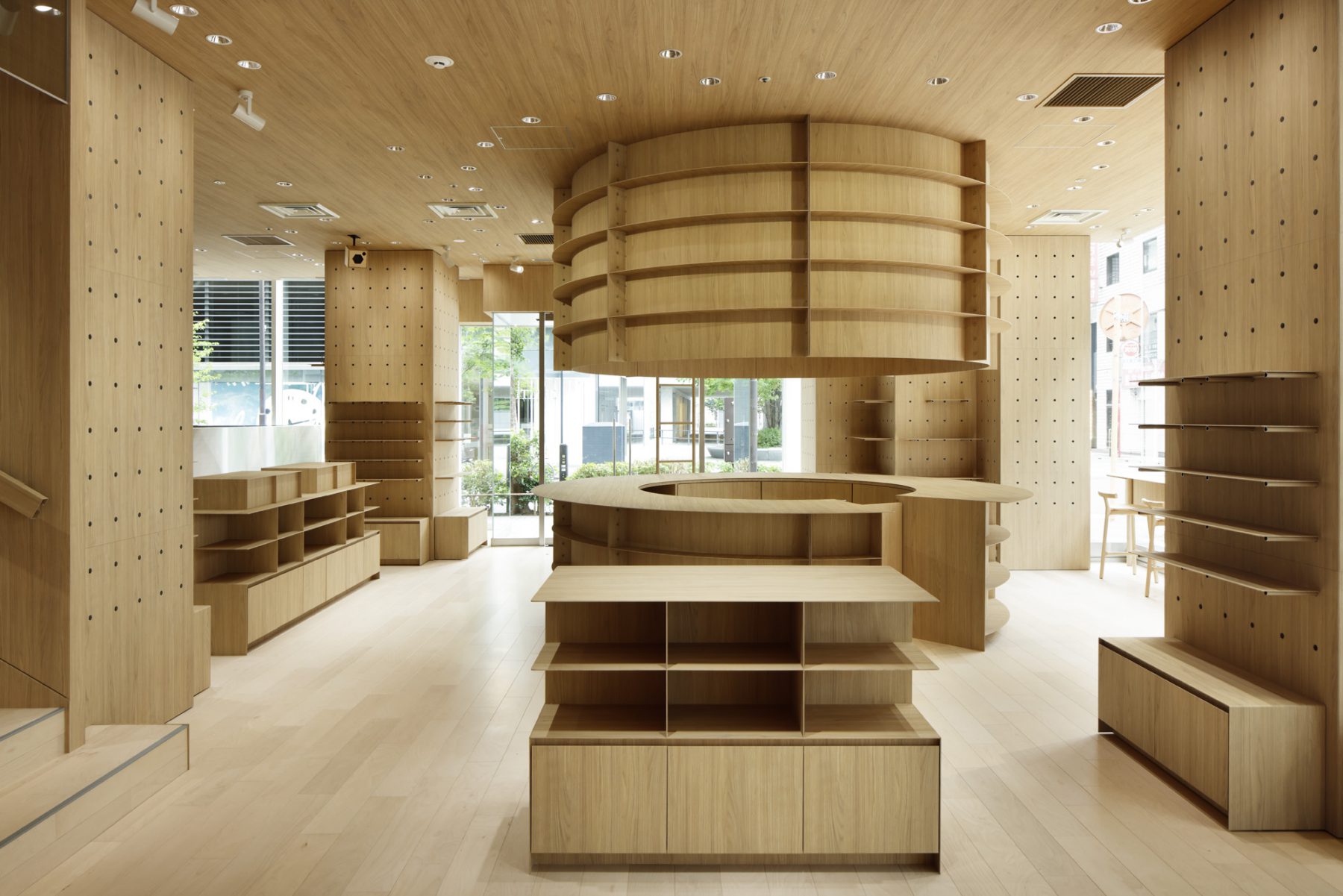
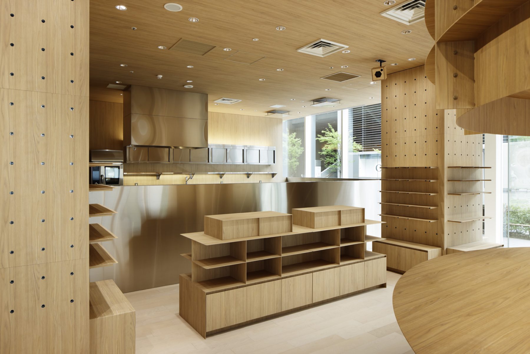
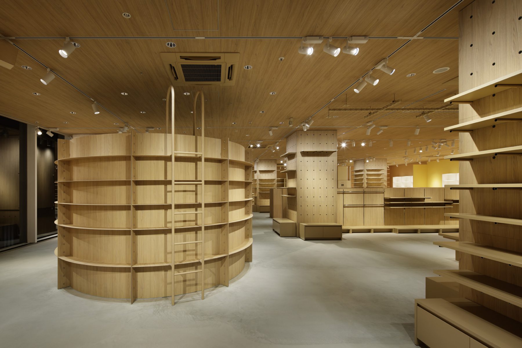
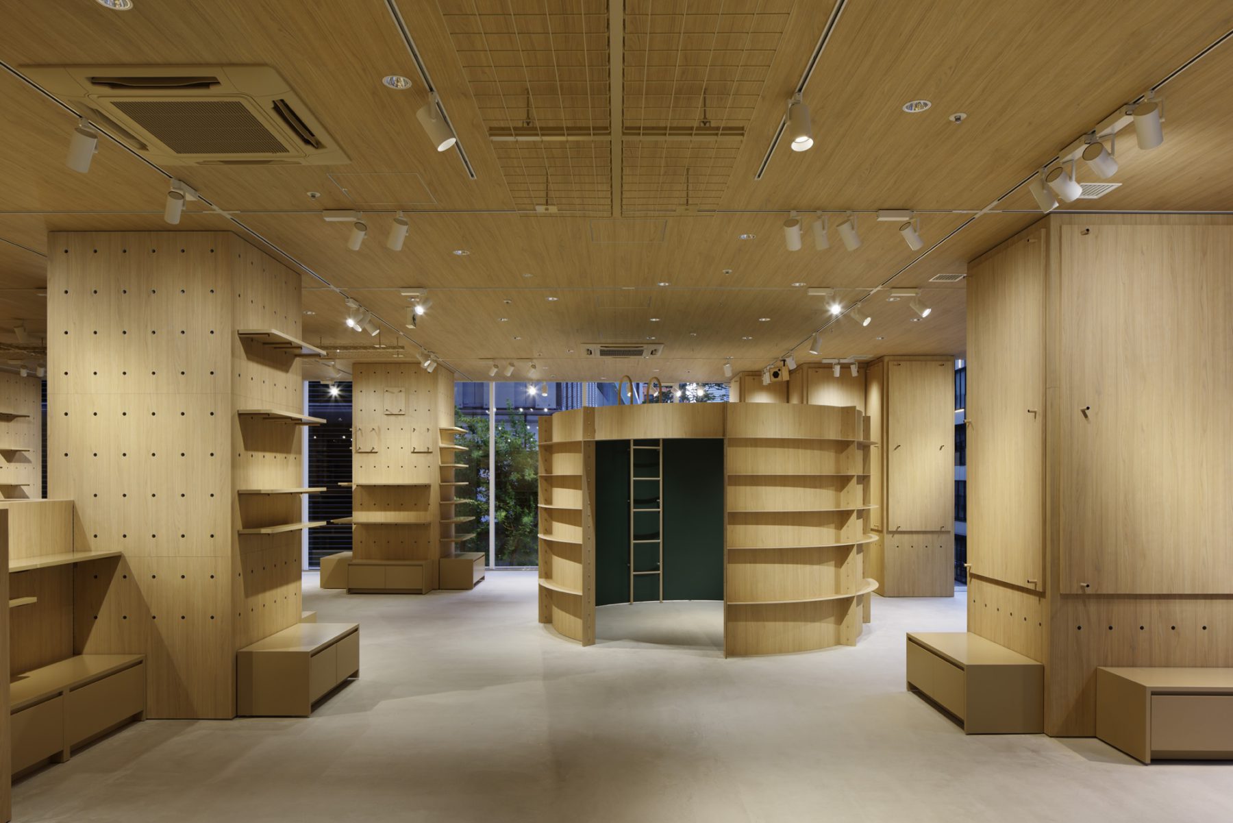
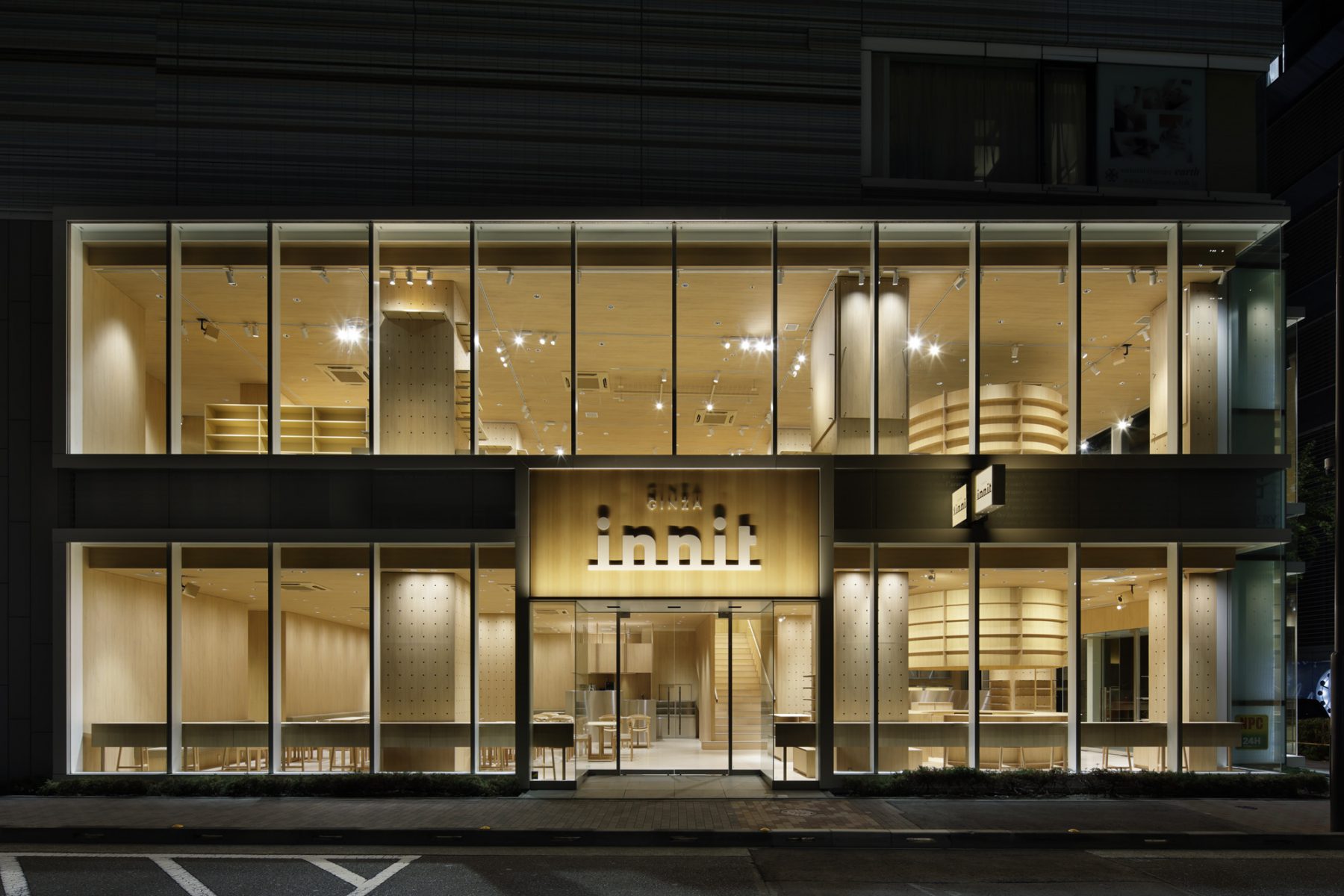
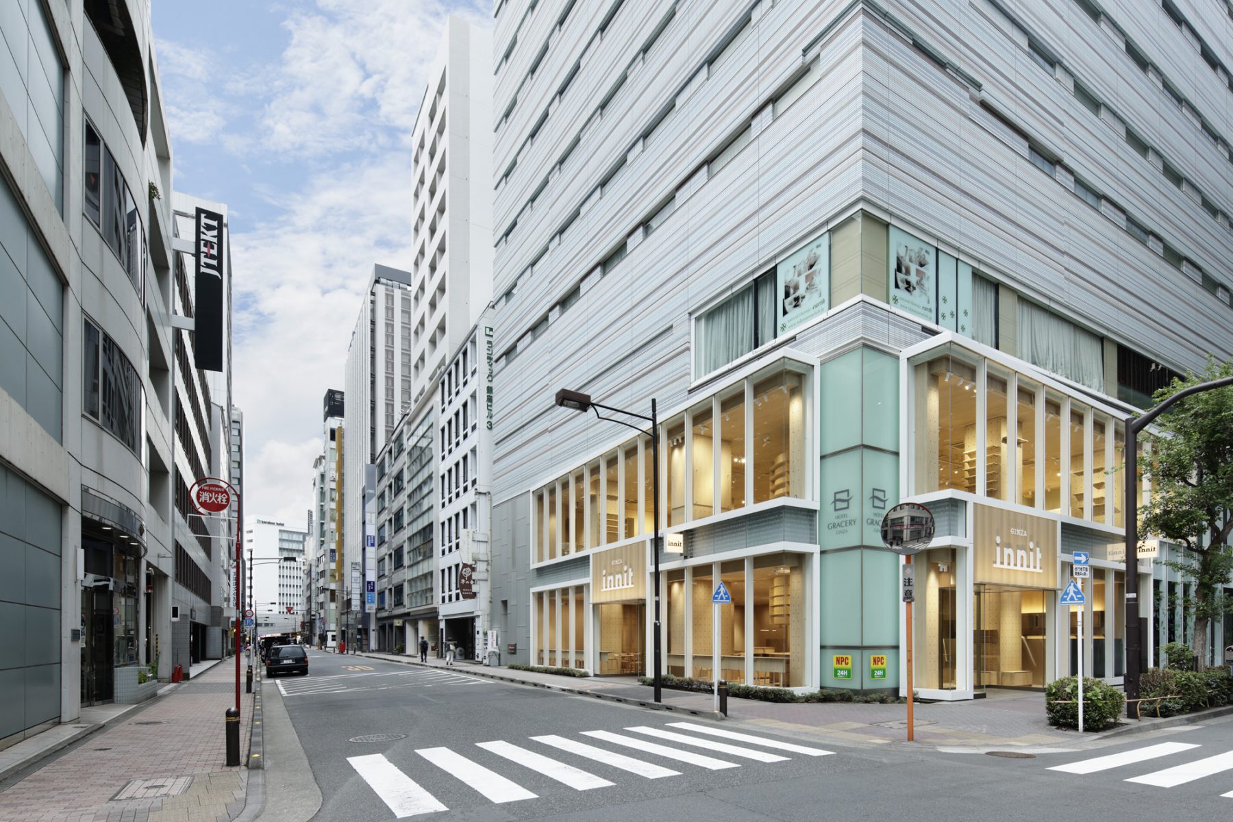
We designed a store that sells IZAMESHI, a “retort pouch food” (packaged ready-to-eat food) developed for emergency use, with a pay-per-use eating area where customers can taste an assortment of “IZAMESHI” from the store on the first floor, and outdoor goods on the second floor.
Retort pouch food refers to food packaged in pouches or tray-shaped containers that have been sterilized at high temperatures and pressures of 120℃ and 4 minutes or more inside a “retort” or autoclave. The consumption of retort pouch foods has increased significantly, because the product characteristics, such as being lightweight and easy to handle and open, quick to heat up, and easy disposal of containers, meet the needs of many consumers. They have become one of the basic foods in households in general. We understand that serving them in the restaurant might help increase the sales of the products, but the question was, would the restaurant make enough profit from it? We suppose it is a matter of whether they taste good or not. The success of the sister restaurant in Shinjuku, which is already bustling with customers, has already proven the quality of the taste. Given that the quality of taste is guaranteed, it would be an advantage to serve food that tastes the same no matter who prepares it. Come to think of it, we realized that many chain restaurants in the city actually serve ready-made “retort pouch” foods. We can say what this store is doing is fairly common, even if very few businesses are bold enough to reveal and sell the behind-the-scene secrets in such a brilliant way. And once the secrets are revealed, their good aspects become more and more apparent. The fact that they are emergency food guarantees long-lasting qualities and less of food loss. In addition, because the emergency food market has less competitors than other retort food markets, both the store and the restaurant are expected to achieve strong sales.
When I first heard about this project, I suddenly remembered my first meeting with Mr. Takeo Kikuchi about ten years ago, when we were commissioned to design the Takeo Kikuchi flagship store in Shibuya. Mr. Kikuchi said, “The Aesop Aoyama store is fantastic. I like the wooden shelves of different colors. You made them from the scrap wood from a demolished house, right? It’s such an interesting idea,” but then he continued, “But I also like the Daikanyama Tsutaya Books, because it is quite cozy for some strange reason. I suppose that those wood patterns – even though I know they are fake – have great effect on people, and make them feel relaxed. What do you think about this, Jo?”
I was taken aback by the question, which was totally unexpected, and gave a vague answer. Since then, I have often recalled his words, and now we had an opportunity to actually put into practice the effect of fake wood patterns in our work. We found a common thread between retort pouch food and DI-NOC films, both offering easy-to-use and instantaneous effects, and designed a store that made extensive use of DI-NOC films.
The site is located behind the Ginza Six building, just off Ginza Chuo-dori, and we felt the need to attract female customers especially in this fashionable location. Ginza, or perhaps most areas in Tokyo, are usually covered with grayish materials. In order to make the store stand out in such surroundings without changing the exterior appearance, we felt the need to use warm colors in the interior. Since the use of wood finishes in the interior was not permitted due to the restriction on interior finishes, we decided to use DI-NOC films. While they are chemical materials, considering the energy required for transportation and the final dismantling and disposal, the resulting carbon footprint would be less than that of natural wood. This project aimed to explore such realistic aspects.
In terms of design, we explored ways of expressing wood patterns that are only possible with DI-NOC films, not with natural wood. The design features wide wall surfaces with wood patterns, countertops and shelves with pale wood patterns throughout.
Data
Title:GINZA innit
Architects:Jo Nagasaka / Schemata Architects
Project team:Yui Matsushita, Raheon Min
Furniture team:Sanako Osawa
Address:7-10-1 Ginza, Chuo-ku, Tokyo, 1F,2F
Usage:restaurant, shop
Construction:TANK
Collaboration:
HOSHIZAKI, Ltd(kitchen)
WHITE LIGHT,Ltd(sound plan)
Hisaki Kato Lighting & Design Inc.(lighting plan)
Bob Foundation(Sign)
Katsuya Kubokawa(Styling)
Hisashi Ikai(Project management)
Total floor area: 684.03m²
1F area: 291.80㎡
2F area: 392.23㎡
Completion:7/2021
Open:9/2021
Photo:Masato Kawano (Nacasa & Partners Inc.)
Press data download
