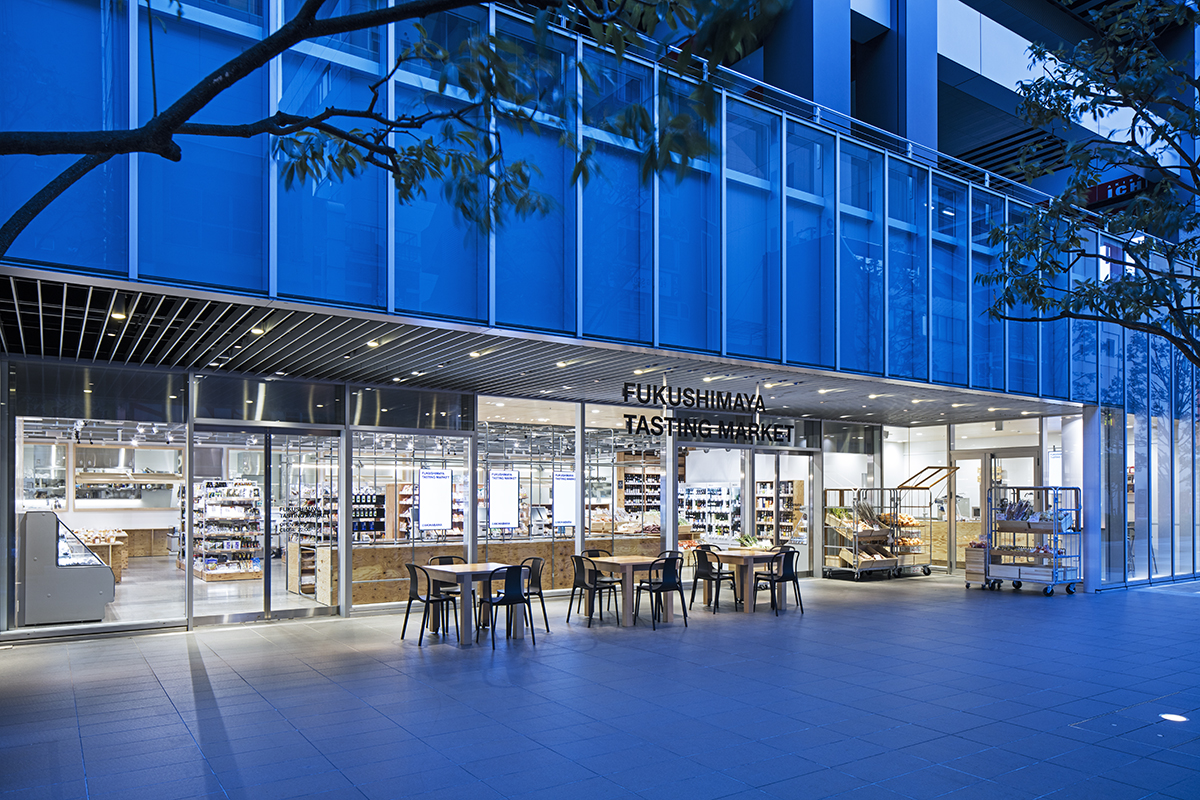
I probably wouldn’t have thought that supermarkets would need to be “designed” ten years ago. I used to think that supermarkets would make efforts to sell as many kinds of commodities as possible, and the commodities are laid out in the most efficient way so that customers can quickly finish shopping; and they would do their best to sell them at the cheapest possible prices and display price tags in the most visible ways possible – in my view, that was what supermarkets were about and there was no room for design intervention.
These days, however, it seems that supermarkets are changing. Consumers are growing more aware of qualities of commodities, and want to buy better and smarter; and more supermarkets strive to provide better commodities to meet their needs. They are starting to understand the necessity of design in order to communicate good qualities of their commodities to customers and provide more enjoyable shopping experiences.
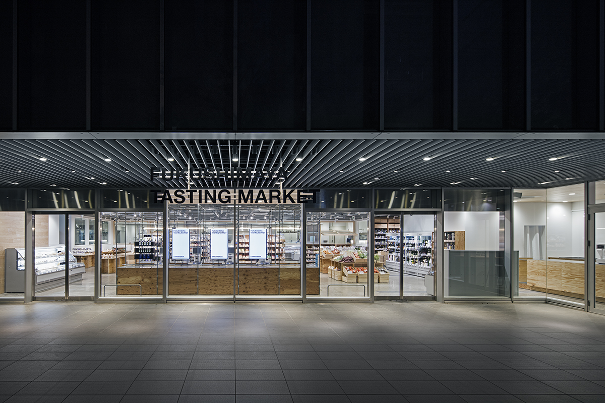
The headquarter of Fukushimaya is located near Hamura station along Ome Line, a suburban town at a1.5 hour-train ride from the center of Tokyo, where their first store opened there more than 30 years ago. Based on the concept of “creating a well-balanced relationship between consumers, producers and retailers to achieve co-existence and co-prosperity”, their business has grown steadily in their own way and now Fukushimaya is supported by local residents as a reliable supermarket known for unique selection of good quality commodities such as organically-grown vegetables, pesticide-free and fertilizer-free vegetables and more. In recent years, consumers’ needs for supermarkets in the contemporary society have rapidly shifted towards the direction that Fukushimaya has been taking, and they were prompted to open Akihabara store, which is their third store in the center of Tokyo following the Roppongi store.
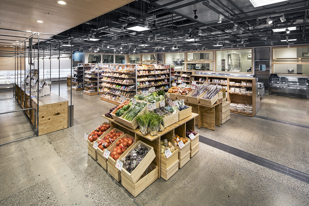
Seeing from another perspective, business conditions of supermarkets tend to fluctuate rapidly according to changes of seasons, weather and time of the day, and their commodity selection and layouts are constantly updated in sync with these changes. Such frequent changes generally attract more customers to the store. We strived to create such attractions with our design, although it was a new and challenging theme for us and our design developed through trial and error.
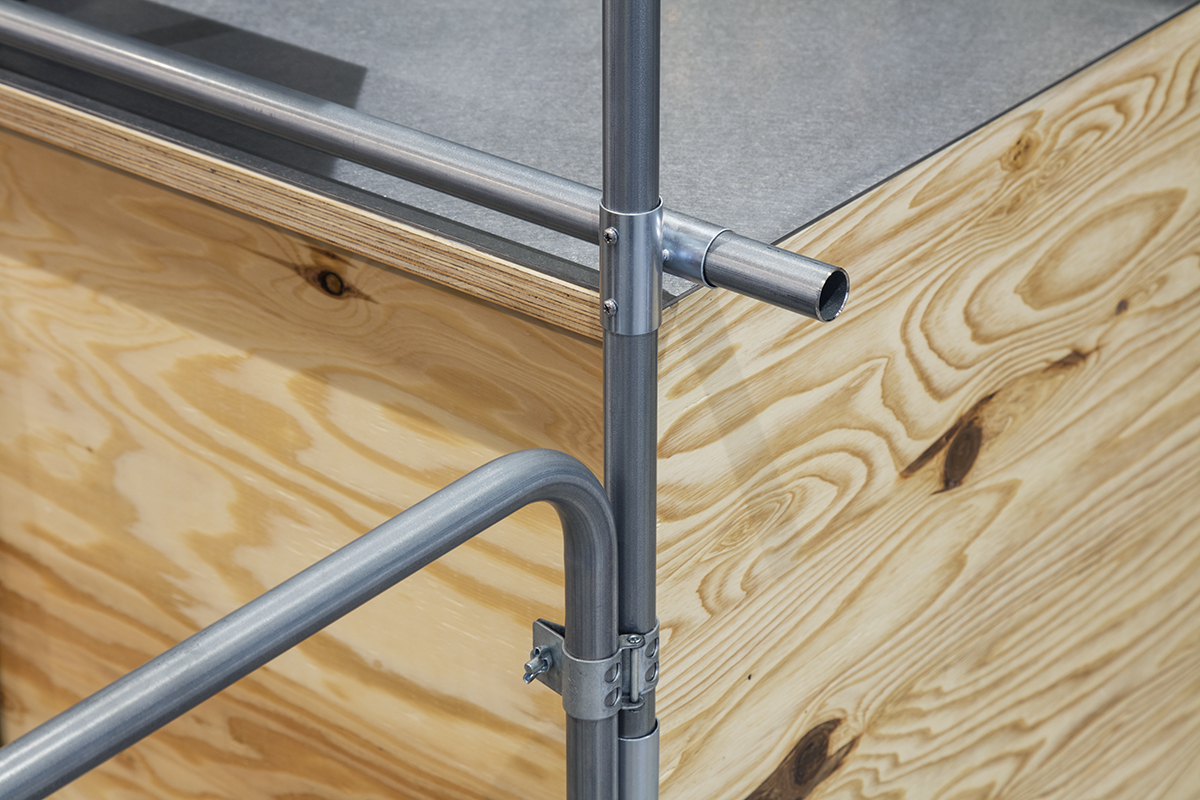
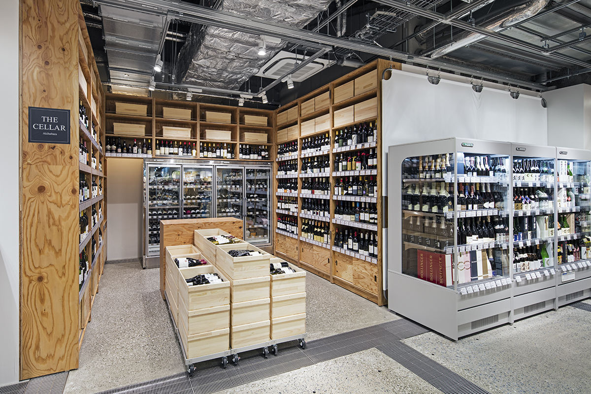
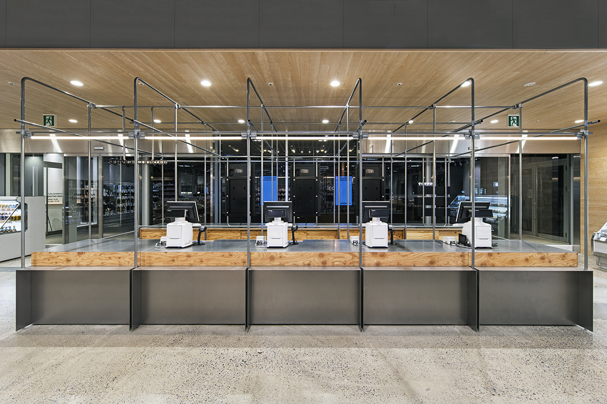
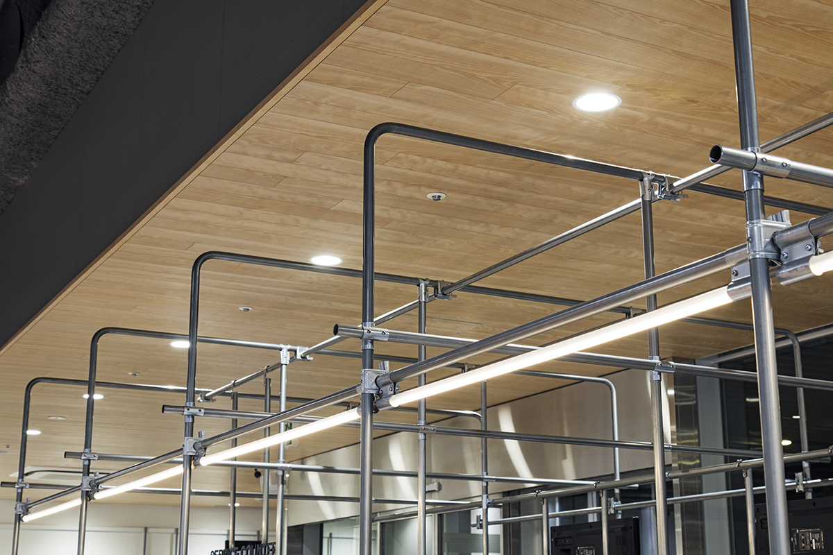
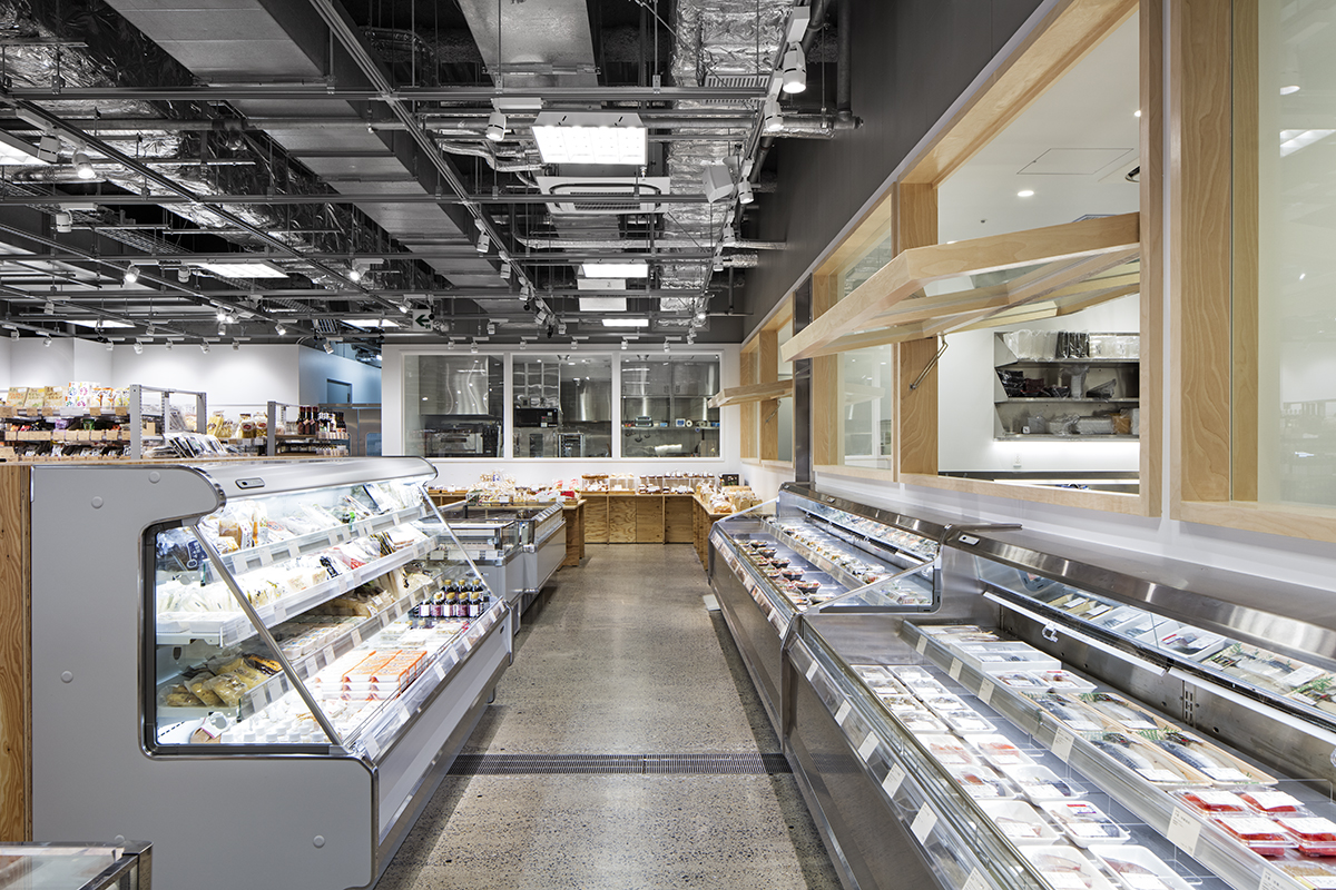
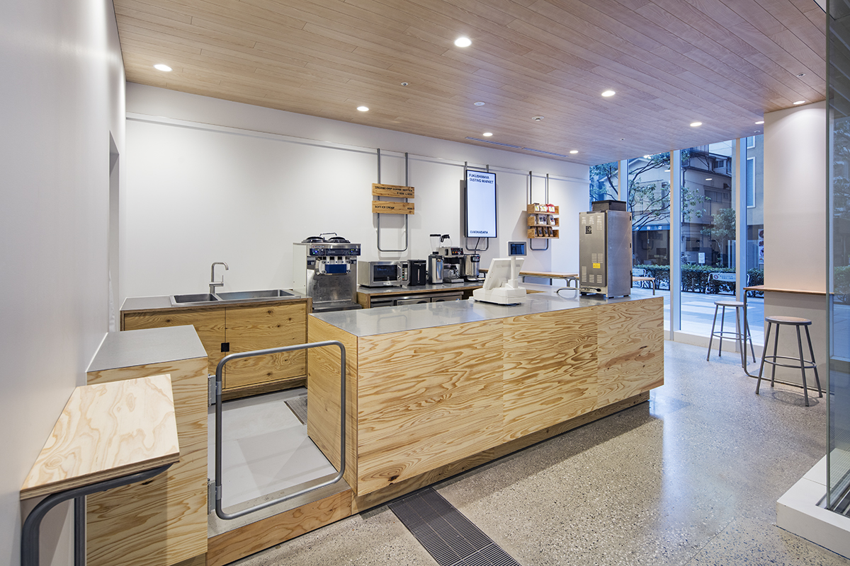
Profit margins of supermarkets tend to be low in general, as is the case with Fukushimaya, and we needed to design within the modest budget. The spatial design is composed of low-cost materials such as ZAM pipes (zinc-aluminum-magnesium alloy galvanized steel pipes) used in greenhouses, prefabricated shopping carts, wood wine boxes and more, arranged carefully to highlight the changing displays of attractive commodities. In addition, an open kitchen partially wraps around the store space so that people can see the staff cooking Fukushimaya’s popular ready-to-eat products, including a la carte delicatessen, rice balls and lunch boxes, while feeling the lively energy of the kitchen; and detailed information of the products are shown following the store’s disclosure policy.
Data
Title: FUKUSHIMAYA TASTING MARKET AKIHABARA
Architect: Jo Nagasaka / Schemata Architects
Project team: Toshihisa Aida + Sho Nishihara
Location: Sotokanda, Chiyoda-ku, Tokyo, Japan
Usage: Super market
Construction: TANK
Collaboration: village (sign)
Number of stories: 1
Floor area: 543.76㎡
Structure: CFT structure
Date of completion: December 2016
Photographer: Kenta Hasegawa
