Recruit Kudanshita Office
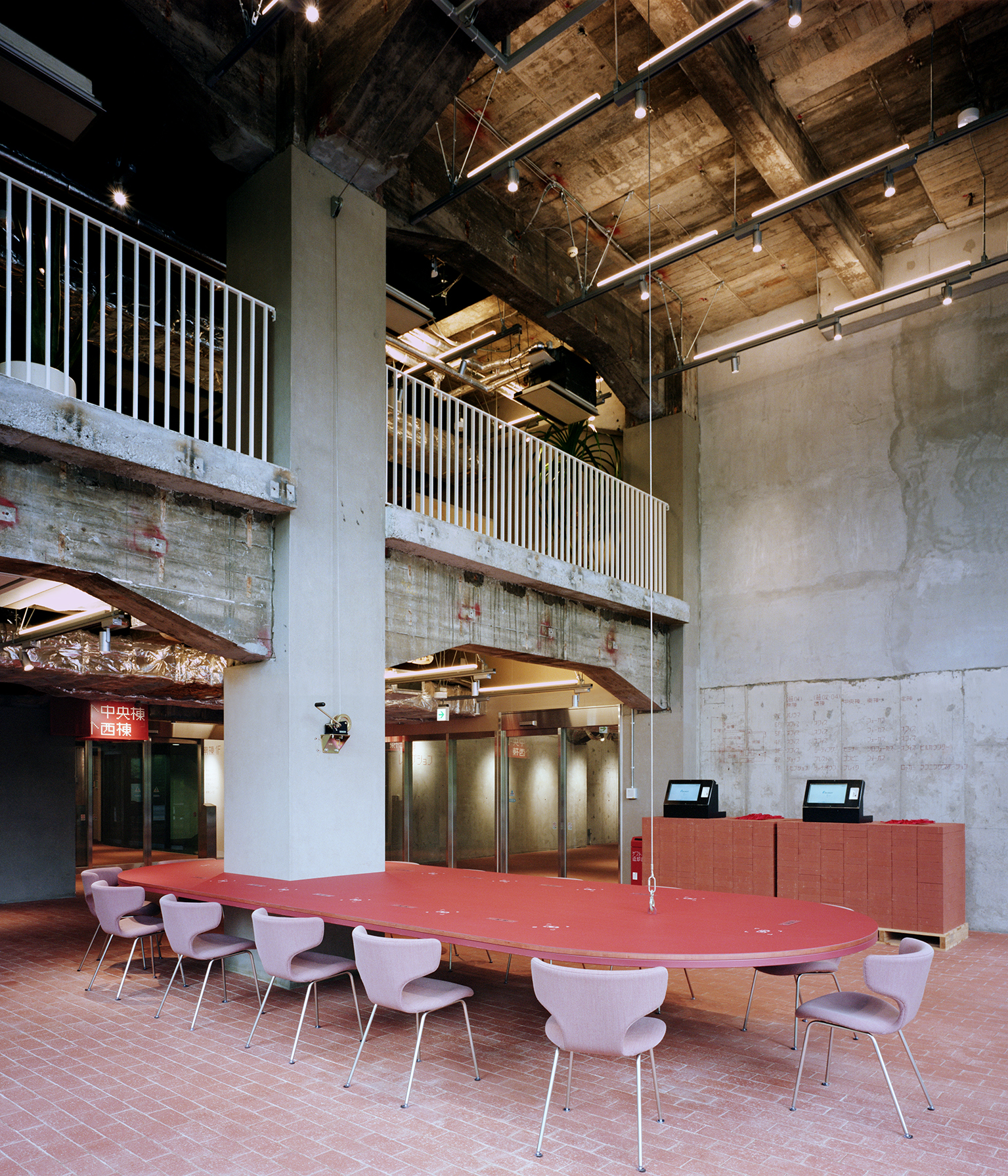
The COVID-19 pandemic has drastically changed the way we work, and office spaces are also going through significant changes a. Under such circumstances, many companies set out to establish their own guidelines and new office styles, and Recruit Co., Ltd. was among the first to take action. Instead of taking a crowded train to the city center, they proposed “mid-sized offices” as a new way of working, based in towns situated between the city center and suburbs of Tokyo including Mitaka, Mizonokuchi, or Musashikosugi. As a prototype of this concept, we designed Recruit’s new office in Kudan. We designed common areas on the first and second floors, and some parts of the upper floors. The building is not a large office building with many floors, but a renovated old university building divided into small rooms. It is coincidental, but because the building is divided into small sections, it allows us to create and experiment with various ways of gathering, and we sought ways of gathering that would be appropriate for mid-sized offices to be built in the future.
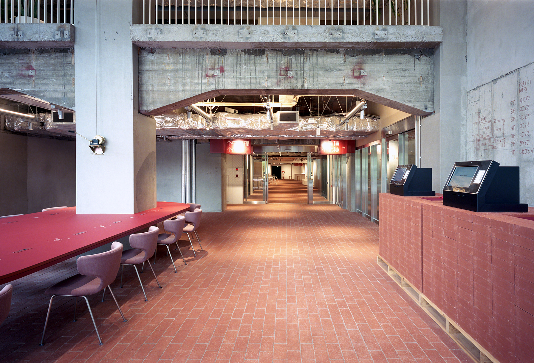
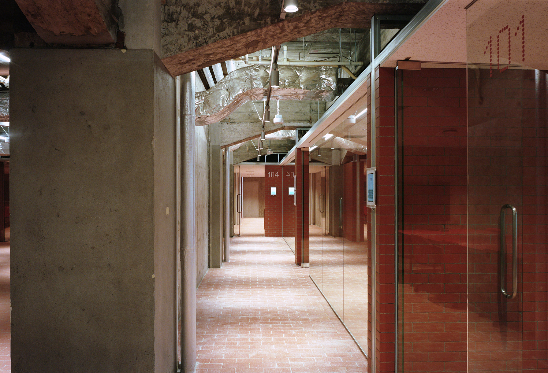
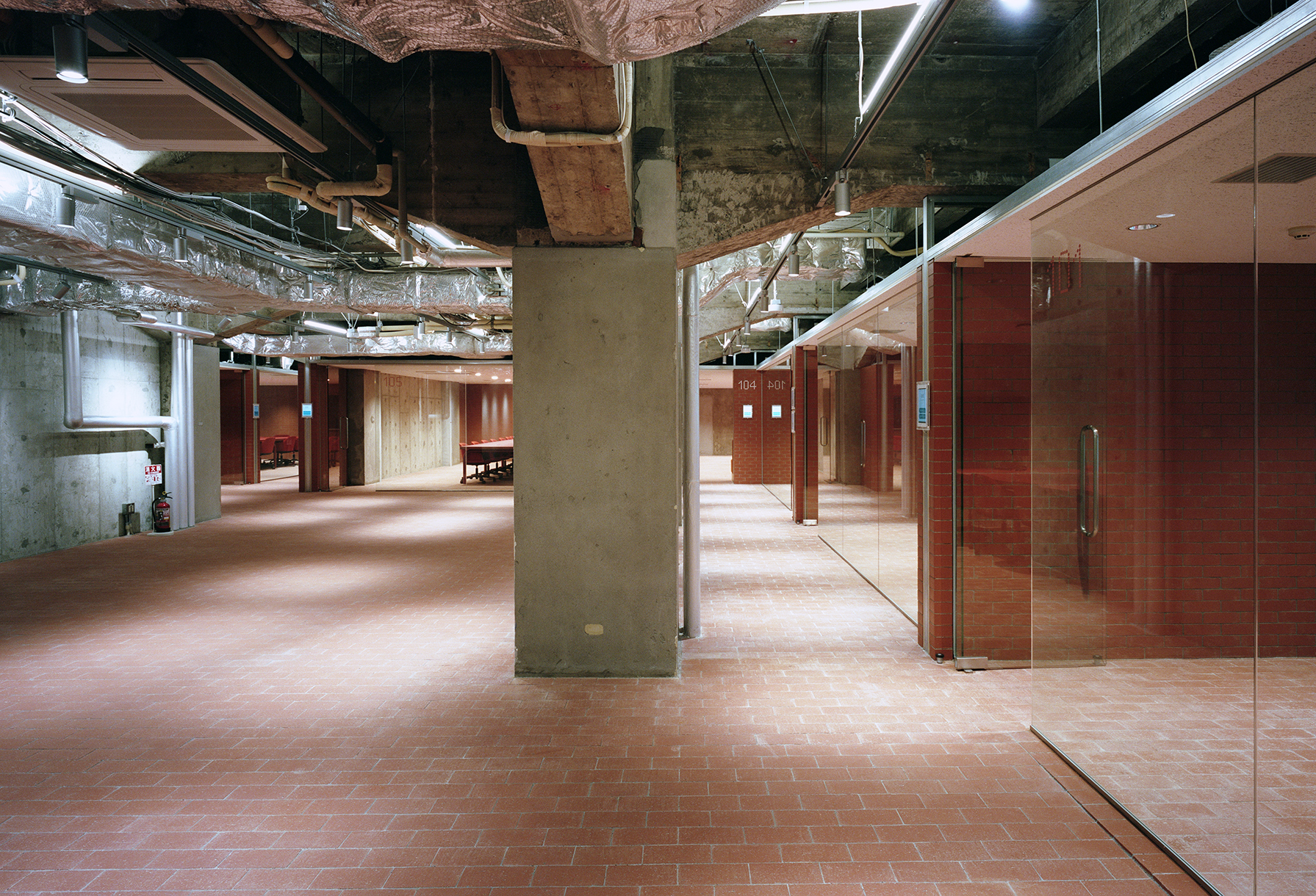
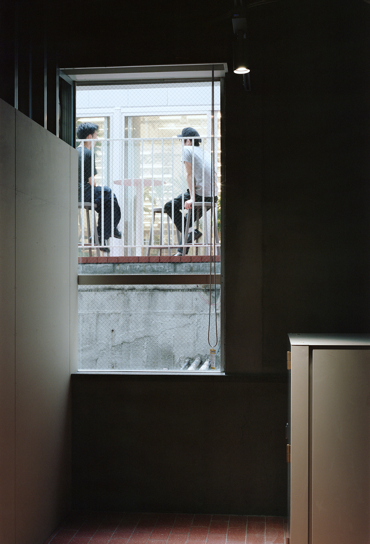
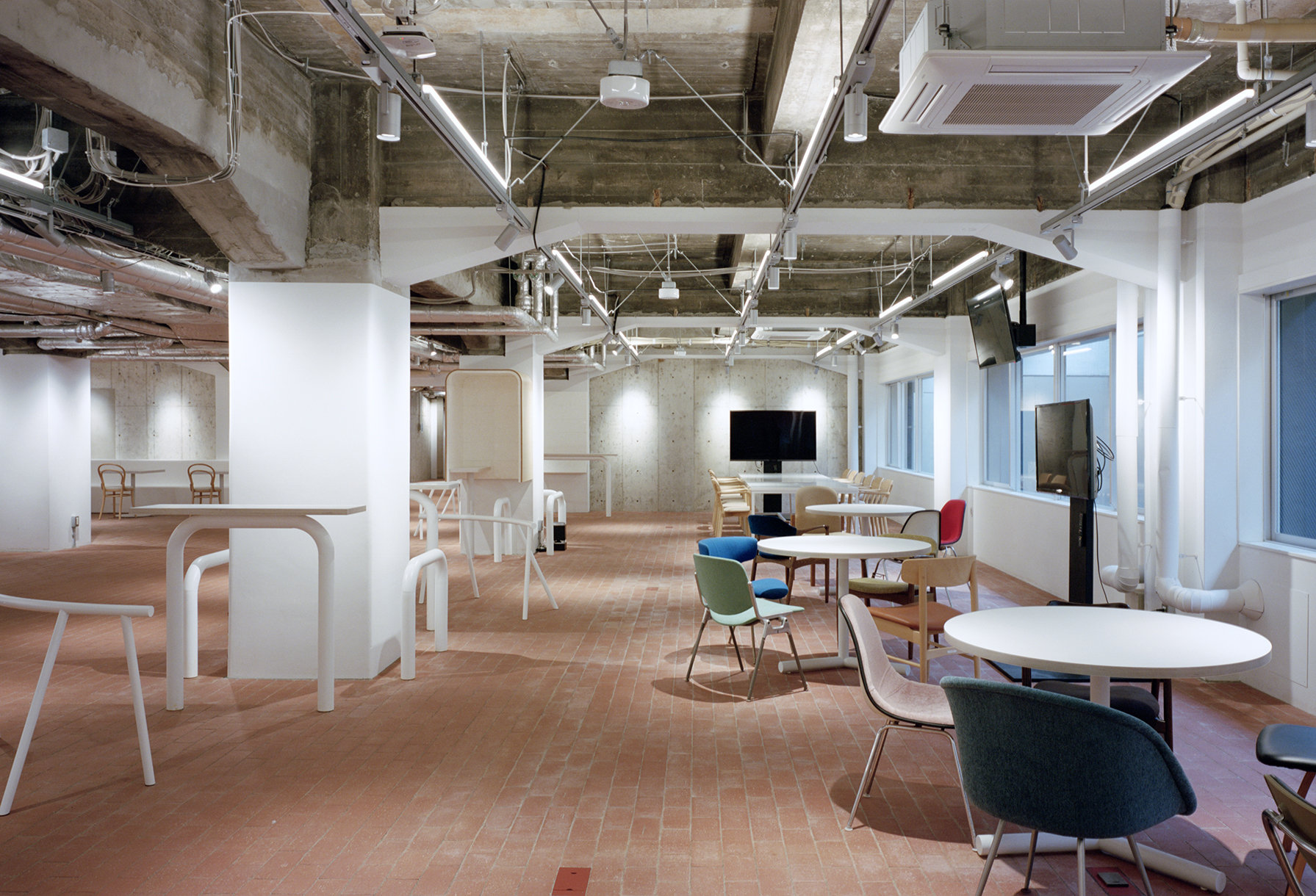
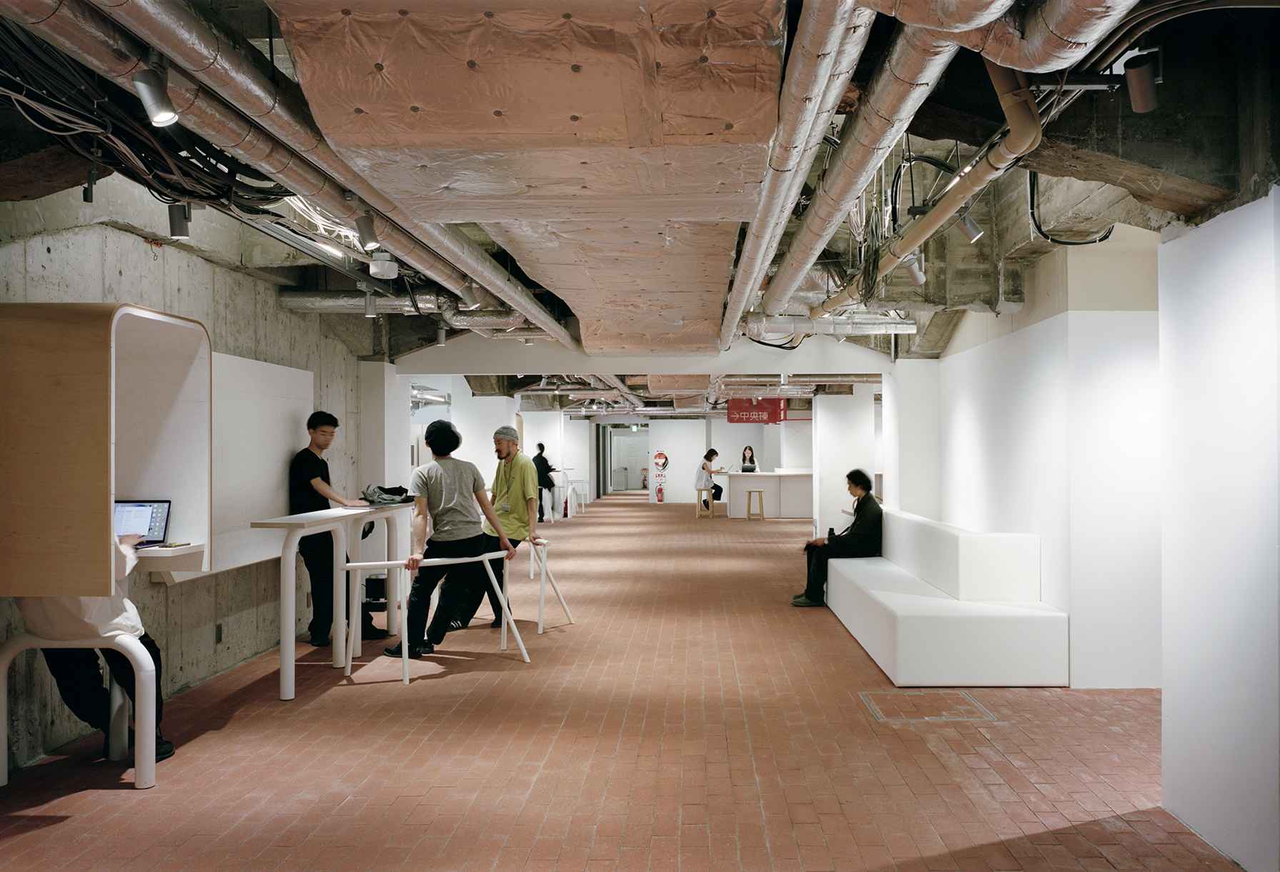
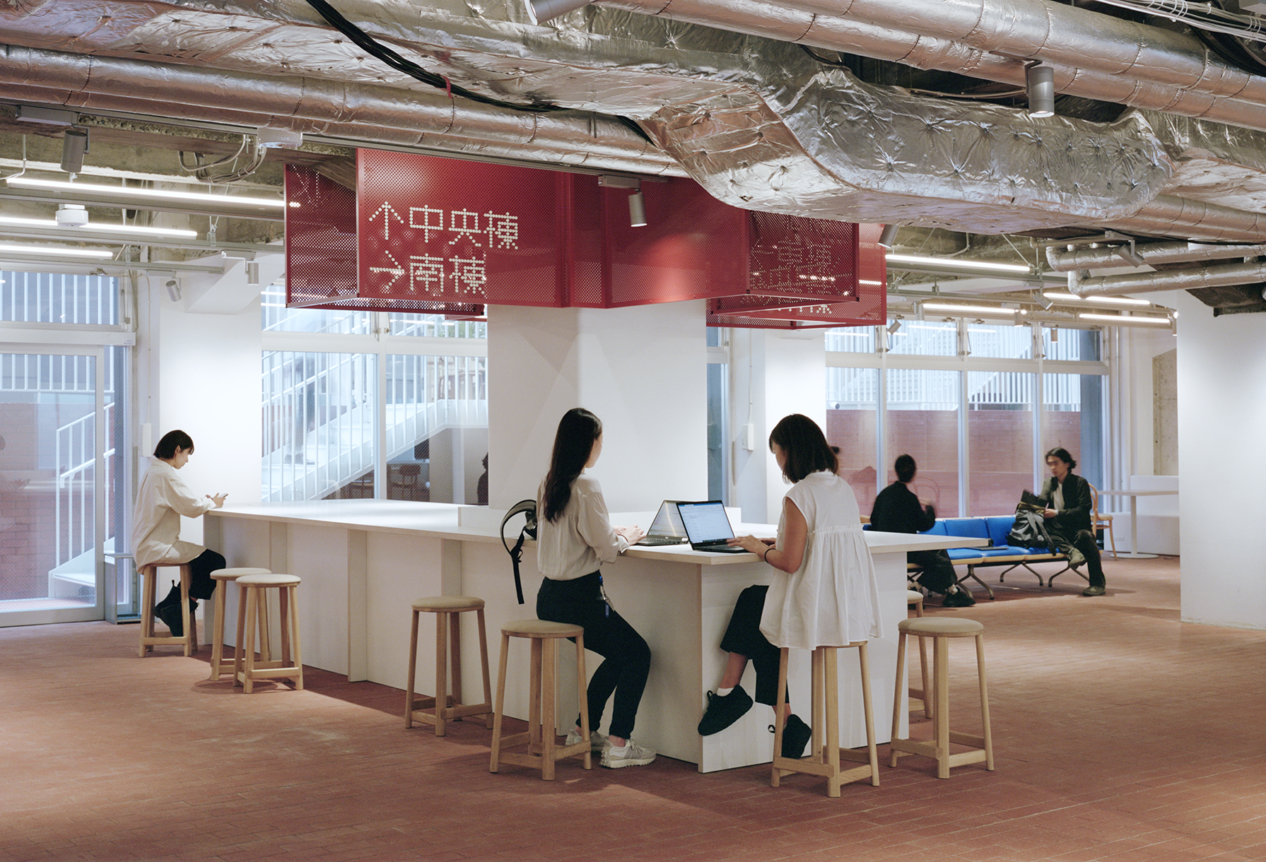
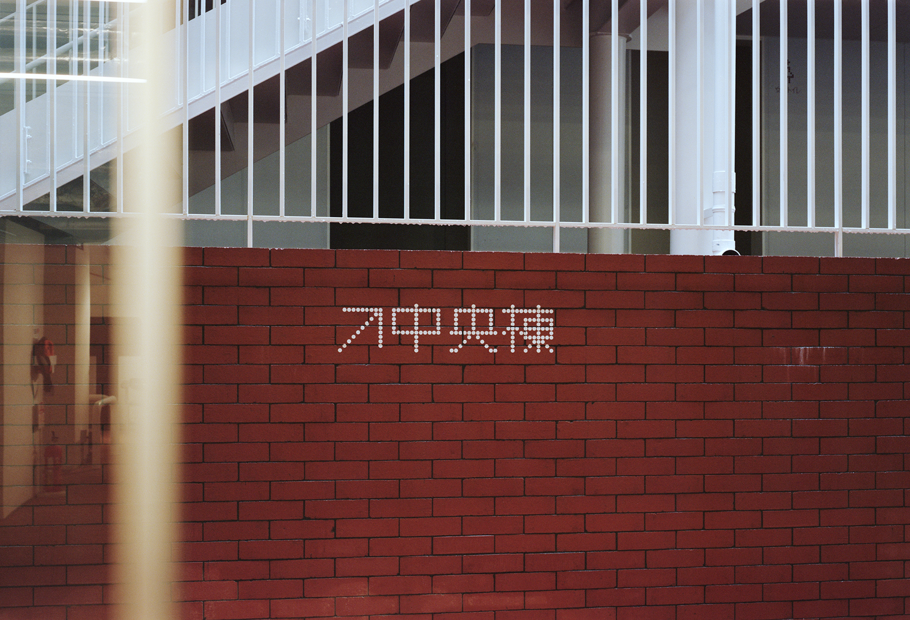
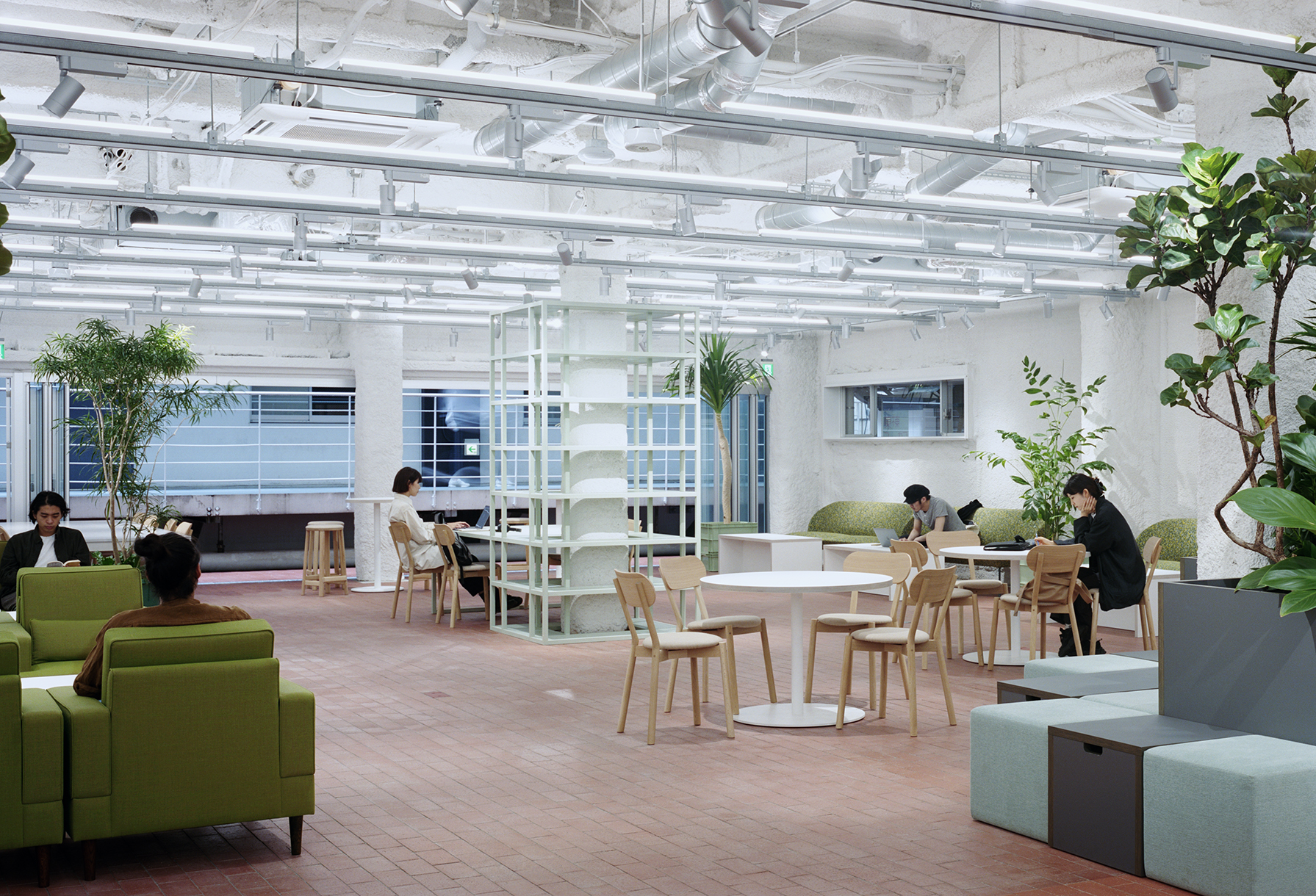
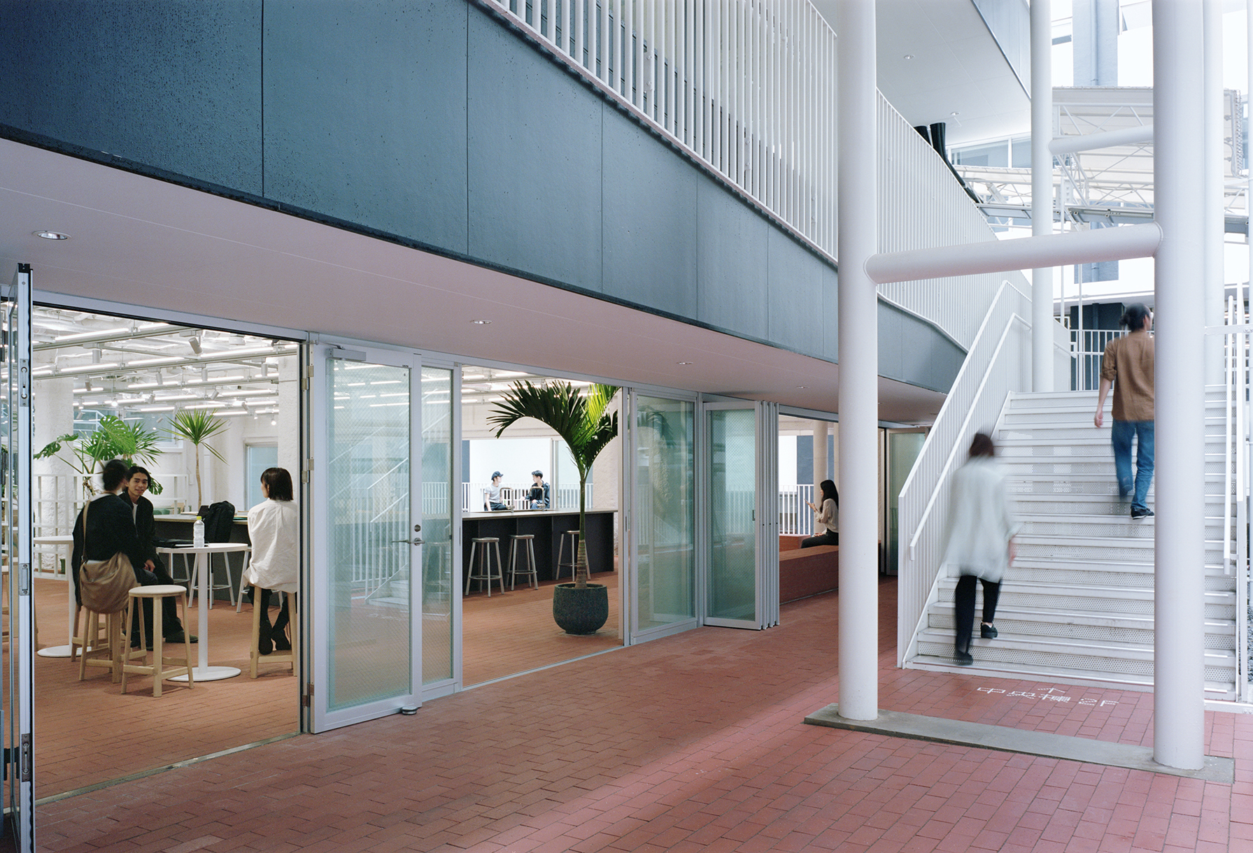
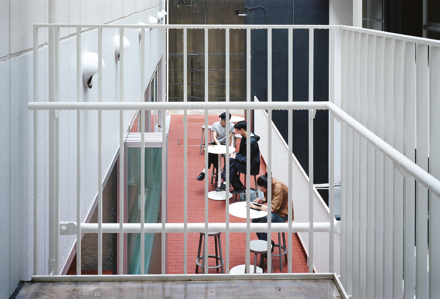
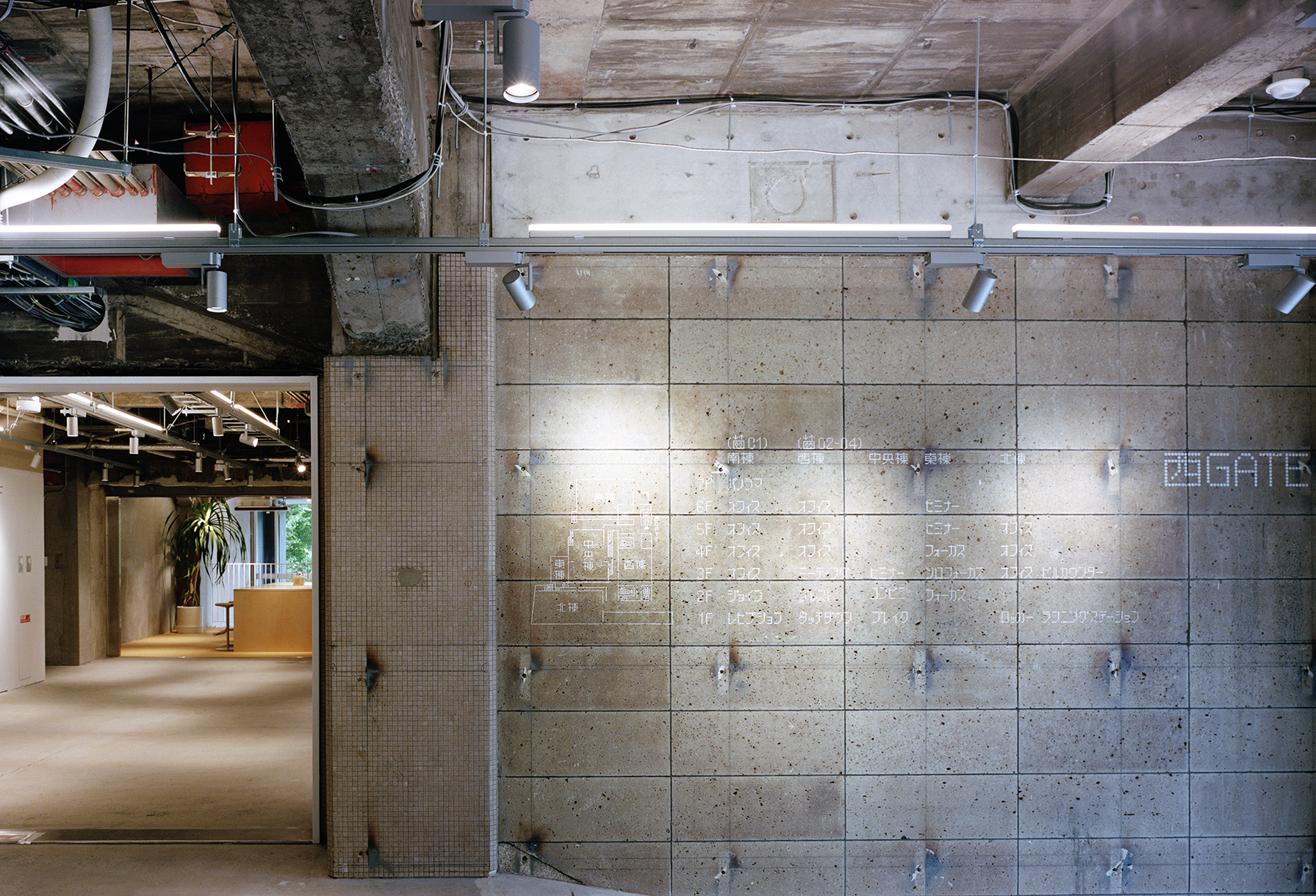
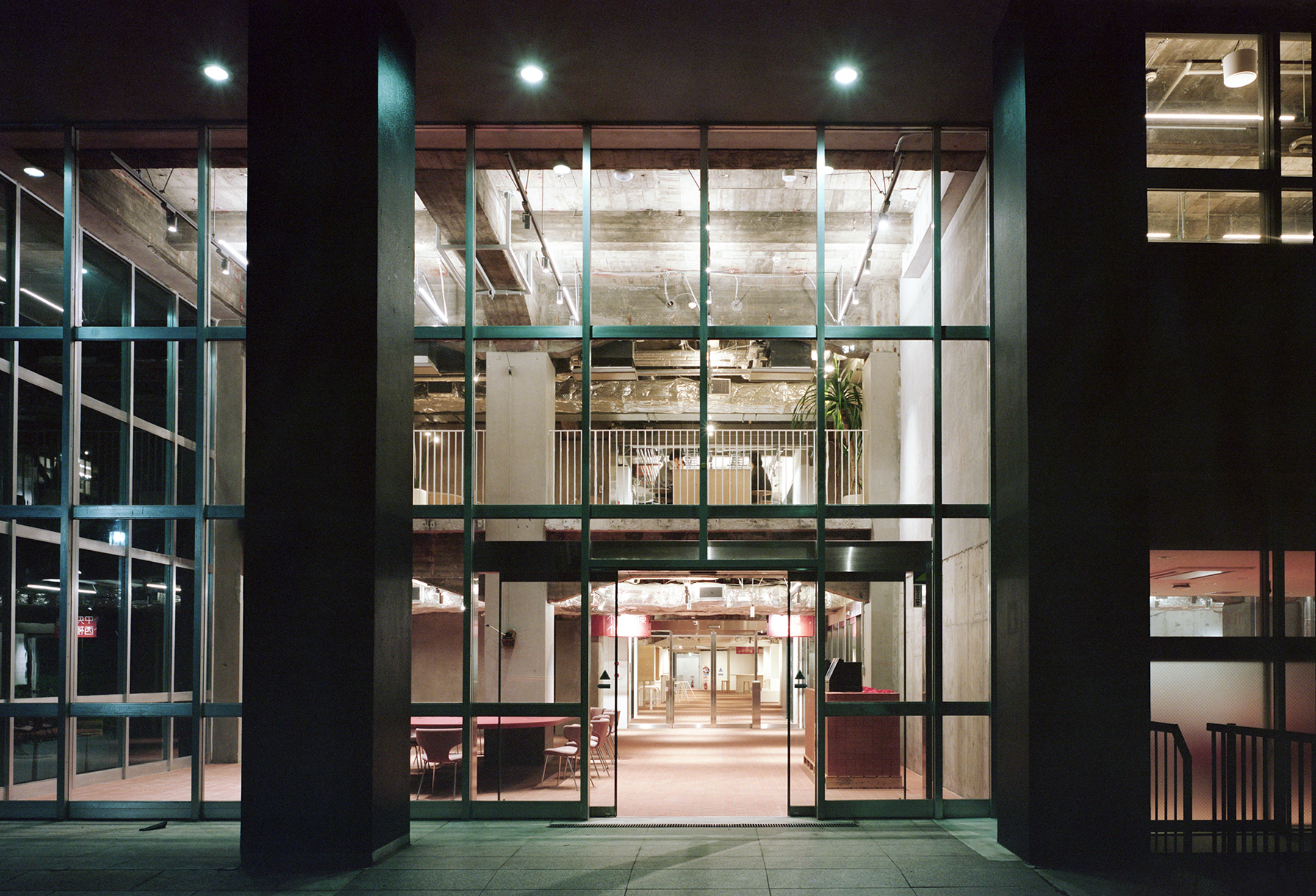
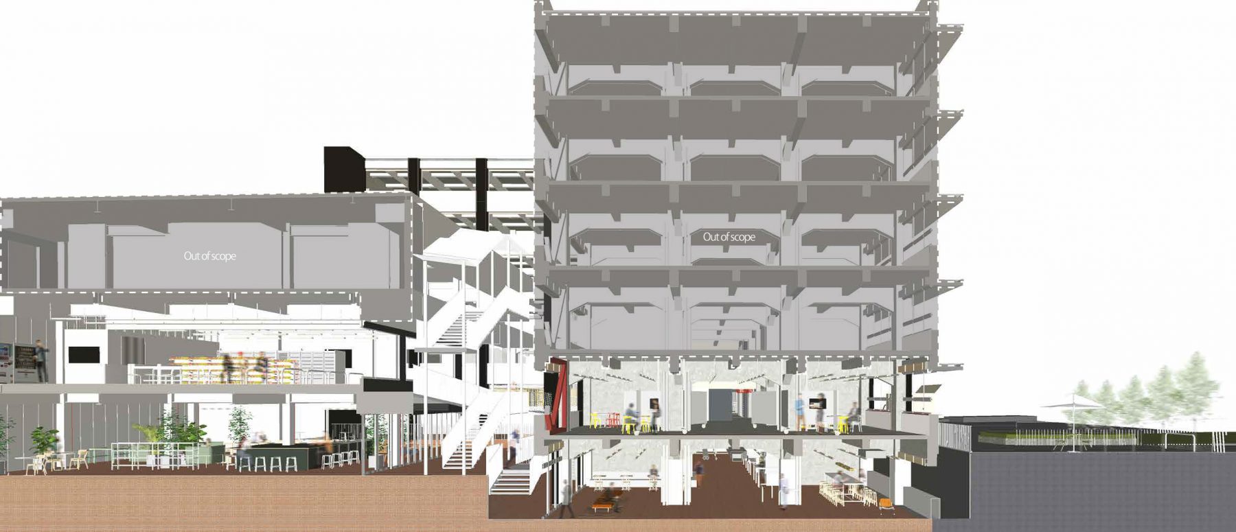
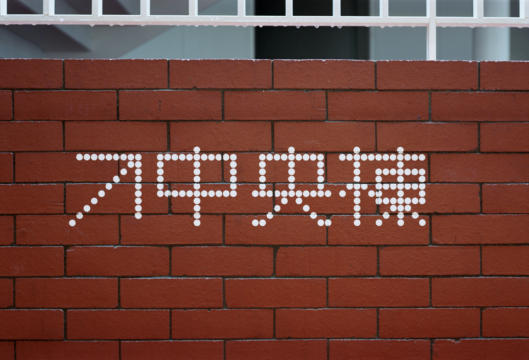
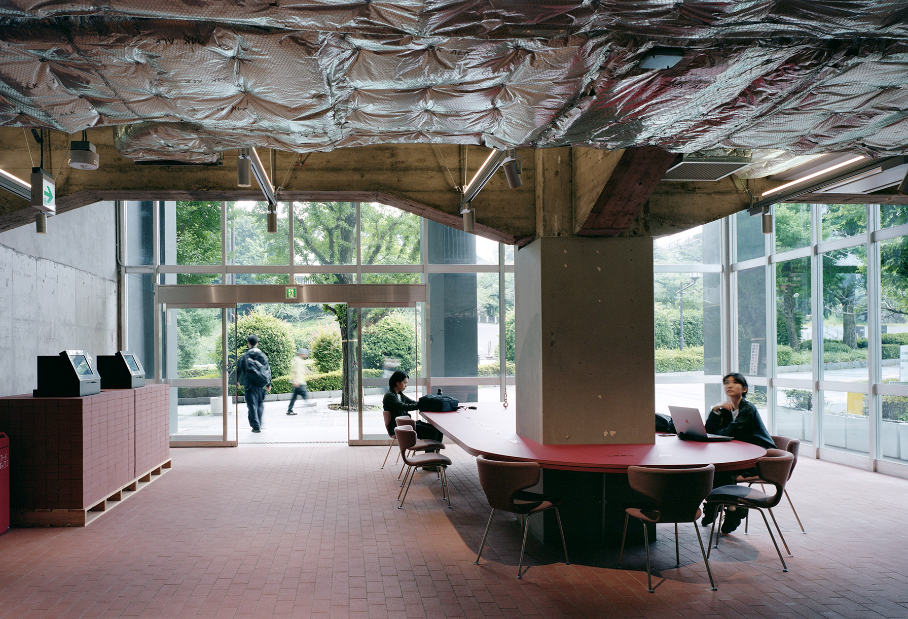
There are three existing buildings on the west, south, and north sides, and a central building stands in the courtyard surrounded by the three buildings. Because they were originally four separate buildings, each with different entrances and floor levels, we were concerned that employees would come down to the ground level and go out in different directions, resulting in a company without a sense of unity. In addition, the central building had no elevator, nor any view to the outside, probably because it was built later as a temporary structure, and it had a desolate atmosphere like a hangout for drifters. To make it a place for employees to heal and relax, we designed a convenience store and a rest area in the building so that they would be always be aware of this central building at all times. We also wanted to make sure that activities in the central building would resonate with the other buildings and transmit to the upper floors. Moreover, in order to connect the disparate buildings and entrances across the difference in elevation and enhance the sense of community, bricks were laid throughout the first floor of each building.
In addition, since this Kudan office is intended to serve as a “rulebook for mid-sized offices,” six floors in the Kudan office are organized in such a way that those who are planning new office floors can use it as a guideline and choose from various ways of gathering, namely (1) 1st floor in the south wing : meeting space with external parties, (2) 1st floor of the west wing: lobby space, (3) 1st floor of the central building: rest space, (4) 2nd floor of the south wing: group work space, (5) 2nd floor of the west wing: brain-storming space, and (6) 2nd floor of the central building: convenience store. We planned each space based on the expected use.
We expect that it will serve as a guideline for Recruit’s mid-sized offices in the future, and lead to a new way of working in the post-COVID-19 era.
(1) 1st floor of the south wing : meeting space with external parties
Located right next to the entrance, it was planned as a business meeting space. To create a calm atmosphere, the number of colors were reduced to match the overall tone of the space with the bricks on the floor.
(2) 1st floor of the west wing: lobby space
It is a place to meet before heading out for a meeting, and to talk briefly with colleagues on your way to work. The space is designed for quick work without long stays, and is furnished with chairs with relatively high seats. Artistic objects and vintage furniture are placed between the red brick floor and white walls to create a cozy atmosphere that embraces diverse things.
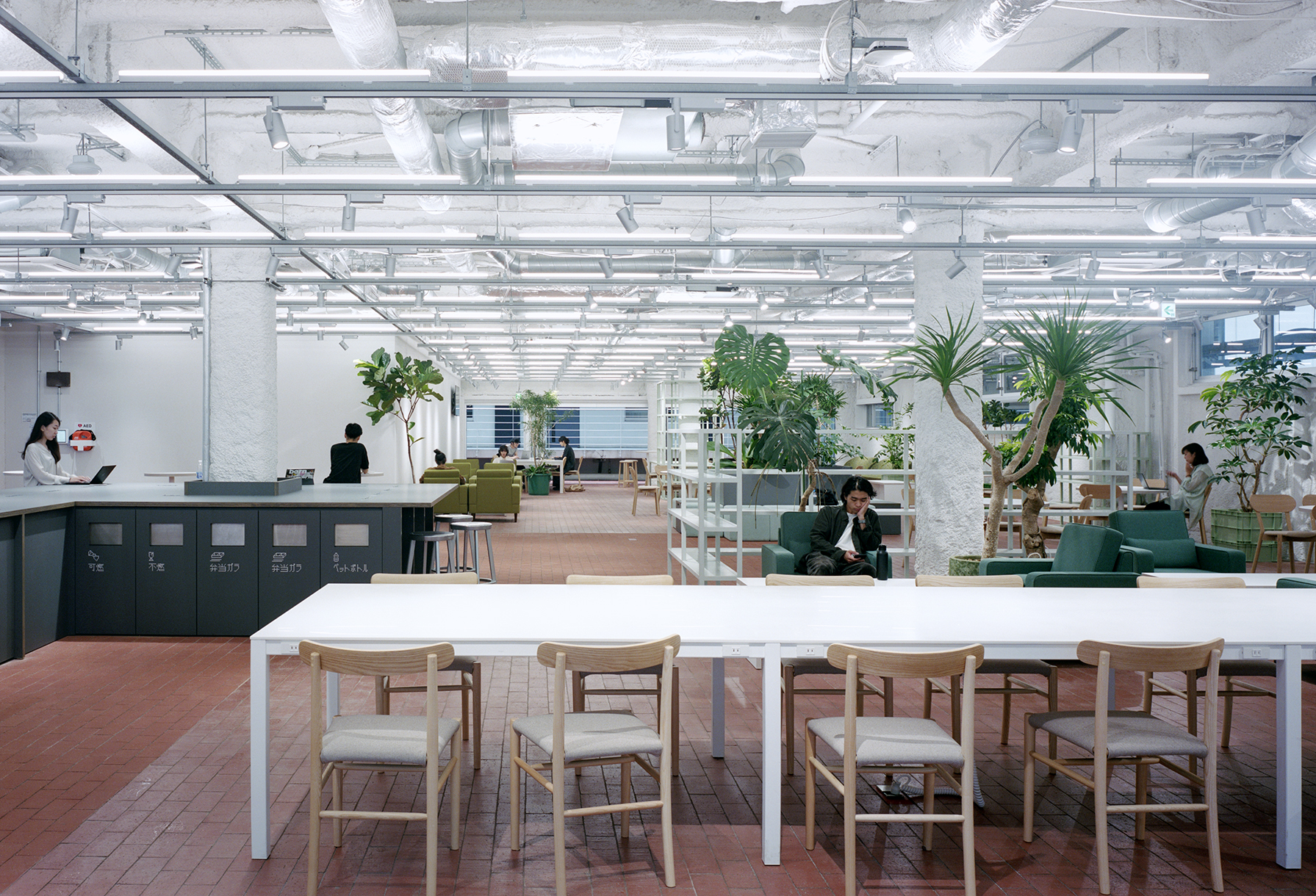
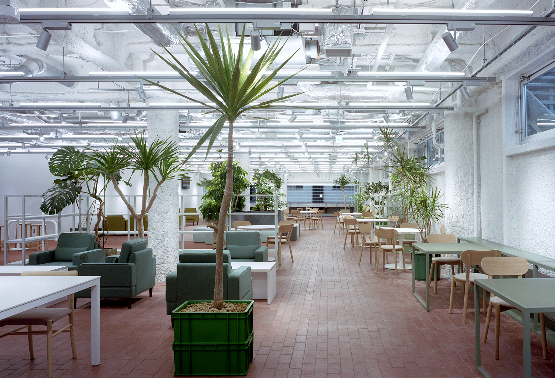
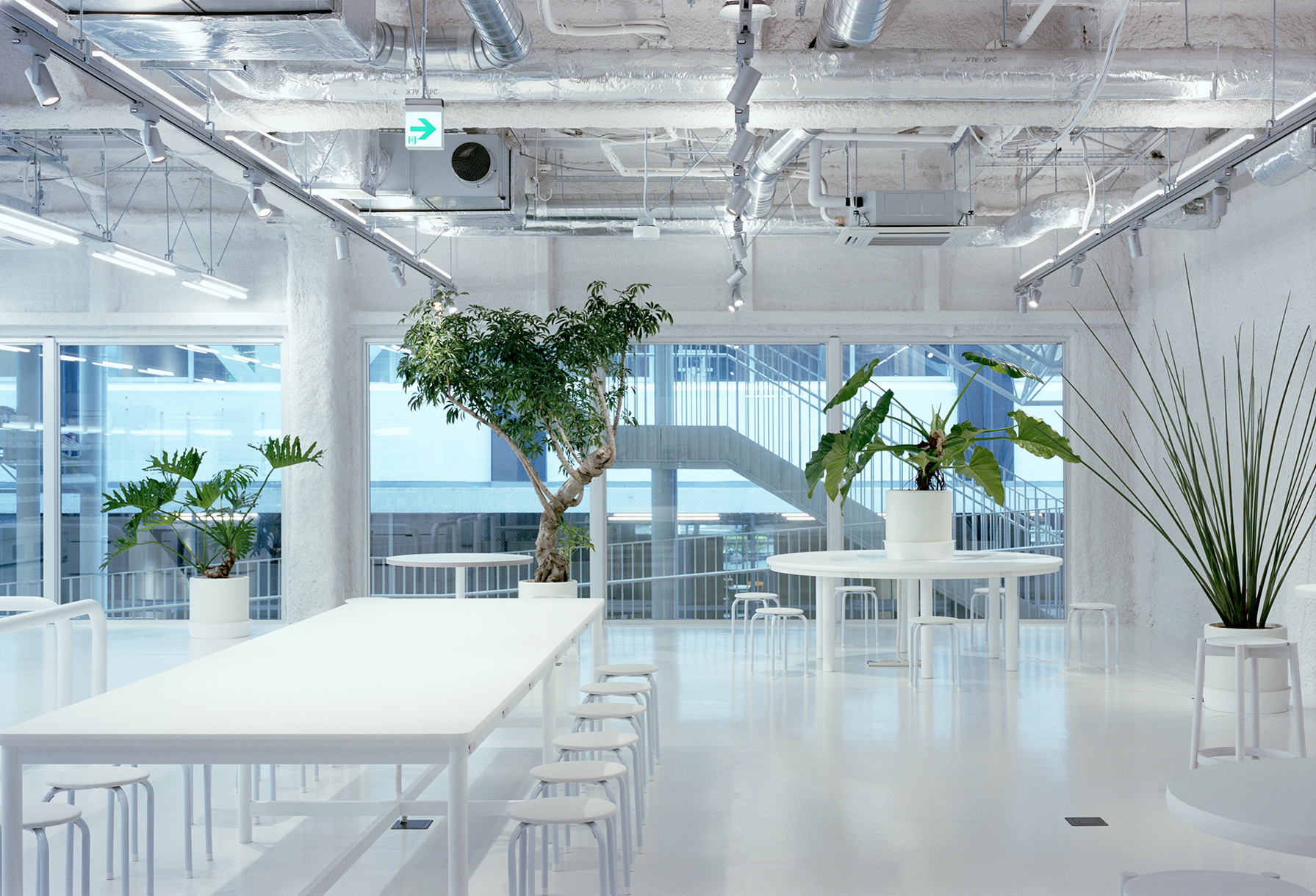
(3) 1st floor of the central building: rest space
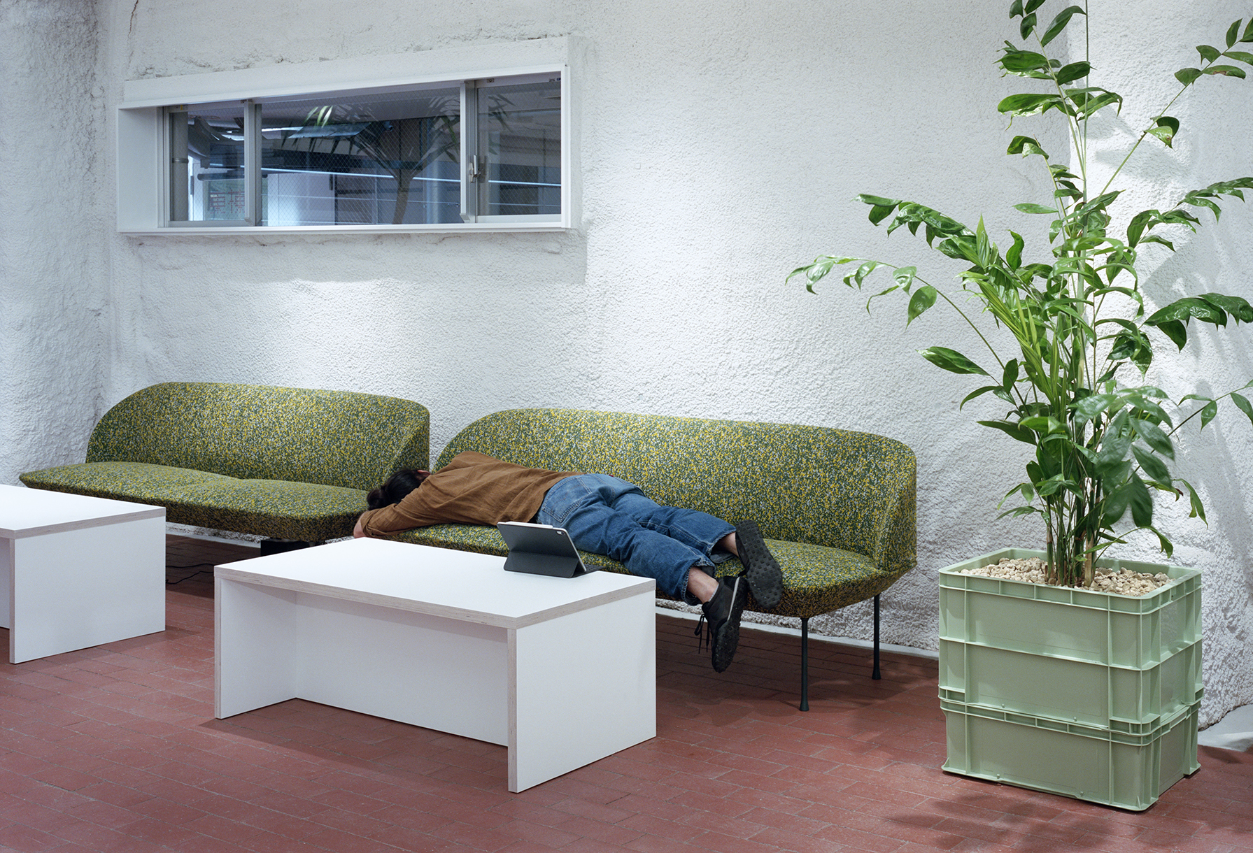
The room, surrounded by walls on four sides, has not light, so the background was first painted white to create brightness, and a lot of plants were scattered throughout to create a space for healing and relaxion. Furniture was designed to match the green color of the plants to create a sense of unity.
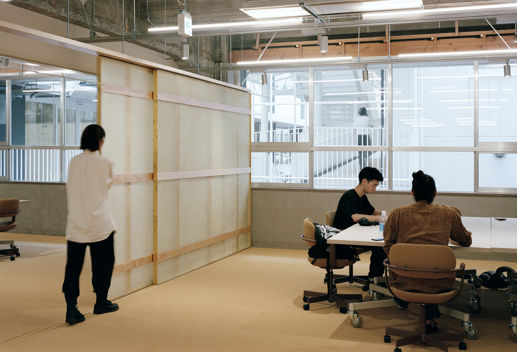
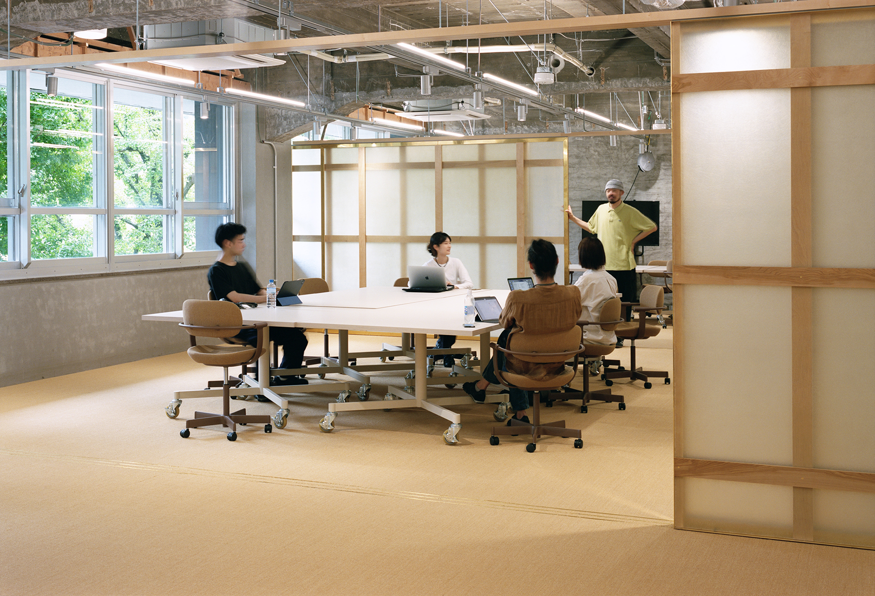
(4) 2nd floor of the south wing: group work space
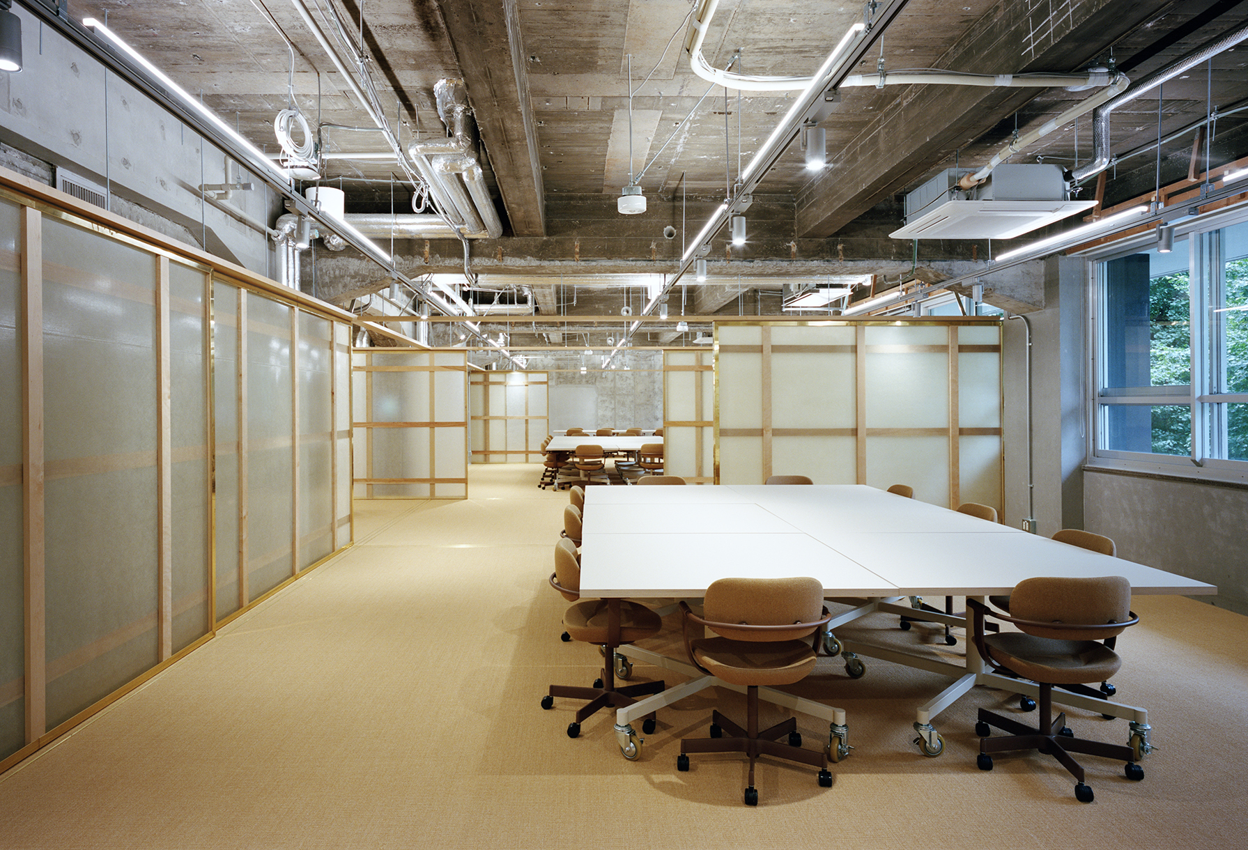
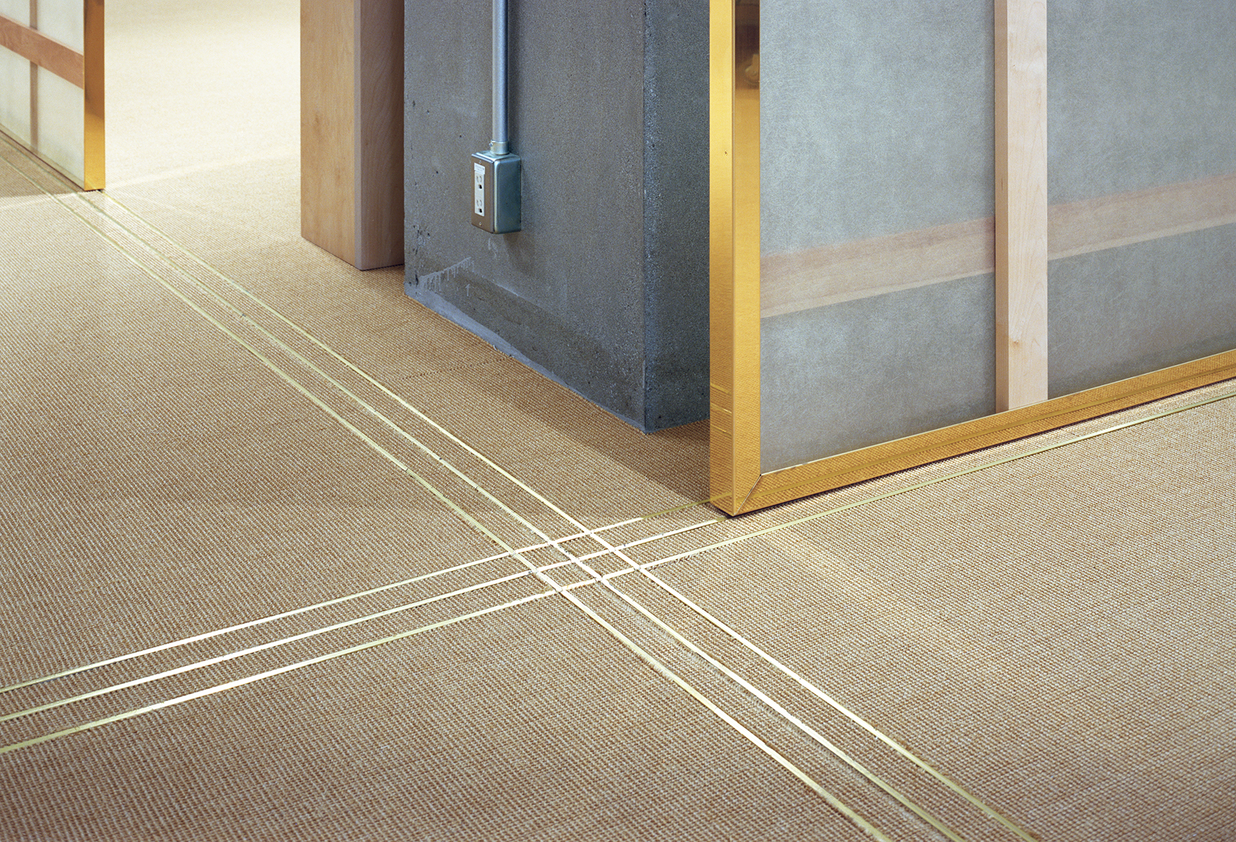
Since it is a group work space and voices tend to resonate, the floor is covered with a sisal hemp carpet for sound absorption, and furniture was designed in the same color to create a calm and gentle appearance.
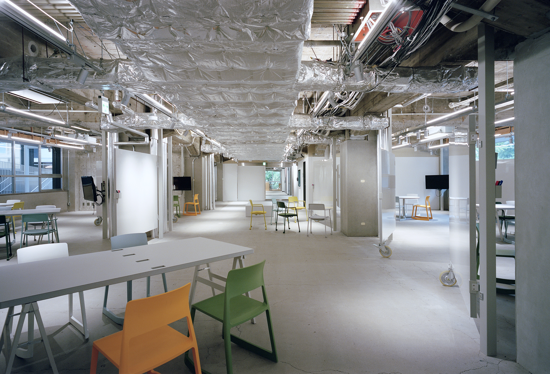
(5) 2nd floor of the west wing: brainstorming space
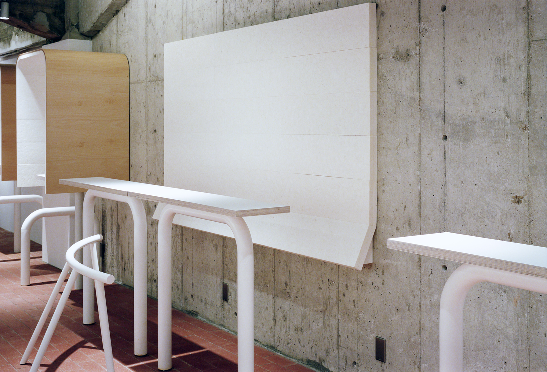
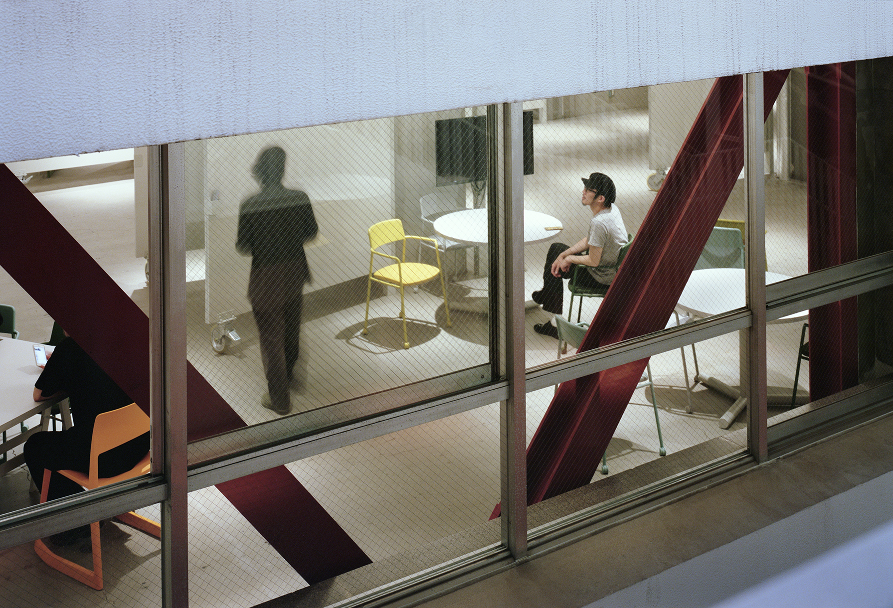
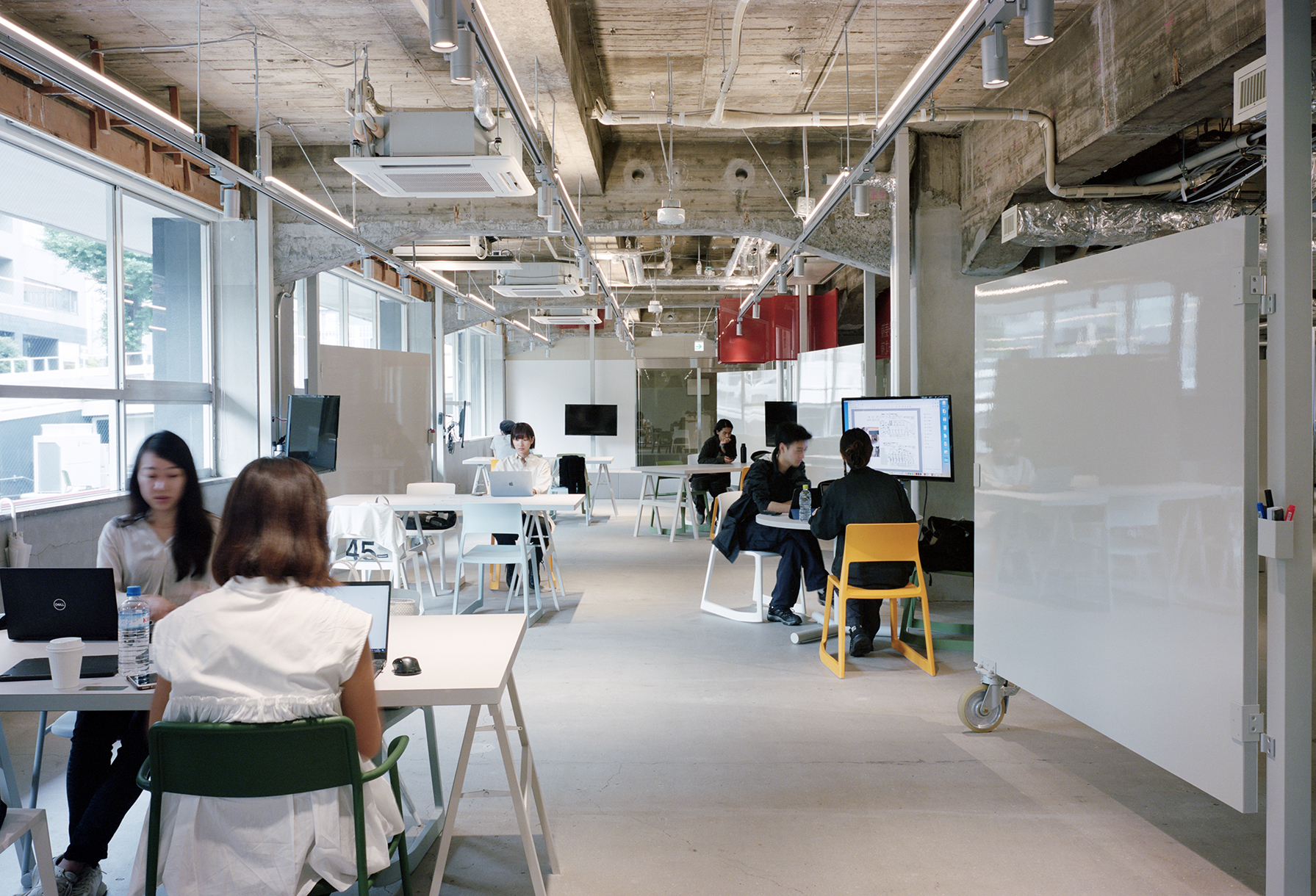
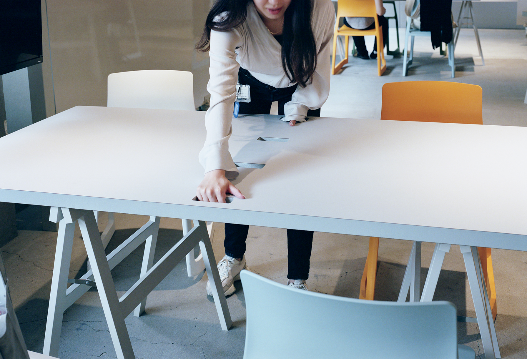
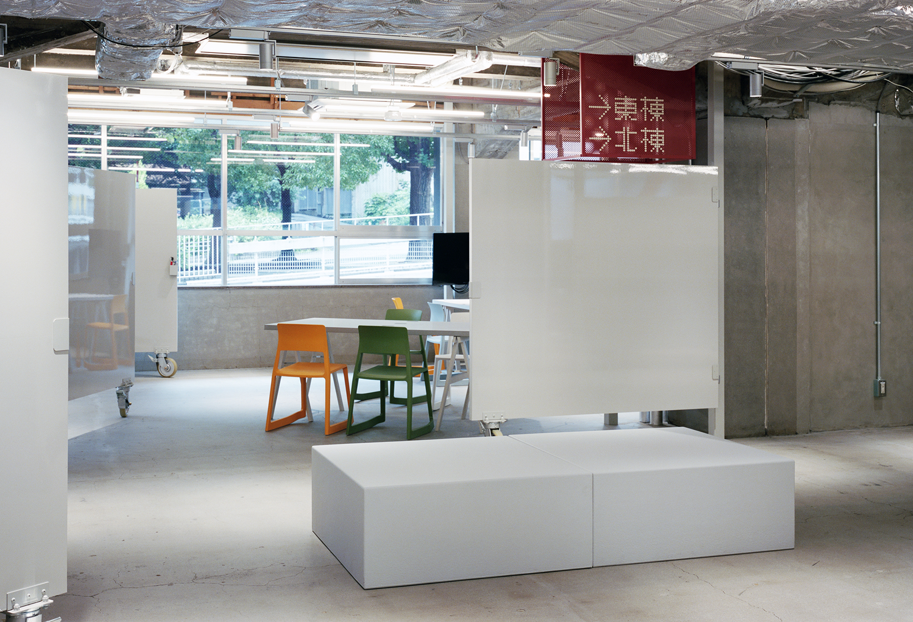
It is designed as a place for brainstorming with multiple people on different scales. Movable partitions cum whiteboards are installed around the many reinforced concrete columns coming down to the floor, and we designed and built lightweight furniture including sponge tables to respond to changes of space configurations.
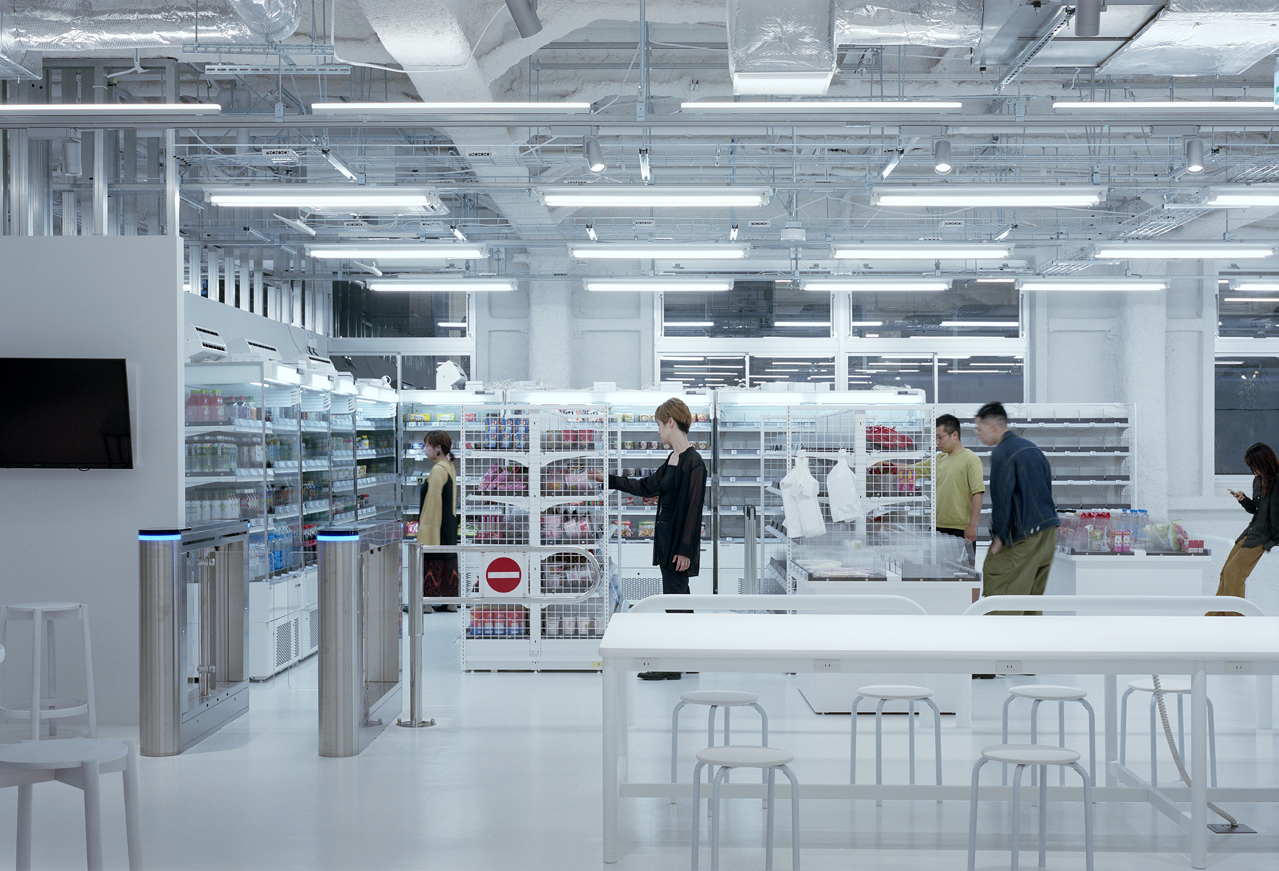
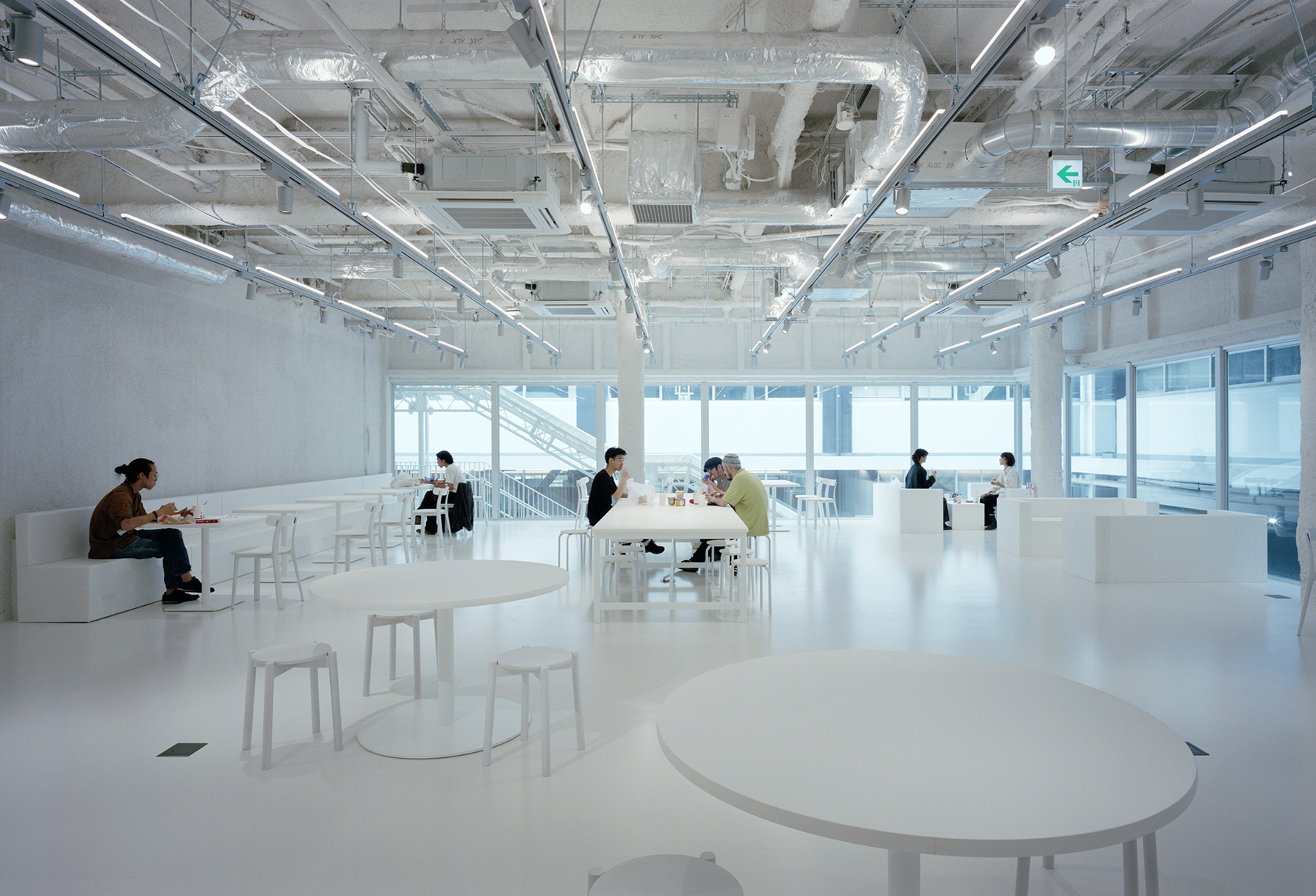
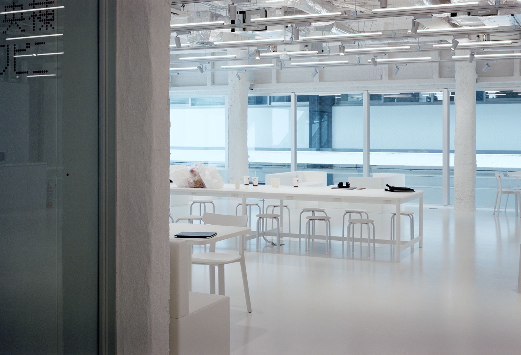
(6) 2nd floor of the central building As with the first floor of the central building, it is surrounded by walls on four sides and has no light, the background was first painted white to create brightness. There is an unstaffed convenience store with a self checkout system with an eating space around it.
PROJECT DATA
Title: RECRUIT Kudanshita office
Architect: Jo Nagasaka / Schemata Architects
Project team: Shota Miyashita Ou Ueno Toshihisa Aida Koh Seki
Location: Chiyoda-ku Tokyo
Usage: office
Construction: Cosmos More Co.,Ltd.
Collaboration: village®︎(Signage)
Qusamura(Plants plan)
Number of stories: 2
Floor area: 3845.42㎡(South1F:796.08㎡ South2F:718.17㎡ West1F:695.75㎡ West2F:697.13㎡ Center1F:447.64㎡ Center2F:490.65㎡)
Structure: Steel and RC
Date of completion: March 2021
Photographer: Yurika Kono
Press data download
