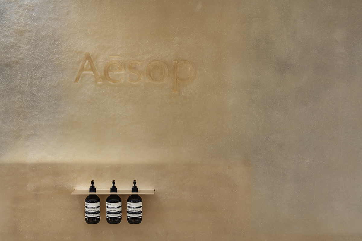
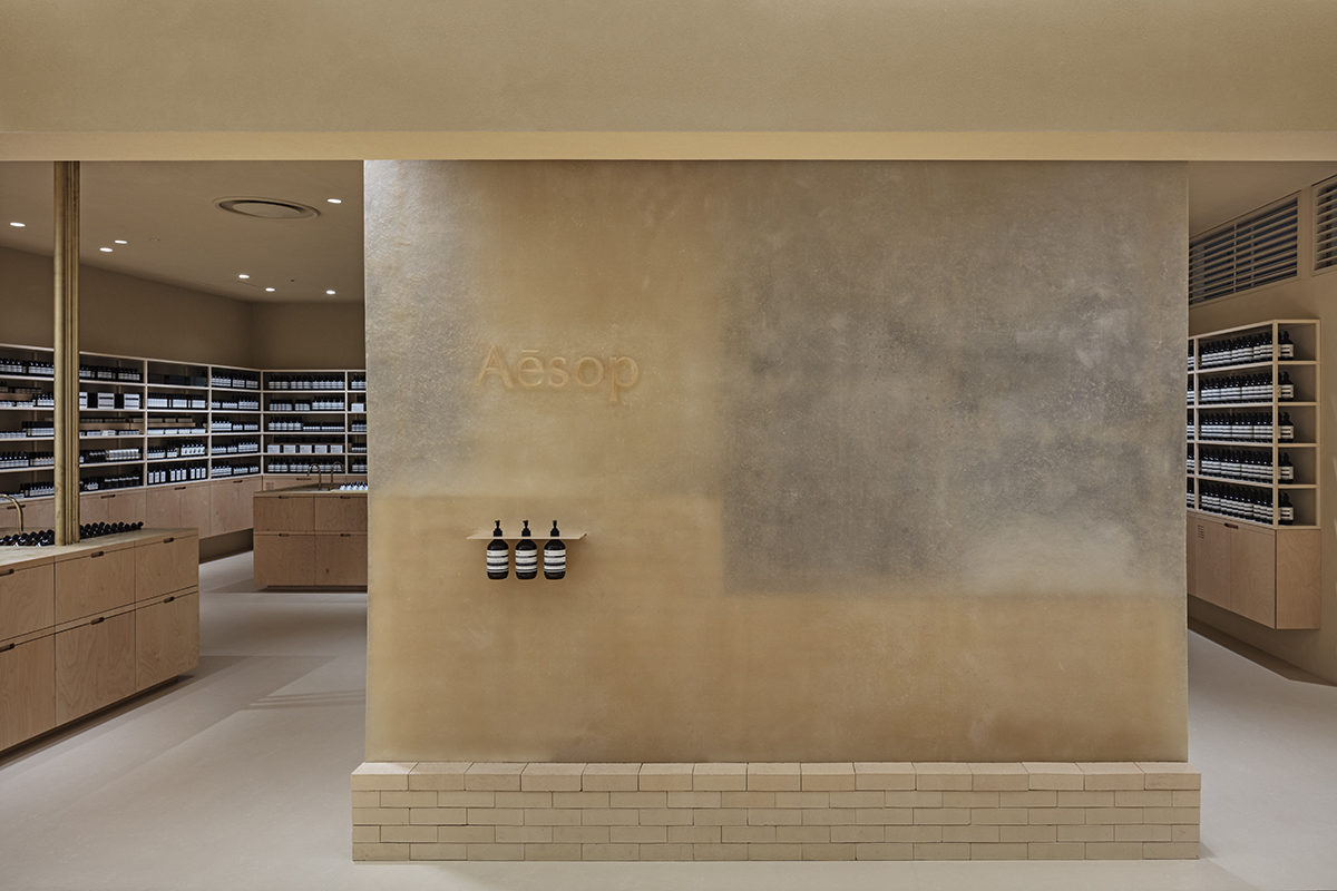
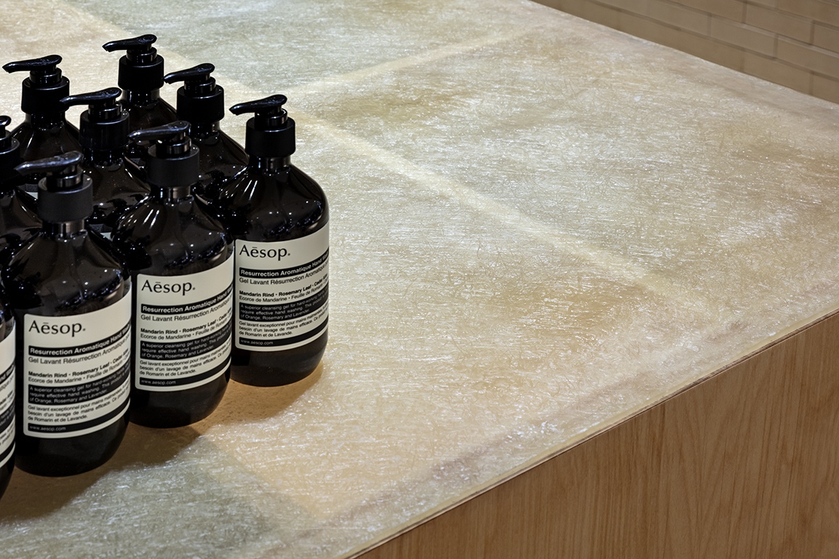
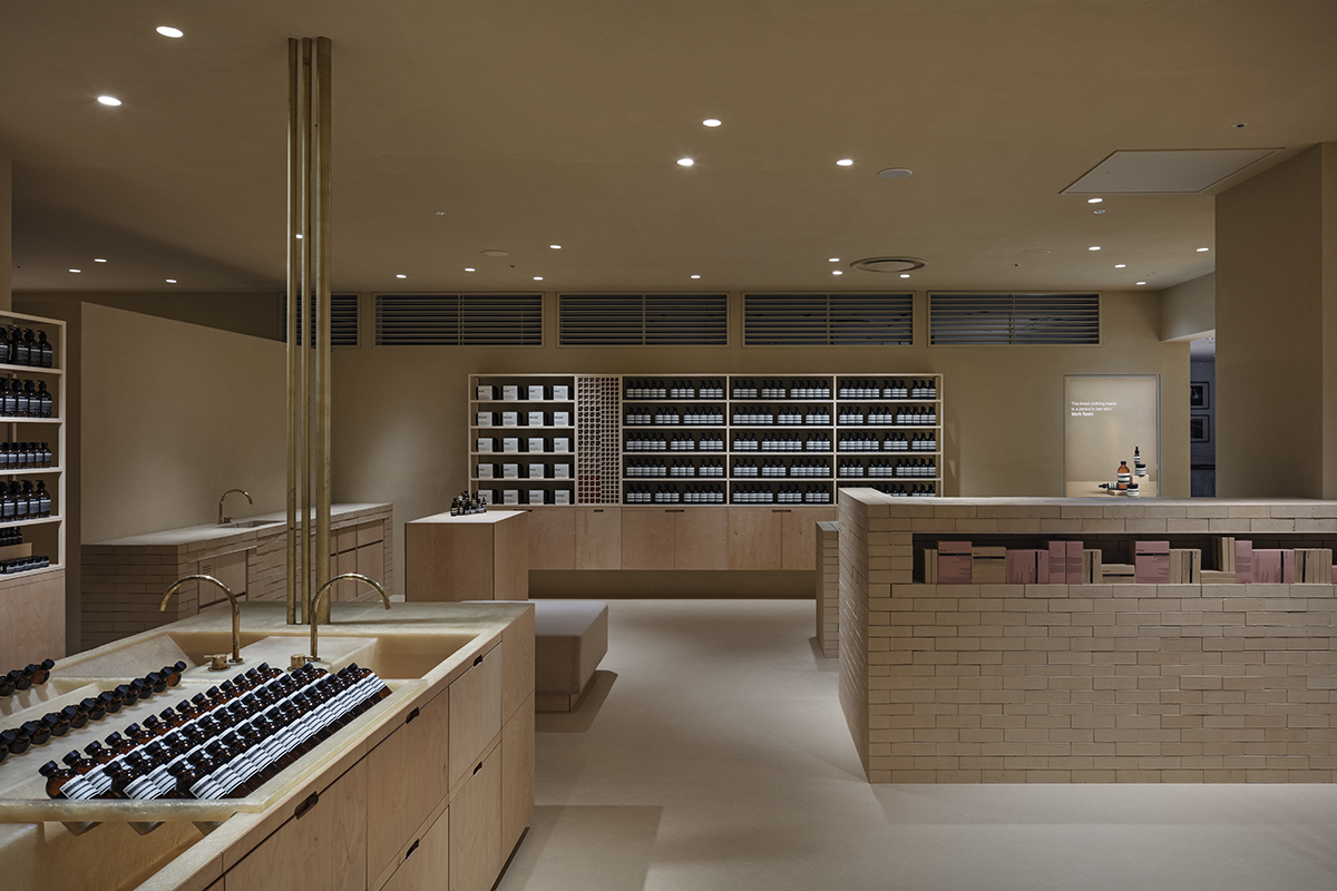

mono color”beige”
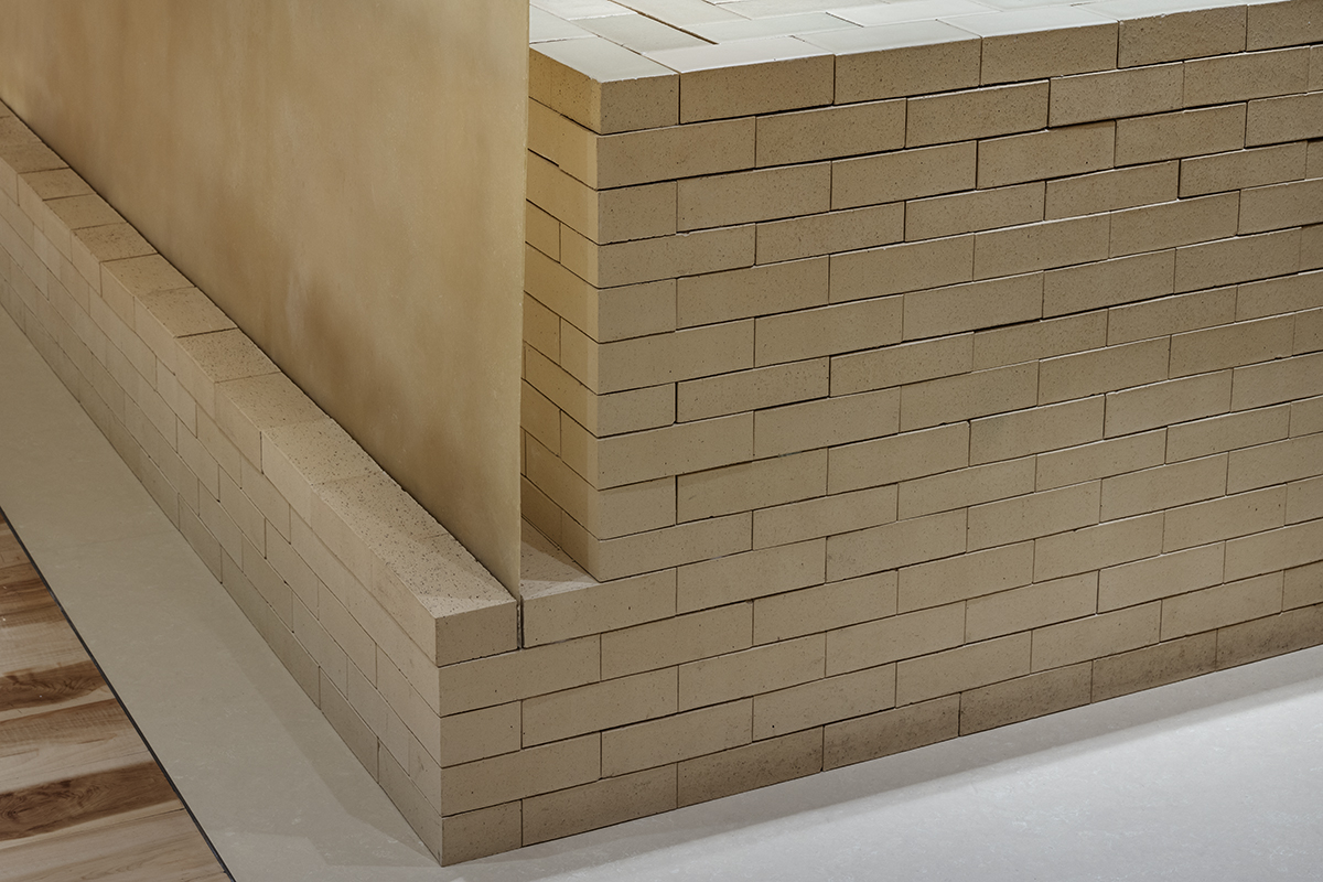
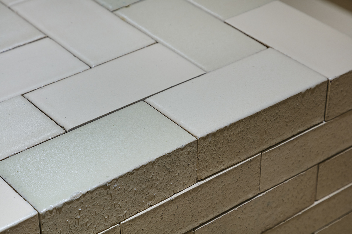
We considered which color would make contrast and highlight amber bottles of Aesop in the most beautiful way then came up with the idea of using only this beige color. However, simple mono-colored space is probably not so interesting to experience, so we decided to use different materials in beige to create a sense of depth in the space, FRP in beige, bricks in beige, glaze in beige, wood in beige, sand wall in beige and so on. One enters the space and notices the subtle differences gradually.
We designed this Aesop store which located in the Osaka Station building. Currently it is one of larger scale Aesop stores in Japan.The retail floor in the building is full of similar glossy-textured materials. We wanted to provide a different environment where one can take a break from the glossy atmosphere.
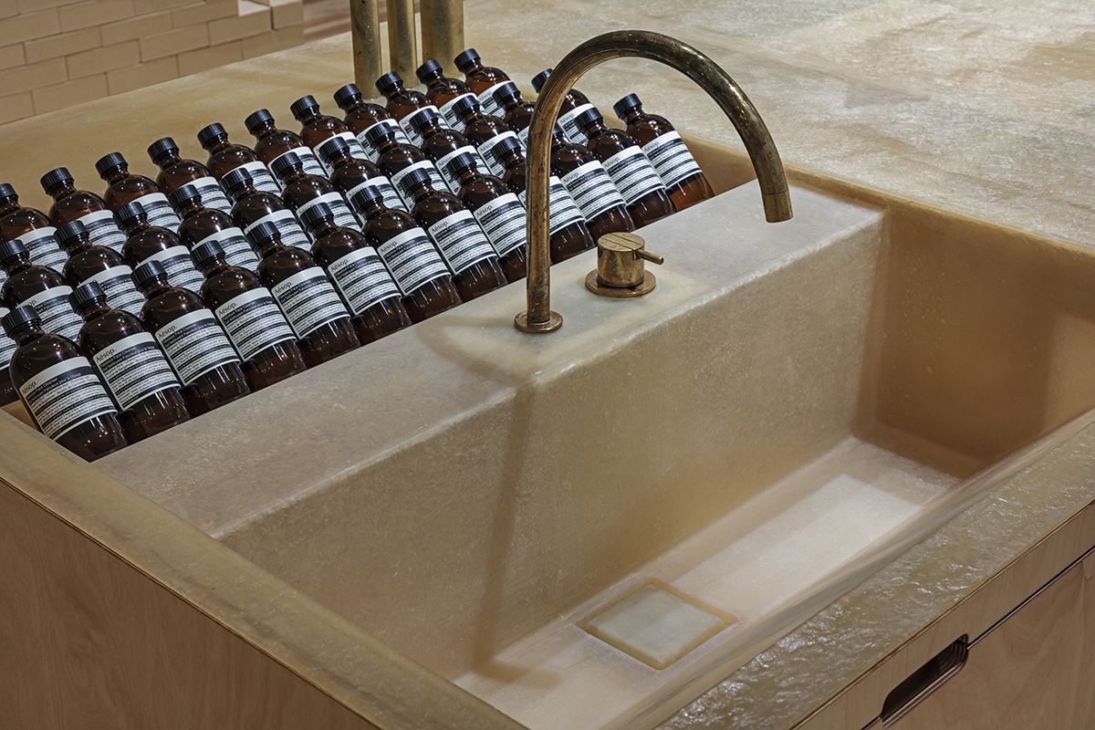
We had designed their first store in Japan on the street of Aoyama which opened in 2010, and the store in Ginza which opened in 2011. The Aesop brand, became well-known and the way the store operates has changed significantly from the time of the first store opened. The first Aoyama store was made as open as possible to actively invite customers to inside. But now the brand became well-known, and many customers visit every day. So, we focused on providing customers enjoyable and stress-free shopping experiences in the new store. We reviewed the ratio between the number of sinks and the number of POS to facilitate the flow of customers. The main POS counter is in the middle of the selling area so that customers whom waiting for the next cashier can make a queue around it without disturbing the area.
Data
Title: Aesop LUCUA 1100
Architect: Jo Nagasaka / Schemata Architects
Project team: Kohei Hayashi
Location: 3F LUCUA 1100, 3-1-3 Umeda Kita-ku Osaka, Japan
Usage: Cosmetic shop
Construction: D.BRAIN CO.,LTD.
Collaboration: BRANCH lighting design(lighting design)
Floor area: 102.51㎡
Completion: May 2019
Photo: Kenta Hasegawa